

About Me

0
DevilJin Wrote:
@Blud:
I like the second version of your sig most out of the two. Only thing is that your BGs in your sigs are pretty wild and messy. Its as if you go crazy with a bunch of brushes and stuff, which makes it of course look bad. I like the little flare in his hand that you put, but it just looks better if you just use like a gradient or something. your in much more control of the outcome of the effect if you do this. You're getting better though. You're at least blending your renders with the BG a little more but of course could be better. Keep trying and before you know it you'll be better.
EDIT:
Just saw your new sig (you posted like a minute before me. Much better blending, and it actually has a better flow then your other sigs. Nice, keep it up.
Thank you for you kind words of wisdom,Jin.I'm trying to learn as you and Skinsley are teaching me,and for the most part I know that it is helping me improve.I'm not really following any tutorials,just trying to learn...
I'm very glad to have some of the best teaching me....

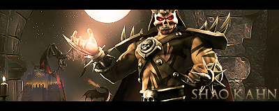
Kahn I like this new one, and the Ironman one... On the ironman one though, past the render ontop again and erase everything but the face...the face needs a little more colour in it rather than the way you have faded it a little during changing lighting effects.
Ither that or make a colour over the face and set it to a decent blending mode and maybee arase some areas or lower the opacity.
The newest sig is pretty good...lot of stuff going on but still your improving every time, I am a little stumped at how I can teach you anything when you use gimp and I use photoshop but I will still try.
DW, your style has always been this cool simplicity and you are the master of it, but if you wanna improve you need to start trying new things.
About Me
0
skinsley Wrote:
Kahn I like this new one, and the Ironman one... On the ironman one though, past the render ontop again and erase everything but the face...the face needs a little more colour in it rather than the way you have faded it a little during changing lighting effects.
Ither that or make a colour over the face and set it to a decent blending mode and maybee arase some areas or lower the opacity.
The newest sig is pretty good...lot of stuff going on but still your improving every time, I am a little stumped at how I can teach you anything when you use gimp and I use photoshop but I will still try.
DW, your style has always been this cool simplicity and you are the master of it, but if you wanna improve you need to start trying new things.
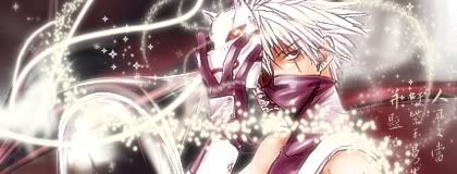
I've lost my interest in the Ironman sig,Maybe it's because I only thought that it looked good while I was actually completing it?I'm not sure,but the Newest Kakashi one is my most-favorite.....
Skinsley,I though that you had once had photoshop then had switched over to gimp?That is why i sent you an IM for help,but does anyone know if there are any good brush sets that I should download?

About Me

MK Online Featured User 31/3/2010 12/4/2011
-----------------------Gifts-----------------------
Shinnok-fan64 - s3Kt0r
0
khanswarrior15 Wrote:
<
I only wish I could be as good as you = ] Well,here is one of my newest,if not my best:
<
I only wish I could be as good as you = ] Well,here is one of my newest,if not my best:

Thanks
DevilJin Wrote:
@DW:
The only real problems I have with your sig is that it looks very simple (not saying anythings wrong with simplicity) and that the text is so big and takes up a lot of space. The only thing thats really "blending" is the render which is just red and black.
@DW:
The only real problems I have with your sig is that it looks very simple (not saying anythings wrong with simplicity) and that the text is so big and takes up a lot of space. The only thing thats really "blending" is the render which is just red and black.
Ok kl
skinsley Wrote:
DW, your style has always been this cool simplicity and you are the master of it, but if you wanna improve you need to start trying new things.
DW, your style has always been this cool simplicity and you are the master of it, but if you wanna improve you need to start trying new things.
I'm starting making sigs again so I'm trying to get back into mood of making sigs before I'm going try anything new but right now I'm just trying making sigs again
are there any tutorials you suggest I should I try?
P.S. where did you get those chinese letters from?
About Me
MK Online Featured User 31/3/2010 12/4/2011
-----------------------Gifts-----------------------
Shinnok-fan64 - s3Kt0r
0


0
skinsley Wrote:
Thats better, your getting back into the swing of things.
As am I
C & C please.....DONT mention the text...it is not important...I know that bit sucks, but what about the rest of it ?
Thats better, your getting back into the swing of things.
As am I
C & C please.....DONT mention the text...it is not important...I know that bit sucks, but what about the rest of it ?
Man that looks cool as hell man. I knew you had it in you
^made this one yesterday. Not as good as my Man in the mask sig but its o.k. I love figuring out new effects and styles. I think I'm gonna stick with the whole smudging technique. Its my favorite style right now and looks cool.
Im also working on a GTA sig now using this style...
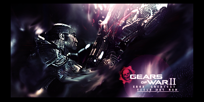
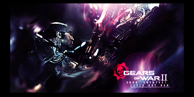
You have done well on the text again, but you need to work a little more on your lighting, I know the Gears of war renders/stocks come with their own lighting, which makes a GOW sig supreme when given its lightsource.
Prodigy is the go to guy when it comes to lighting, though I am not too shabby myself. I like where its going, the background is chaotic and there the sigs I love the most to be honest....ones where you just FUCK IT UP but keep depth and flow.
Prodigy is the go to guy when it comes to lighting, though I am not too shabby myself. I like where its going, the background is chaotic and there the sigs I love the most to be honest....ones where you just FUCK IT UP but keep depth and flow.
0
Hmm, I will have to keep an eye on Prodigy's work so I can see how get some good lighting. I hope he uses photobucket as a image host so I can see more of his sigs, and figure out the lighting technique.
Oh, and its not really hard to get that kinda text. I see that you tried to do the same thing as well and you pretty much got it. use a nice small text that looks good (maybe too small to be able to read but still looks nice). I know I was like when I found out that the font has to "look good" just to get that kinda text pulled off.
Thanks for the feedback...
P.S I finished my GTA sig I was talking about in my other post last night, and I'll post it later.
Oh, and its not really hard to get that kinda text. I see that you tried to do the same thing as well and you pretty much got it. use a nice small text that looks good (maybe too small to be able to read but still looks nice). I know I was like
Thanks for the feedback...
P.S I finished my GTA sig I was talking about in my other post last night, and I'll post it later.
About Me
MK Online Featured User 31/3/2010 12/4/2011
-----------------------Gifts-----------------------
Shinnok-fan64 - s3Kt0r
0
skinsley Wrote:
Thats better, your getting back into the swing of things.
As am I
C & C please.....DONT mention the text...it is not important...I know that bit sucks, but what about the rest of it ?
Thats better, your getting back into the swing of things.
As am I
C & C please.....DONT mention the text...it is not important...I know that bit sucks, but what about the rest of it ?
Yeah I'm back into sig making
anyway, nice sig
___________________________________________________________
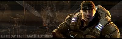
Devil Jin nice sig but make texts under the "Gears Of War II" bigger beacuse it is hard to see.
can't wait to see GTA 4 sig

About Me

0
You're getting better DevilJin! The GOW sig is probably the best out of the ones you have been recently doing imo. The second version is the better.
KW15, your ideas for the sigs are pretty neat (For example, the swirly dots in the Sub-Zero sig are great but it would be better if you position the dots coming from the icy projectile). The only thing you have to pay attention to is to not have the background incredibly busy (The Ironman one, especially).
The lighting lenses added to Sub-Zero and Ironman's hands are a good touch really.
If you want to know how a good background looks like, you can always take a look at some tutorials. Gimp Talk has some good tuts.
Sites recommended for tutorials:
Planet Renders (You have to register though to get access to free tutorials)
Global Sig Alliance
Tech GFX (Again, you have to register)
DevilJin Wrote:
Hmm, I will have to keep an eye on Prodigy's work so I can see how get some good lighting. I hope he uses photobucket as a image host so I can see more of his sigs, and figure out the lighting technique.
Hmm, I will have to keep an eye on Prodigy's work so I can see how get some good lighting. I hope he uses photobucket as a image host so I can see more of his sigs, and figure out the lighting technique.
Good luck getting on my PB. Maybe you should try coming up with your own techniques now, allot of what Im seeing from you is decent but they look like sigs from tuts that I've seen. It seems as though your trying to get other peoples look/styles rather than come up with something yourself.(imo)
New.
0
@DW:
The text is supposed to be small and hard to read like that. You know how you see something like a movie poster and you see that little text under it mostly saying stuff like little facts like who it's made by or whatever? Thats how its supposed to be. Or a even better example like in Hikari's current Ash sig.
@Hikari:
Thanks for the comment! When you gonna post up some more new stuff?
@ AKELDAMA (I'm guessing prodigy)??:
I don't know what makes people keep thinking that I use tutorials and shit like that? First it was Skins, then people from globalsigalliance.com, now you. I don't get it? Two different people can have the same style you know. Is it because of the improvements I've made so quickly? You guys gotta tell me because I can't figure it out. The only tutorial I've ever used was Jago's, and if you looked in the Gift thread you'll notice that it didn't really turn out so good. Mostly because I suck when it comes to using tutorials. I like to do my own thing.
I mean, I've seen plenty of sigs/tutorials that may look like "Hikari's" style (Sharp and nice colors as we know) but I don't ever be all like "Hikari do you be using tutorials?!?!"
Oh and, the only reason why I said "I gotta keep my eye out for one of your sigs" is because Skins said "Prodigy is the main man if you wanna know about lighting" or some thing like that, and I want to learn and get better so I wanted to see one of your sigs to get an idea or example of how lighting works.
Damn, shit like this gets annoying and now I don't even wanna post my new sig because I think everyone's gonna be on my ass about it.
The text is supposed to be small and hard to read like that. You know how you see something like a movie poster and you see that little text under it mostly saying stuff like little facts like who it's made by or whatever? Thats how its supposed to be. Or a even better example like in Hikari's current Ash sig.
@Hikari:
Thanks for the comment
@ AKELDAMA (I'm guessing prodigy)??:
I don't know what makes people keep thinking that I use tutorials and shit like that? First it was Skins, then people from globalsigalliance.com, now you. I don't get it? Two different people can have the same style you know. Is it because of the improvements I've made so quickly? You guys gotta tell me because I can't figure it out. The only tutorial I've ever used was Jago's, and if you looked in the Gift thread you'll notice that it didn't really turn out so good. Mostly because I suck when it comes to using tutorials. I like to do my own thing.
I mean, I've seen plenty of sigs/tutorials that may look like "Hikari's" style (Sharp and nice colors as we know) but I don't ever be all like "Hikari do you be using tutorials?!?!"
Oh and, the only reason why I said "I gotta keep my eye out for one of your sigs" is because Skins said "Prodigy is the main man if you wanna know about lighting" or some thing like that, and I want to learn and get better so I wanted to see one of your sigs to get an idea or example of how lighting works.
Damn, shit like this gets annoying and now I don't even wanna post my new sig because I think everyone's gonna be on my ass about it.
About Me
MK Online Featured User 31/3/2010 12/4/2011
-----------------------Gifts-----------------------
Shinnok-fan64 - s3Kt0r
0
DevilJin Wrote:
@DW:
The text is supposed to be small and hard to read like that. You know how you see something like a movie poster and you see that little text under it mostly saying stuff like little facts like who it's made by or whatever? Thats how its supposed to be. Or a even better example like in Hikari's current Ash sig.
The reason they do that beacuse the general public dont want to see the copyright or credits so that why it's so small. what your doing does not work. I haven't seen Hikari's sig but I think I know what your trying to do and to me, stuff like that only work with japanese letters.
DevilJin Wrote:
Damn, shit like this gets annoying and now I don't even wanna post my new sig because I think everyone's gonna be on my ass about it.
Damn, shit like this gets annoying and now I don't even wanna post my new sig because I think everyone's gonna be on my ass about it.
Your going need to take bad comments (even tho some of them can be out of order at times. This is NOT aim at you, AKELDAMA.) as well good ones
Try some tutorials beacuse it can help like my new sig which borrow three parts of different tutorials and mix them together.
0
Hmm I see what you're saying about the whole small text thing now, and your kinda right. I don't know why but I still like that kinda text readable or not. I tried to make it readable but its like the font I used to get that like changes so much that it got in the way so I just made it super small.
And your right. Even if people think I use tutorials, or "take" others styles shouldn't stop me from posting them up.
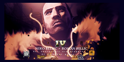
NEW: GTA IV
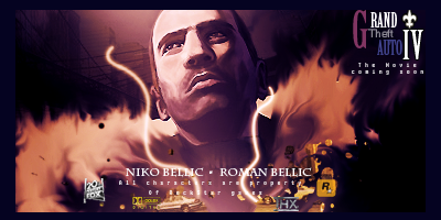
If this was a stolen idea/style I quit making sigs forever....lol
Opinions!?
And your right. Even if people think I use tutorials, or "take" others styles shouldn't stop me from posting them up.
NEW: GTA IV
If this was a stolen idea/style I quit making sigs forever....lol
Opinions!?

Nice GTA which tut is it from ? .... I joke.
Anywhoo the lighting is brilliant, and the smudging is something to be admired.
The text in the top right is fantastic but should be put a little closer to the render because it acts as its own focalpoint further away.
And the other bit of text and stuff at the bottom of the sig...no just no, get it away kill it burn it no never....two areas of text just dont go..so unless its been requested for you to do by someone else your making a sig for....never do it.
0
skinsley Wrote:
Nice GTA which tut is it from ? .... I joke.
Anywhoo the lighting is brilliant, and the smudging is something to be admired.
The text in the top right is fantastic but should be put a little closer to the render because it acts as its own focalpoint further away.
And the other bit of text and stuff at the bottom of the sig...no just no, get it away kill it burn it no never....two areas of text just dont go..so unless its been requested for you to do by someone else your making a sig for....never do it.
Hmm, *writes on paper* Don't...ever....use....text...in....two....different...areas... Got it. O.k, thanks for the feedback Skins. Next time I look at that tutor...I mean, next time I do a sig like this I should either not put a two areas of text, or I should put the two text areas together to make it look like one focal area of text.
@Ulcatron, I like the 1st one the best, but, not even trying to joke aroundjavascript:postMsg()
javascript:postMsg() or nothing. That sig looks very close to another sig I've seen before. The only way this can be cleared up is if you tell me that the stuff coming out of his hands on the render already looks like that.
The second one, looks kinda simple and plain.
EDIT:
would this be any better with the text?
About Me
MK Online Featured User 31/3/2010 12/4/2011
-----------------------Gifts-----------------------
Shinnok-fan64 - s3Kt0r
0
DevilJin Wrote:
Get rid of logos and small text. it might look better (as sig) but I'm not 100% (just like my GTA game, lol)
If you keep the small text then make the space between the two lines smaller.
The design is great and nothing wrong with it
Get rid of logos and small text. it might look better (as sig) but I'm not 100% (just like my GTA game, lol)
If you keep the small text then make the space between the two lines smaller.
The design is great and nothing wrong with it


0
AKELDAMA Wrote:
Noice job.
About Me
0
AKELDAMA Wrote:
Thanks.
Thanks.
Prodigy,how do you give your renders that smooth effect?


© 1998-2026 Shadow Knight Media, LLC. All rights reserved. Mortal Kombat, the dragon logo and all character names are trademarks and copyright of Warner Bros. Entertainment Inc.