
0
ThePredator151 Wrote:
avy = tgrant comp
hehe...
What do you think?
avy = tgrant comp
hehe...
What do you think?
Hmm...not bad at all. I still think your first one was hands down one of the best animated avy's I have ever seen. I think it would be tough trying to top that one.
It doesn't really match the sig you have now, but I have an idea.


0
prodigy004 Wrote:
Hmm...not bad at all. I still think your first one was hands down one of the best animated avy's I have ever seen. I think it would be tough trying to top that one.
It doesn't really match the sig you have now, but I have an idea.
Hmm...not bad at all. I still think your first one was hands down one of the best animated avy's I have ever seen. I think it would be tough trying to top that one.
It doesn't really match the sig you have now, but I have an idea.
Thanks for the feedback man.
I thought about that too before I changed it. I was gonna wait to change it along with something that matched better....but I just like this sig too much to let it go along with the avatar like that. So, I guess I kind cursed myself there...
And you're right too, I've been fooling around with this new avatar for about a month..month and a half, debating on whether it's good enough to replace my last one. You'll probably see a few, slightly different versions of this current avatar as a result.
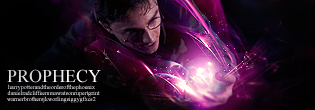
Overall, I think my old one wins on originality, and the integrity of the actual animated part was a little better. While this new one, wins on originality, and actually being able to work a real lightning storm in there. Raiden has been edited indefinitely, a few different "Raidens" make up this Raiden image. And then the background was tediously manipulated over time.
::You have an idea, hu? *cheezes*


0
UlcaTron Wrote:
Honest opinions?
UlcaTron Wrote:
Honest opinions?
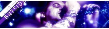
O.k, it looks ok but to me the colors look a little strange or to "out there." And its like the same style that you always use. (ok kinda different but still looks the same as your other work.)
I like how you put the text though. I was never able to do that in GIMP when I used it.
Not gonna rate it like people be doing in those fake threads because I'm in no position to rate how good someones art is, but I will give you my opinion.

0
HOT^.
About Me

0
0
You make it hard to catch up don't you MIN? heh
Excellent job as usual bro. Needed to see something that good right about now.
Excellent job as usual bro. Needed to see something that good right about now.

0
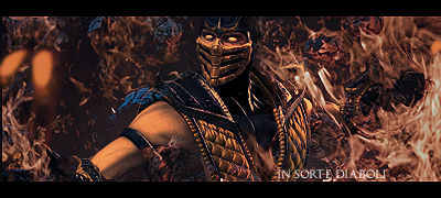
Nothing fancy or special about this one, I just had to make a sig of this render. Scorpion looks so insane, I love it. I just wanted to make the sig as "hellish" as possible. No fancy effects, bright pretty colors or anything like that. Text was taken from a Dimmu Borgir CD which was called In Sorte Diaboli. Which means in direct contact with satan or something like that.

About Me
0
Here's something new I tried out

0
Prod, that looks amazing!!! I LOVE IT!!!
btw... where;d u find that render
btw... where;d u find that render


0
Kamionero Wrote:
Prod, that looks amazing!!! I LOVE IT!!!
btw... where;d u find that render
Prod, that looks amazing!!! I LOVE IT!!!
btw... where;d u find that render
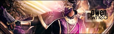
Thanks man.
The render was released a couple days ago. You can find the cut out, in the cut out thread thanks to MINION. I used the stock which can be found in the MK vs DC thread.

About Me

0
Yeah MINION's render edits are awesome =D
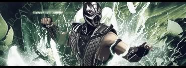
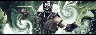
Ulcatron, very well done. I personally think it's definitely your best one yet. The colors actually do work well with the Smoke render. The lightning around him work nicely including the little speckles (Although I think the speckly dots could be reduced a bit- it just looks a bit too much to me.)
The only problem is that most parts are oversharpened. Erase some of them (I recommend erasing the sides). Maybe fading the opacity of the sharpened layer would work too (75% maybe). And get rid of that wierd shape above the lightning which is somewhere on top of the sig. EDIT: v1 is the best.
----------
0
Raw dope Ulca-pants!
Whew! Those look good. I think I like the first one best though.
Whew! Those look good. I think I like the first one best though.


0
2 New-

Made with UF. LP on its way.
Made with UF. LP on its way.


© 1998-2026 Shadow Knight Media, LLC. All rights reserved. Mortal Kombat, the dragon logo and all character names are trademarks and copyright of Warner Bros. Entertainment Inc.