


0
-Jago- Wrote:
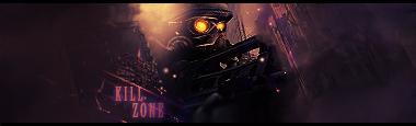
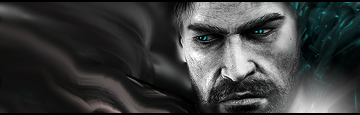
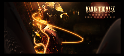
Yeah I like the darker version and I do think you are improving. The text isn't too bad but I'd move it closer to the render and the glow on the K is bad make it like the rest of the glow. I have a tut I wrote that I think would help your style a lot, you want it?
Yeah I like the darker version and I do think you are improving. The text isn't too bad but I'd move it closer to the render and the glow on the K is bad make it like the rest of the glow. I have a tut I wrote that I think would help your style a lot, you want it?
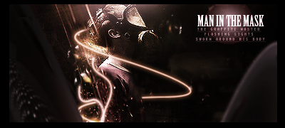
-Yeah, I like the darker one better as well.
-I knew there was something wrong with the glow and text a little. I'm gonna put it closer to the render and see how it works out. I can see that the text at that position doesn't really go with the flow.
-.And yes, I would love to see a tut that'll help me in any kinda way. Thanks
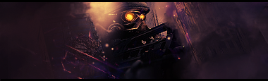
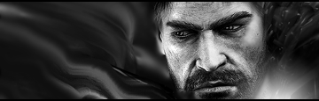
EDIT: added more to it so it won't look so empty:
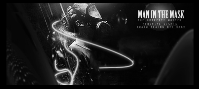
EDIT: new shit (literary)
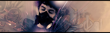
Bad, but wanted to share anyway...

About Me

0

Comments?I think it looks gay.....
0
khanswarrior15 Wrote:

Comments?I think it looks gay.....

Comments?I think it looks gay.....
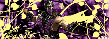
Ah.My old avatar.Brings me back to my good ol' memories.Well,not that old,but I loved playing MVC with Strider H.The sig looks pretty good ,but for me it's a little too blurry.
0
DevilJin... MAAAD style points for those lines in that last sig!!! ;)
that;s what i call talent!
that;s what i call talent!
0
Kamionero Wrote:
DevilJin... MAAAD style points for those lines in that last sig!!! ;)
that;s what i call talent!
DevilJin... MAAAD style points for those lines in that last sig!!! ;)
that;s what i call talent!
lol, I know you like those line making skills
About Me
0
New Sig:


0
khanswarrior15 Wrote:
New Sig:
New Sig:
Thats actually pretty nice dude. The only thing that I don't like about it is that triangle thing to the left, and the fact the render doesn't really blend in with the nice BG. but thats just me. Also you should save your sigs as PNGs so that it'll have better quality.
New:
Hey jago I found a faster way to get "your" kind of smudge effect without using the wave filter. I seems easier to do, and less time consuming trying to find a good look by clicking randomize.
Opinions?
....Skins?
....Prodigy?
...Anybody?
About Me
0
New Sigs:

^ I think that Rain signature turned out much better than the original.I tried to base it off of Minion's style (Not sure if I accomplished it though..)Comments?Suggestions?


^ I think that Rain signature turned out much better than the original.I tried to base it off of Minion's style (Not sure if I accomplished it though..)Comments?Suggestions?
0
I like that subzero one. Liking the ice...energy....thing going around the freezeball in SubZ's hands.
On the rain one, try blending rain in with the BG a little more like you did with the SubZ one.
By the way, your page to get to your sigs is on private and I can't see it. Put it on public so we can see what nice sigs you made.
EDIT: New sig

I kinda didn't want to post this one because it kinda looks too much like something that Hikari (nice/bright colors) a would do And it seemed like I was just coping her style...even though I wasn't trying to.
On the rain one, try blending rain in with the BG a little more like you did with the SubZ one.
By the way, your page to get to your sigs is on private and I can't see it. Put it on public so we can see what nice sigs you made.
EDIT: New sig
I kinda didn't want to post this one because it kinda looks too much like something that Hikari (nice/bright colors) a would do And it seemed like I was just coping her style...even though I wasn't trying to.


0
Spur of the moment...request and completion.


Used some of MINION's vectors that he handed out a while back (I think that was him)
Anyway, nothin special really. Nothing about it was stock from the start.
It's a blend and manipulation for ECLASSIC.
Used some of MINION's vectors that he handed out a while back (I think that was him)
Anyway, nothin special really. Nothing about it was stock from the start.
It's a blend and manipulation for ECLASSIC.

About Me

0
I just made a new one. Nothing compared to the stuff you guys make, but I love the Shao Kahn picture I used in it.


OK then peeps.
Gotta say Owen your sigs aint that great...I would go learn some more, I don’t know of any sites specific to GIMP but find one.
Love the Killzone Tag DJ, I prefer the second version without Text, not much else to say about it it’s a good tag, but could be improved with sharpening blurring Burning and Dodging in random areas.
The sig that you said was BAD but shared anyway...I actually liked mate, its C4D is a little Obvious but it is a nice tag.
Splintercell sig is not my cup of tea...it’s a little boring, I have no problem with simplicity, but this tag does not want simplicity, the left side is way to plain and the right does not blend with the tag all that well.
The JSRF tag is also just not for me, I can see you used some good skills making it, but the final outcome just hasn’t got the stuff...whatever that may be lol.
You have become VERY GOOD though.
Kahnswarrior you need a little improvement...is it PS you use or GIMP or what ?..looks like lil tricks I used to use when I first started PS. Your Rain sig is not too shabby, the second version is a NO, and the subby sig you made has some nice ideas but is not a good tag in itself, you used the light and added some good depth with that brushing, though some other parts of the tag cancelled out the tag completely. I would advise some tutorials (learn not follow) you do have potential already.
Pred that is not a style I have ever seen you use before...feeling adventurous? They look good, but they are very simple...my guess is that’s intentional. Duno, not much advice to give here, looks like stuff I used to do ages ago, but is still effective.
MK4life. Don’t make sigs in Word ?....if you now use another programme...go find tutorials.
0
skinsley Wrote:
Love the Killzone Tag DJ, I prefer the second version without Text, not much else to say about it it’s a good tag, but could be improved with sharpening blurring Burning and Dodging in random areas.
The sig that you said was BAD but shared anyway...I actually liked mate, its C4D is a little Obvious but it is a nice tag.
Splintercell sig is not my cup of tea...it’s a little boring, I have no problem with simplicity, but this tag does not want simplicity, the left side is way to plain and the right does not blend with the tag all that well.
The JSRF tag is also just not for me, I can see you used some good skills making it, but the final outcome just hasn’t got the stuff...whatever that may be lol.
You have become VERY GOOD though.
Thanks for the feedback on all of my current sigs dude. Really appritiate it man for real. I know that I have a long way to go to become as good as you, MINION, prodigy, Hikari, or XTACTICS, but I'm going to keep making sigs, and don't really play to stop soon. Love sig making too much to just quit. I even make sigs when I'm upset and want to get my mind off it
Hey man, when you gonna make a new tag yourself? I know you think your bad but your really not. That last sig you made with the sprite was really cool.
About Me
0
skinsley Wrote:
OK then peeps.
Gotta say Owen your sigs aint that great...I would go learn some more, I don’t know of any sites specific to GIMP but find one.
Love the Killzone Tag DJ, I prefer the second version without Text, not much else to say about it it’s a good tag, but could be improved with sharpening blurring Burning and Dodging in random areas.
The sig that you said was BAD but shared anyway...I actually liked mate, its C4D is a little Obvious but it is a nice tag.
Splintercell sig is not my cup of tea...it’s a little boring, I have no problem with simplicity, but this tag does not want simplicity, the left side is way to plain and the right does not blend with the tag all that well.
The JSRF tag is also just not for me, I can see you used some good skills making it, but the final outcome just hasn’t got the stuff...whatever that may be lol.
You have become VERY GOOD though.
Kahnswarrior you need a little improvement...is it PS you use or GIMP or what ?..looks like lil tricks I used to use when I first started PS. Your Rain sig is not too shabby, the second version is a NO, and the subby sig you made has some nice ideas but is not a good tag in itself, you used the light and added some good depth with that brushing, though some other parts of the tag cancelled out the tag completely. I would advise some tutorials (learn not follow) you do have potential already.
Pred that is not a style I have ever seen you use before...feeling adventurous? They look good, but they are very simple...my guess is that’s intentional. Duno, not much advice to give here, looks like stuff I used to do ages ago, but is still effective.
MK4life. Don’t make sigs in Word ?....if you now use another programme...go find tutorials.
Ok and as for me...I want your C & C but im gonna say a little about what I think of them....in my defence lol.
Vector

Ok this is the first time I have EVER vectored an image...to be completely honest....ITS FUCKING BALLS, a fantastic fuck up even for a first try, someone teach me Vectoring.
Thought

It began well, but ended up pixelated and I could not fix it....another mess that I kept and I don’t know why.
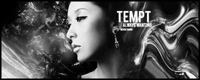
Tempt

I like it, yet I don’t, I think im getting there though as I am trying to get back to sig making.
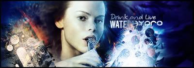
Water

Ok I think I may have cracked it a little here, its not great but it’s a start to being good again.
What y’all think ?
OK then peeps.
Gotta say Owen your sigs aint that great...I would go learn some more, I don’t know of any sites specific to GIMP but find one.
Love the Killzone Tag DJ, I prefer the second version without Text, not much else to say about it it’s a good tag, but could be improved with sharpening blurring Burning and Dodging in random areas.
The sig that you said was BAD but shared anyway...I actually liked mate, its C4D is a little Obvious but it is a nice tag.
Splintercell sig is not my cup of tea...it’s a little boring, I have no problem with simplicity, but this tag does not want simplicity, the left side is way to plain and the right does not blend with the tag all that well.
The JSRF tag is also just not for me, I can see you used some good skills making it, but the final outcome just hasn’t got the stuff...whatever that may be lol.
You have become VERY GOOD though.
Kahnswarrior you need a little improvement...is it PS you use or GIMP or what ?..looks like lil tricks I used to use when I first started PS. Your Rain sig is not too shabby, the second version is a NO, and the subby sig you made has some nice ideas but is not a good tag in itself, you used the light and added some good depth with that brushing, though some other parts of the tag cancelled out the tag completely. I would advise some tutorials (learn not follow) you do have potential already.
Pred that is not a style I have ever seen you use before...feeling adventurous? They look good, but they are very simple...my guess is that’s intentional. Duno, not much advice to give here, looks like stuff I used to do ages ago, but is still effective.
MK4life. Don’t make sigs in Word ?....if you now use another programme...go find tutorials.
Ok and as for me...I want your C & C but im gonna say a little about what I think of them....in my defence lol.
Vector
Ok this is the first time I have EVER vectored an image...to be completely honest....ITS FUCKING BALLS, a fantastic fuck up even for a first try, someone teach me Vectoring.
Thought
It began well, but ended up pixelated and I could not fix it....another mess that I kept and I don’t know why.
Tempt
I like it, yet I don’t, I think im getting there though as I am trying to get back to sig making.
Water
Ok I think I may have cracked it a little here, its not great but it’s a start to being good again.
What y’all think ?
Actually I use Gimp,but most of my Brushes were converted form Photoshop.I've seen some tutorials already,but I didn't base my style of a tutorial at all,just off from different stuff I've seen,or something that looks similar.
About Me
0
Version #1:
Version #2:

Version #2:

0
skinsley Wrote:
As you wish.
As you wish.
There you go
-I'm lovin that 1st one. Nice use of the liquify filter and the BG is really cool. It just looks a little...how can I put this?...Flat. Give it a little more depth, and have the render stick out a little more.
See how the render is all nice, clean and sticks out nicely? Thats all you need to do with that sig a little more and it'll look really good.
-Sorry, but I don't really like the 2nd one that much. Not a big fan of the text or the color selections. And the clipping masks arn't that good either. Pretty much in basic words, not that good, but keep trying.
Only thing I blame about you "not being that good" (as you saw) is the fact that you make sigs every once in awhile, instead of making them more then just like once or twice a month.
I also just looked at your photobucket page and I saw that of course your weren't that good at 1st (who is?). But then at one point the sigs started to get really good, then it slowly getting worst and worst (Im guessing because you stopped making sigs then tried to restart again, correct me if Im wrong)
EDIT:
How do you guys like my new avi
0
Hmm, thats what I thought. Well you can re-start again, and become as good as you once were. Just start making them a little more than once or twice a month.
NEW:
V2
V3
B&W
Opinions?
skins?...
anyone?...
NEW:
V2
V3
B&W
Opinions?
skins?...
anyone?...


Incredible DJ. Your best by bfar.
Text is nice, lighting nice, exelent use of the stock.
Well done altogether, no improvements.....I like all versions but not sure weather i prefer 1 or 2.
I am not willing to let you surpass me any further lol I needs to gets me some practice.
Text is nice, lighting nice, exelent use of the stock.
Well done altogether, no improvements.....I like all versions but not sure weather i prefer 1 or 2.
I am not willing to let you surpass me any further lol I needs to gets me some practice.
About Me
0
Is no one going to comment/criticize my sig?

About Me

MK Online Featured User 31/3/2010 12/4/2011
-----------------------Gifts-----------------------
Shinnok-fan64 - s3Kt0r
0
khanswarrior15 Wrote:
Version #1:
Version #2:
Version #1:

Version #2:

AAAHHHHH
I don't know which one I like more but there both good
___________________________________________________________
About Me
0
devilwithin Wrote:
AAAHHHHH
I don't know which one I like more but there both good
___________________________________________________________
khanswarrior15 Wrote:
Version #1:
Version #2:
Version #1:
Version #2:
AAAHHHHH
I don't know which one I like more but there both good
___________________________________________________________
I only wish I could be as good as you = ] Well,here is one of my newest,if not my best:

0
@Skins&Jago:
Thanks you two I really like this one as well, and think its my best to so far. Thanks for the comments and lol Skins, I think you could beat me in a sig contest easy. You have a lot of experience.
@Blud:
I like the second version of your sig most out of the two. Only thing is that your BGs in your sigs are pretty wild and messy. Its as if you go crazy with a bunch of brushes and stuff, which makes it of course look bad. I like the little flare in his hand that you put, but it just looks better if you just use like a gradient or something. your in much more control of the outcome of the effect if you do this. You're getting better though. You're at least blending your renders with the BG a little more but of course could be better. Keep trying and before you know it you'll be better.
EDIT:
Just saw your new sig (you posted like a minute before me. Much better blending, and it actually has a better flow then your other sigs. Nice, keep it up.
@DW:
The only real problems I have with your sig is that it looks very simple (not saying anythings wrong with simplicity) and that the text is so big and takes up a lot of space. The only thing thats really "blending" is the render which is just red and black.


© 1998-2026 Shadow Knight Media, LLC. All rights reserved. Mortal Kombat, the dragon logo and all character names are trademarks and copyright of Warner Bros. Entertainment Inc.