

0
YEESSSSSSSSSSSSSSSSS!!!!
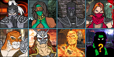
Kahn looks effin perfect. He ain't nothin' to fuck with!!!
Kahn looks effin perfect. He ain't nothin' to fuck with!!!

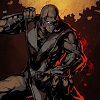
Shao Kahn pretty much looks like shao Kahn, can't really complain. I like it except for the damn sandals. Why isn't he wearing boots? I can just see him fighting Batman and then he gets a batarang to the toes.
Darkseid looks really intimidating. I don't like the muted colors though. I thought he could use some blue. Still looks good though.
I can't wait to see Superman and Wonder Woman meet Shao Kahn, mk's ultimate badass.
Darkseid looks really intimidating. I don't like the muted colors though. I thought he could use some blue. Still looks good though.
I can't wait to see Superman and Wonder Woman meet Shao Kahn, mk's ultimate badass.
About Me
My Action Short Films:
http://www.youtube.com/playlist?list=PL_AJSvQq2bL3-GtOoCMTReaXAYX83SX3l
0
I like Kahn's scars. I don't like his mask that much, I like the old one better. But he looks good.


0
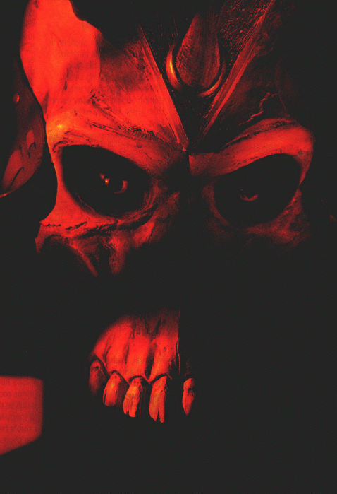
I must admit to knowing basically shit about DC outside of Batman. I looked up images for Darkseid once he was announced to see what he looked like, read up on his story and what not. I honestly hated the charactars appearence. It was just God awful to me. But somehow in some strange way. THAT Darkseid render is fucking amazing.
Can't say enough good things about Shao Kahn. The classic look was a good move IMO(aside from the damn cape...aren't there enough fuckin capes in this game?). The scarring on the face is a nice touch that adds a level of depth to the design. You've always been aware of Shao Kahn's emperor/warlord status, but this is the first time that the render actually tells the story. The eyes are a weakpoint....kind of. The fact that the helmet rides a little high to SLIGHTLY reveal some of the more monstrous feature of the charactar is a nice touch, but the helmet riding high makes it look a little awkward.
Can't say enough good things about Shao Kahn. The classic look was a good move IMO(aside from the damn cape...aren't there enough fuckin capes in this game?). The scarring on the face is a nice touch that adds a level of depth to the design. You've always been aware of Shao Kahn's emperor/warlord status, but this is the first time that the render actually tells the story. The eyes are a weakpoint....kind of. The fact that the helmet rides a little high to SLIGHTLY reveal some of the more monstrous feature of the charactar is a nice touch, but the helmet riding high makes it look a little awkward.
0
I'm glad they beefed up Kahn. His render looks great, now he looks like a boss again and very intimidating. Reminds me of the damn near impossible Shao Kahn from MK3/UMK3/MKT
Darkseid looks absolutely amazing! I never really cared for him or his look(especially in the animated series) but he looks damn evil and intimidating, The only thing though is like someone said earlier, he always has his arms behind him like that statue in the background. Oh well, I can't wait to see what Dark Kahn looks like
Darkseid looks absolutely amazing! I never really cared for him or his look(especially in the animated series) but he looks damn evil and intimidating, The only thing though is like someone said earlier, he always has his arms behind him like that statue in the background. Oh well, I can't wait to see what Dark Kahn looks like


0
Both characters need capes or cloaks. Something to justify their massive shoulder pads.
But other than that, very good. Cool details.
Love the scarring or whatever just above Kahn's eyes.
But other than that, very good. Cool details.
Love the scarring or whatever just above Kahn's eyes.


0
They did a good job with both of these renders. Darksieds is the better one of the two though, ultimately. I'm figuring besides the ballsak curtain and the shoulder pads. I don't think those hurt so much in this one (kinda @ Mick).
Now, I'm gonna be the bad guy for a second.....
Shao Kahn has some problems though. He looks silly. Call me old fashion but, I still like the Mk2-T look over these 3D ones. He looks better in this render than in that little XB360 avatar, definitely. And certainly, this is one of the more aggressive designs for Kahn. But I still take points off for not being realistic and, not at least seeming functional enough.
The bone mask falls pretty flat for me, even though I like that they tried to get more aggressive with it. It's not realistic enough, it's a tad to high on his face, and overall, it doesn't construct a false face so much as it used to for me. Mask // Helmets protect the face and head. So, what's it doing so high on his face? lol Also, they're a method of intimidation. Like I said, I like that this one is designed more aggressive than recently previous ones, but if it's not giving the allusion of a false face....why have it on? It needs to come down a tad, maybe to suggest that it omits his top lip, and his teeth.Full allusion to a theme is what I'm talking about. And Kahns theme of terror and destruction has a lot of room for improvement here.
Click it.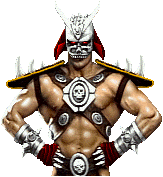
See? The old one is still better, and more impressive than the new one. The old one has this "A demon-slave was probably forced to construct this for Shao Kahn" look to it. hmmm...? HMMM....?!? (Forgot who brought that example// point up, otherwise I'd give credit to them)
Go back to a "beat on" metal mask, and just as an option, look at also going back to the intense blood red colors his costume used to have. Psychology tells me what certain red colors do to people though. The less seizures the better, I know. Thing is, if he's not impressive or intimidating through his colors and so on, he needs to make it up in sensibility.....
This new one has a Pig Face, slash Skeleton vibe too it. It's just a shiny, tan helmet-thing. No illusion, so like a few people have pointed out, it humanizes him. Personally, I don't favor a humanized demon boss character. I just want the demon boss character with slight humanization's applied. "Two legs, two arms, five or so fingers, one nose, one mouth, two eyes, ect".
===
Another thing is something I agree with Mick-Lucifer on more and more now. Those cursed shoulder pads. They're an eye-sore because they're being over used. And on this new Kahn, they don't rest on his shoulders....they're trying to escape! haha... Looks like he's about ready to fly away somewhere with those things on his shoulders. lol All of his pads give this impression to me as a matter of fact.
Anyway, if they flap up like that, they should give the impression of imperial(they don't), and they should be used alot less on him. Everything else should be strapped down, laced up or tied down tight. Should at least look like it's guarding or protecting whatever it's covering for potentially stress ridden situations like this...c'mon man. Makes the whole thing just look funny when it doesn't look functional.
That said, spikes placed on parts of his costume that are commonly kicked, punched, or landed on(like shoulder tossing) makes sense. The pads on his hands look funny in combination with the spikes on his wrists. What is he gonna do with those? Back-hand you......with a cushion?
Shao Kahns got some problems man, lol. But I do like what they did with him though.
About Me
0
Hey now, Shao Kahn has ALWAYS worn a cape. His sprite just didn't have it in-game until Deception because they couldn't blue-screen that and make it look good back in the day.


Darkseid looks a lot better than Shao. Though I don't remember Darkseid ever having a loinflap. Midway has a serious hardon for loinflaps. And shoulderpads. Why does Darkseid have shoulderpads?
Kahn looks like ass. I needn't elaborate because people smart enough to realize that already see what's wrong.
Kahn looks like ass. I needn't elaborate because people smart enough to realize that already see what's wrong.

Great renders. Shao Kahn looks amazing to be honest. Best Shao Kahn since MK3. Shao Kahn is a supernatural emperor, so of course he will be bigger than your average muscle man. This is the way he should be imo. Well done Midway 
About Me

0
Both lookgreat. Lol @ Kahn's tiny feet.

0
Vomit Wrote:
Oh man, I hope to GOD you can knock off Kahn's helmet off to reveal his freakishly deformed Tarkata-like face! I mean, if we can knock Scorpion's mask off, to reveal his skull, then why not Kahn's right? Who's with me?
FACE OR GTFO
Oh man, I hope to GOD you can knock off Kahn's helmet off to reveal his freakishly deformed Tarkata-like face! I mean, if we can knock Scorpion's mask off, to reveal his skull, then why not Kahn's right? Who's with me?
FACE OR GTFO
I'm with you. FACE OR GTFO!


0
Shao Kahn looks great. But the teeth and scars is bothering me.

About Me
0
God I can't wait to play this game!!!!!


Mick-Lucifer Wrote:
Shoulder pads and a loin cloth.
Oh yeah, that's definitely what he needed!
Shoulder pads and a loin cloth.
Oh yeah, that's definitely what he needed!
Protip: Darkseid looked like a total fag since day one,so this is actually an improvement. Seriously,despite his badassness,his design is flippin' terrible.
About Me

Sig by MINION
0
Riyakou Wrote:
Darkseid looks too much like Apocalypse in the face.
Shao Kahn looks as good as always, except for the fact that his drawers aren't black anymore, and they can be seen from the front. Talk about censorship...
Darkseid looks too much like Apocalypse in the face.
Shao Kahn looks as good as always, except for the fact that his drawers aren't black anymore, and they can be seen from the front. Talk about censorship...
Actually its the other way around, Darksied came first.


© 1998-2026 Shadow Knight Media, LLC. All rights reserved. Mortal Kombat, the dragon logo and all character names are trademarks and copyright of Warner Bros. Entertainment Inc.