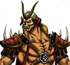
Hello everyone! I came up with two concepts for Raiden's alternate costumes instead of one. I did a rough color for both just to see how they looked, so forgive me for them not being as finished as usual. For the first concept on the left, redid the alternate of Raiden that i did a while back. I changed his hat to look more like the conical hat Japanese monks wear and wooden sandals. His second design on the right was a mix of MK Mythos Raiden and Conquest Raiden. **Please comment if you rate!! Thank you!
The first one looks a little weird to me, the chest armor reminds me of, like, a Greek/Roman soldier and Raiden without sleeves just always seems strange to me. It's not bad, I'm just not used to it.
I like the Mythologies-inspired look of the second, though.
Thank you for your feedback Razor! The armor does look roman like or knight like now that I look at at it. I should have added some asian influence to the breastplate. I also was going to make the pants on the left one black, similar to my first Raiden alt design. Do you think I should have gone with the black instead of the white?
I dunno, I think Raiden is sort of a character whose color scheme is iconic and you don't want to throw off the balance too much, it should always be white dominant, then blue, then black, silver, and yellow/gold as trim. At least, for a primary. You can go a little more wild with any outfit where he's not wearing the hat, like his Deadly Alliance samurai look.
Part of that is because black clothes on him actually mean "Dark Raiden".
The other part is because if you look at the other god characters, Shinnok and Fujin, part of the reason their designs always suck is because their color scheme is a mess, they splash red, yellow, and green/blue all over them in unbalanced amounts. Like, which color is supposed to be dominant? Shinnok looks like an evil rainbow sometimes, lol.
I see what you mean. Raiden's color scheme is pretty solid. I do agree that Shinnoks color scheme is a bit weird and his look in mythologies was pretty awesome. Hopefully in the new MK they will darken his color scheme.
I like the one on the right more than the one on the left. I think the closer we get to the idea of a battle ready God character that stay within his color pallet(s) (mk1 or mk2>>)...the better.
Raiden's designs have remained pretty practical and "safe" for the most part over the years so, even though I think this is a good thing, I feel like it's time to take some risk. Particularly with either his MKD look or his MK1 look. Great Job though...no doubt.