Raiden render
0
07/26/2007 03:05 AM (UTC)by
Avatar
Garlador
Avatar
Member Since
02/23/2003 03:56 AM (UTC)
Avatar
fedegita
07/14/2007 10:51 AM (UTC)
0
Definitely not as polished as your Sareena piece. His face is far too thin and young looking for Raiden and his hat looks like a giant bell. The crease in his robe on his right leg also looks wierd and out of place. 2.5/5
Avatar
Garlador
07/14/2007 02:36 PM (UTC)
0
fedegita Wrote:
Definitely not as polished as your Sareena piece. His face is far too thin and young looking for Raiden and his hat looks like a giant bell. The crease in his robe on his right leg also looks wierd and out of place. 2.5/5


I love criticism, I really do. If I didn't, I wouldn't keep doing what I do because what I do would suck.

Let's see:
1. I was asked specifically to do a "younger" Raiden, in his late "20s" in appearance, so that was intentional, but for the sake of the picture, I could make him older.

2. The hat was a major pain to create. I'm not that great with morphs just yet, and I swear I spent an hour trying to get the right size... and even I still think it looks off. I'll work on that again.

3. The robe's crease was a problem with its "skeleton", which didn't have enough points of movement to make such a pose look natural. I'll have to add some "bones" to that section to make it flow better.

I received a nice long hate letter too about this one already (no, not from you Pred) telling me just how much I suck at life and how the model is awful. Well, I haven't heard anything good about this one yet, so I guess it's back to the drawing board...
Avatar
Garlador
07/14/2007 07:18 PM (UTC)
0
Well, it seems like every render I do I end up redoing. The Raiden one was a request from a fan and so I did a pretty big overhaul which results in the render I'm including below. I might end up redoing THAT, but, oh well. I'm more proud of this one anyway.

Alternate Raiden
Avatar
Iori9
07/14/2007 07:54 PM (UTC)
0
Garlador Wrote:
Well, it seems like every render I do I end up redoing. The Raiden one was a request from a fan and so I did a pretty big overhaul which results in the render I'm including below. I might end up redoing THAT, but, oh well. I'm more proud of this one anyway.

Alternate Raiden

wow shinny nipples...
Avatar
s3Kt0r
Avatar
About Me
------------> DO
07/14/2007 07:59 PM (UTC)
0
It looks great but it looks nowhere as good as your previous renders. I really didn't like the "rice picker" hat, since it pretty much doesn't have the shape of a cone. The lightning didn't have much detail as well. In my opinion this attire doesn't suit Raiden at all. But the alternate looks really great, in fact it looks ten folds better. I really like the kitana sword addition.-4/5 overall 5/5 overall for the alternate
Avatar
-Jago-
Avatar
About Me
07/14/2007 10:16 PM (UTC)
0
Very nice. I don't like the first one TBH, but the alternate version is awesome and much better. I don't think the tight black pants fit him...maybe make them baggier, and have him wearing a hakama or something maybe. Other than that he looks amazing, excellent job.
Avatar
fedegita
07/14/2007 10:28 PM (UTC)
0
I'm ... absolutely speechless man. Your alternate version is amazing, there's no other way to describe it.

Pros -
- the sheen off his skin is so realistic. That along with the waterfall in the background gives it a looks that is incredibly peaceful and tranquil for the god of thunder
- The clothes are greatly improved, dont see anything wrong with them
- I dont know if its just me, but he as a certain aura about him that reminds me of Bill from Kill Bill

Cons-
- nothing, except maybe smoothe out the edges on his hat ^_^

I didn't realise your previous version was intentionally young-looking, so that's fine.

5/5
Avatar
lastfighter89
07/14/2007 10:54 PM (UTC)
0
of the original render i don't like the ha,it doesn't sems maden by bamboo but it's like a sorcerer one(do you remmeber Final Fantasy 9?)

4/5

the second is perfect so 5/5,you deserve it.
Avatar
ThePredator151
Avatar
About Me
The Ultimate Mortal Kombat Experience
- Lead Graphic Designer - Mortal Kombat Online -


:G-play

:Story

:F-Design

:Cutout

:Get Sig

:Raiden

:Fans [1] [2]

:#LegendaryArts

07/15/2007 08:21 AM (UTC)
0
Garlador Wrote:
I received a nice long hate letter too about this one already (no, not from you Pred) telling me just how much I suck at life and how the model is awful. Well, I haven't heard anything good about this one yet, so I guess it's back to the drawing board...


You don't know how deep a breathe I took before the hyphens. Like "Dude, he thinks I hate him now".. lol

The second Render is far better than the first. Thank you. I probably should have posted the analytical part of that message in here, but instead now, I'll do the second one.


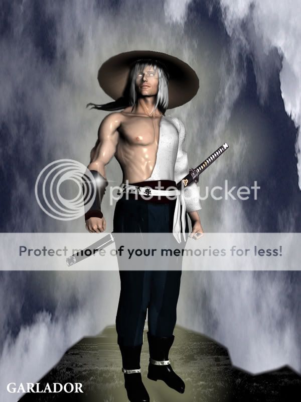
Pretty much everything from the waist up, I think is on spot for the Mk "novice diety" Raijin.

From the waist down?

1. His pants should either over-lap the shoes or be in some kind of wrap that concludes the pants. Like his Mk1 interpretation:


No matter, it should be in a more Oriental Fashion.."Japanese Deity".
I like how you draw up the shoes on each of your art. But seeing's it, I don't thing his boots overlapping his pants compliment the pic much at all...


2. Because of no1. He could use some slack in the shirt. I say because whether Standing on solid Ground, or Floating in air, gravity should lax the clothing to//over the "tuck".
Like a loosely tucked shirt, or a shirt that's been let out slightly....It's that "puff" around the belt//cumber bun from those loose types of garments I'm looking for. He also could use th thick stiching across the chest
....like Kimono//Hakama wear:


Relaxed, but fighting attire...


(I remember you mentioning the difficulty in "laying//swaying fabrics however")

Everything else is perfect in mine eye for a Youthful Mk Raijin Character.
Pose, facial expression, the Katana......

Actually, he could have his staff in the hand on the right side of the picture. It's already shaped to fit anyway...

and that's nit picking folks... 2/5 for the first render. I waited to score so, If I could dictate the degree, you'd receive a very high 4/5 for the second render... It's that much better than the first on all corners.

151

Avatar
Anthony667
Avatar
About Me

THE OFFICIAL #1 Nitara Fan ¥ ¤ ¥ ¤ ¥ ¤ ¥ ¤ ¥ ¤ ¥ ¤ ¥ ¤ ¥ Join Nitara Fan Central! Www.NitaraFanCentral.9f.Com

07/16/2007 06:14 AM (UTC)
0
kool.wink
Avatar
Thunderstudent
Avatar
About Me

I need a new sig picture....

07/17/2007 03:23 AM (UTC)
0
i like them both but the 2nd is to much like his deadly aliance and deception alternates. i like the 1st better execpt for the hat, it's way to big. still, good pic's
Avatar
3D_MK_Art
07/25/2007 02:54 AM (UTC)
0
I think this render is alright. I mean, I don't recognize the hat in this render. I like the writing on his pants though. How did you make such real electricity? I can tell you worked hard on that though. 4/5
Avatar
Angellous
07/26/2007 03:05 AM (UTC)
0
Hey just wanted to say this one is good, but needs work. Not a big buff on renders so I won't get all into it...looks a bit off though.
Pages: 1
Download on the App StoreGet it on Google Play
© 1998-2024 Shadow Knight Media, LLC. All rights reserved. Read our Privacy Policy.
Mortal Kombat, the dragon logo and all character names are trademarks and copyright of Warner Bros. Entertainment Inc.