

About Me

0
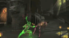
Finally a offical release date.
And the cover looks sweet as hell. Yall is just some babies.
And the cover looks sweet as hell. Yall is just some babies.
Well...typical.
They took page from the SF4 again.
At least they didn't go by Soul Calibur 4 route and didn't place Kratos right on the top of the cover.
Of course I'd prefer simple MK logo. Everyone knows it. It as recognizable as those two ninjas, maybe even more.
Besides, putting some nice renders and generic symbols - is what every other fighting game does. MK was different - it always was just a symbol on the cover. But a symbol that was familliar to anyone, a symbol that conveyed that is not just another fighting game - it is Mortal Kombat. It's always stood out in the crowd of other games, fighting and what not.
Now it's just another "cool" cover to attract kids. Not that I expected anything different, mind you.

About Me
0
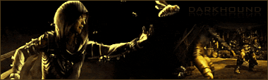
Would have preferred something more understated, like this:

Excuse the terrible image, I'm too lazy to find a better one.
Excuse the terrible image, I'm too lazy to find a better one.

0
Bickering over the cover art? Bless You, MKO.
MK_MortalKombat: Kombat Begins April 19th, 2011
Awwwwwwww Yeah!
MK_MortalKombat: Kombat Begins April 19th, 2011
Awwwwwwww Yeah!
0
Ion3008 Wrote:
Bickering over the cover art? Bless You, MKO.
Bickering over the cover art? Bless You, MKO.
Negative Nancys, lol.
I do understand their arguement, though.
Ion3008 Wrote:
MK_MortalKombat: Kombat Begins April 19th, 2011
Awwwwwwww Yeah!
MK_MortalKombat: Kombat Begins April 19th, 2011
Awwwwwwww Yeah!
SO buttfucking excited.
About Me
Fare Thee Well
0
Guess i am the only one who actually likes the cover art. Dam it looks better than final fantasy 14.
Anyway, yeah april hmm isn't that when the orginal came out? or was that october.
Can't wait to play as scorp, kung lao, and liu.
Anyway, yeah april hmm isn't that when the orginal came out? or was that october.
Can't wait to play as scorp, kung lao, and liu.

0
^Aside from the fact it's tacky as hell, nothing's wrong.


About Me

0
What's wrong with the cover? I like it! I'm a rabid Jade fan, but I don't see anything wrong. lol


Disco_Diva Wrote:
^Aside from the fact it's tacky as hell, nothing's wrong.
^Aside from the fact it's tacky as hell, nothing's wrong.
Tacky? No...going to a party and not using a coaster is tacky. How exactly can coverart be tacky? You understand the definition of that word?
tack·y
2 [tak-ee]
–adjective, tack·i·er, tack·i·est.
1.
not tasteful or fashionable; dowdy.
2.
shabby in appearance; shoddy: a tacky, jerry-built housing development.
3.
crass; cheaply vulgar; tasteless; crude.
4.
gaudy; flashy; showy.
The only one you could possibly be thinking of is gaudy flashy or showy. But how exactly is 2 characters on a box flashy?

About Me
0
I love the cover art and I would like to personally thank all of the MKO users without you guys to fight over silly things,life would be such a drag.
Love you guys........
Love you guys........

About Me
Dedicated, hopeless...Li Mei fan.
0
I think the cover is just way too busy. A simple black box with the MK dragon logo and the words "MORTAL KOMBAT" would have perfectly sufficed. Simple, powerful, elegant.
About Me
Fare Thee Well
0
Darkhound74 Wrote:
I love the cover art and I would like to personally thank all of the MKO users without you guys to fight over silly things,life would be such a drag.
Love you guys........
I love the cover art and I would like to personally thank all of the MKO users without you guys to fight over silly things,life would be such a drag.
Love you guys........
ahh we love you too, just we don't admit it.
anyway, hmm tacky? well i guess you mean showing off two chars. fighting is not very clever for a cover. However it does it job, heak at least its better than mkvsdcu.
About Me
0
Shohayabusa Wrote:
ahh we love you too, just we don't admit it.
anyway, hmm tacky? well i guess you mean showing off two chars. fighting is not very clever for a cover. However it does it job, heak at least its better than mkvsdcu.
Darkhound74 Wrote:
I love the cover art and I would like to personally thank all of the MKO users without you guys to fight over silly things,life would be such a drag.
Love you guys........
I love the cover art and I would like to personally thank all of the MKO users without you guys to fight over silly things,life would be such a drag.
Love you guys........
ahh we love you too, just we don't admit it.
anyway, hmm tacky? well i guess you mean showing off two chars. fighting is not very clever for a cover. However it does it job, heak at least its better than mkvsdcu.
Every time I have to work before the night is over with somehow a MKvsDC finds its way to me and I usually hide it, but it keeps finding its way back.
About Me
Fare Thee Well
0
Darkhound74 Wrote:
Every time I have to work before the night is over with somehow a MKvsDC finds its way to me and I usually hide it, but it keeps finding its way back.
Shohayabusa Wrote:
ahh we love you too, just we don't admit it.
anyway, hmm tacky? well i guess you mean showing off two chars. fighting is not very clever for a cover. However it does it job, heak at least its better than mkvsdcu.
Darkhound74 Wrote:
I love the cover art and I would like to personally thank all of the MKO users without you guys to fight over silly things,life would be such a drag.
Love you guys........
I love the cover art and I would like to personally thank all of the MKO users without you guys to fight over silly things,life would be such a drag.
Love you guys........
ahh we love you too, just we don't admit it.
anyway, hmm tacky? well i guess you mean showing off two chars. fighting is not very clever for a cover. However it does it job, heak at least its better than mkvsdcu.
Every time I have to work before the night is over with somehow a MKvsDC finds its way to me and I usually hide it, but it keeps finding its way back.
Its the new black sheep of mk, kinda like how the mk untied forces was.
0
I don't think anyone's genuinely upset over the cover art. I know I'm a little disappointed that it's not the dragon symbol we've seen up to this point. But this is more or less what I expected, and there certainly are some games that have shittier looking boxes.

 MK Khronology: 58.49% complete...

0
Anyone remember characters on the cover art of MK4? That was actually awesome. Goro all in the middle, ready to poke them fools in the eyes.
 I must say though, it looks like the most RANDOM choice of characters to me.
I must say though, it looks like the most RANDOM choice of characters to me.
About Me
0
Shadaloo Wrote:
Ugh. The dragon sold itself; this was unnecessary.
Ah well. Not like I bought it to stare at the packaging anyway.
Ugh. The dragon sold itself; this was unnecessary.
Ah well. Not like I bought it to stare at the packaging anyway.
I hate to be the first to tell you this but MK was not the best selling fighting game.
So the Dragon logo could've been selling itself (to the fans), but not good enough.
Now that WB is involved you know they can't just go and say "as long as the fans buy the game it's good enough". This is the reason why Kratos is in and this is the reason they put a very cool illustration (coz you know it looks cool) on the cover.
The logo would be cool for old times sake, but now everything about your game including the cover needs to make everyone want play your game. Otherwise a lot of people would just look at the cover. Make a comment about it like "Mortal Kombat was cool in the 90's" and move on to the next game or don't even give it any attention at all. These people need to want to play this game as well. A cool cover can be a trigger to make people wanna find out more about the game by trying it out in the store, going home and looking it up on review sites or youtube, or just picking it up right then and there.
At least you should be happy they didn't put Kratos on the cover to sell this game a some more.
Besides, when you put the game in your PS3/Xbox360 you're not gonna worry about the boxart. You're gonna be playing a kickass game and forget this thread.

0
RedSumac Wrote:
Now it's just another "cool" cover to attract kids. Not that I expected anything different, mind you.
Now it's just another "cool" cover to attract kids. Not that I expected anything different, mind you.
You're talking about a game with multicolored ninjas, over the top gore, and a player base that's composed mostly of 14 year olds.
This series has always been about being "cool".

TotalReject Wrote:
I hate to be the first to tell you this but MK was not the best selling fighting game.
So the Dragon logo could've been selling itself (to the fans), but not good enough.
Now that WB is involved you know they can't just go and say "as long as the fans buy the game it's good enough". This is the reason why Kratos is in and this is the reason they put a very cool illustration (coz you know it looks cool) on the cover.
The logo would be cool for old times sake, but now everything about your game including the cover needs to make everyone want play your game. Otherwise a lot of people would just look at the cover. Make a comment about it like "Mortal Kombat was cool in the 90's" and move on to the next game or don't even give it any attention at all. These people need to want to play this game as well. A cool cover can be a trigger to make people wanna find out more about the game by trying it out in the store, going home and looking it up on review sites or youtube, or just picking it up right then and there.
Shadaloo Wrote:
Ugh. The dragon sold itself; this was unnecessary.
Ah well. Not like I bought it to stare at the packaging anyway.
Ugh. The dragon sold itself; this was unnecessary.
Ah well. Not like I bought it to stare at the packaging anyway.
I hate to be the first to tell you this but MK was not the best selling fighting game.
So the Dragon logo could've been selling itself (to the fans), but not good enough.
Now that WB is involved you know they can't just go and say "as long as the fans buy the game it's good enough". This is the reason why Kratos is in and this is the reason they put a very cool illustration (coz you know it looks cool) on the cover.
The logo would be cool for old times sake, but now everything about your game including the cover needs to make everyone want play your game. Otherwise a lot of people would just look at the cover. Make a comment about it like "Mortal Kombat was cool in the 90's" and move on to the next game or don't even give it any attention at all. These people need to want to play this game as well. A cool cover can be a trigger to make people wanna find out more about the game by trying it out in the store, going home and looking it up on review sites or youtube, or just picking it up right then and there.
Sorry, but no. Not even close. Cool's a subjective opinion, and that cover looks ugly. Too much going on. The new version of the classic dragon against a black background is a nice sharp contrast - lack of insanity going on everyplace also adds to appeal for a lot of people. A lot of the time, less is more.
Then there's the fact that Mortal Kombat's a brand name that's been around for nearly twenty years. At the time of the first game's release on home systems, the insanity was nation-wide; I remember it well. You had to hit three stores to find a copy (if you were lucky). That was then, but you know what? Deadly Alliance, Deception, Shaolin Monks and Armageddon all did well enough in sales to net Greatest Hits status - it was doing well enough that Midway were pretty much relying on it to survive for ages, they had no other decent titles. And to boot, MKDA's cover was nothing more than the stylized dragon inside the Metal V, Deception's a larger dragon with Onaga - a completely new character - on the cover, and Armageddon's was the silver logo against a red background.
MK Unchained - a repackaging of Deception with a few extras- also netted GH status, as did MKDC, despite being utter shit - that sold on the brand names of MK as well as the great big honkin' DC name. The series is not the powerhouse that the likes of Mario or Link are, or what have you - few series are - but please don't tell me Scorpion and Sub-Zero were necessary to sell this game; it's been selling just fine for quite a while now with or without guests on the cover. :)

-Ant- Wrote:
Tacky? No...going to a party and not using a coaster is tacky. How exactly can coverart be tacky? You understand the definition of that word?
tack·y
2 [tak-ee]
–adjective, tack·i·er, tack·i·est.
1.
not tasteful or fashionable; dowdy.
2.
shabby in appearance; shoddy: a tacky, jerry-built housing development.
3.
crass; cheaply vulgar; tasteless; crude.
4.
gaudy; flashy; showy.
The only one you could possibly be thinking of is gaudy flashy or showy. But how exactly is 2 characters on a box flashy?
Disco_Diva Wrote:
^Aside from the fact it's tacky as hell, nothing's wrong.
^Aside from the fact it's tacky as hell, nothing's wrong.
Tacky? No...going to a party and not using a coaster is tacky. How exactly can coverart be tacky? You understand the definition of that word?
tack·y
2 [tak-ee]
–adjective, tack·i·er, tack·i·est.
1.
not tasteful or fashionable; dowdy.
2.
shabby in appearance; shoddy: a tacky, jerry-built housing development.
3.
crass; cheaply vulgar; tasteless; crude.
4.
gaudy; flashy; showy.
The only one you could possibly be thinking of is gaudy flashy or showy. But how exactly is 2 characters on a box flashy?
I'll take definitions 1, 2, and 3 please.
To me, it is tacky. It's a cliche scheme to increase sales by slapping the franchise's most popular characters on the cover. And of course, Scorpion gets the full body image.
This is a clear sign that despite all the ass kicking praise this game has gotten over the last few months, Ed Boon is still lacking the confidence to make a game without feeling the need for a cheap marketing tactic.
Why don't he just quit being stubborn, call Tobias, and say he's sorry?


© 1998-2026 Shadow Knight Media, LLC. All rights reserved. Mortal Kombat, the dragon logo and all character names are trademarks and copyright of Warner Bros. Entertainment Inc.