
0
TheOmniOni Wrote:
I actually gotta agree with Death. I think it looks poor. I've noticed the same with the rest of the renders too. It's like they're trying to over texturize the renderings to make up for the lack of detail. Primarily in the super heroes. It's not that necessary, and looks it's worst with this flash render.
XTREEMIST Wrote:
In what way? The quality? or your personal biased opinion on DC/Flash?
Deathbearer Wrote:
I must be the only one who thinks it looks kinda shitty.
Then again all the renders do so what should one expect?
I must be the only one who thinks it looks kinda shitty.
Then again all the renders do so what should one expect?
In what way? The quality? or your personal biased opinion on DC/Flash?
I actually gotta agree with Death. I think it looks poor. I've noticed the same with the rest of the renders too. It's like they're trying to over texturize the renderings to make up for the lack of detail. Primarily in the super heroes. It's not that necessary, and looks it's worst with this flash render.
That pretty much sums it up.

About Me

0
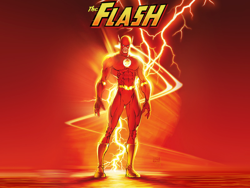
That sure is a nice shade of lipstick Flash's wearing. I know its been said, I don't care.
I hope midway fixes his lips, they are really bothering me.
I hope midway fixes his lips, they are really bothering me.


0
*Slow Hand Claps*
Looks good MkTeam.
My take?
I am a little puzzled as to why some parts of him looks one dimensional though. I don't know the remedy to it, so I can't really voice it. Blending maybe? Lighting? Can't quite peg it.
It's around his knee, and his left elbow, underneath hisleft arm about his chest...maybe it's the way they cut him out. Could also be the lack of definition there...hm
Other than that? I've accepted the direction their taking with the texture generality amongst the renders, so that's not a complaint in this post. And to be quite honest, the texture scheme that they're using, looks better on the DC characters than it does the MK characters. I think it's because those characters are mainly spandex, or heavy paten leather wearers. MK characters should have "tougher" texture methods employed depending on the character. For instance Scorpion with the bone structures and it's textures.
I see a difference between the fabrics of his suit, and the metals(lightning bolt on his ear, and belt in particular) in this render. So that's good. There's also a noticeable difference in texture, between the aforementioned suit & metals, and the insignia on his chest. Another good thing.
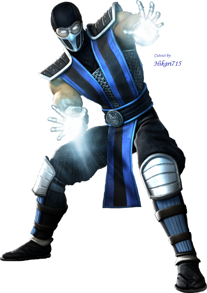
There is a slight difference in texture between his suit fabric, and his shoes and gloves, but they all share the same texture though. A better difference would have been to make his suit like what the fabrics looked like in the MKSM renders. This render of MKSM Sub-Zero has great texture differences throughout, and I think it's relative to what these MKvsDC are ending up looking like.
Saying, it looks possible to accomplish that kind of difference in texture here with these MKvsDC renders. But in particular, Flash's main suit could probably look like Sub-Zeros pants fabric, yet tightly faceted about his body, and maybe even promoting "stitching". Giving the suggestion of "breath-ability". While, his shoes could stay they way they are. Then, his gloves could look like the texture on Sub-Zero's head-wear, or also stay the way you have them.
See it?
Moving on, Flash's face looks fine, looks like what I would call "gritty". In the future, the lighting involved about the face could pretty much stay, but get better the way light effects actual skin. Should almost look like a "see through jelly" type texture. Doesn't look like that now, even though it looks good the way it is for this render. So no complaint there.
I would've went easier on the color of his lips, lol, those stick out. The "dip" in the top lip looks a little funny too, but I guess that works.
A little more definition in the stomach, and chest area seems warranted. *shrugs* Just part of the "super suit" agenda.
For the background, I might have used a heavy combo of gaussian blur+motion blur, and I think using an "echo" of the Flash might have helped established "super-speed" better. Like an Olympic medalists starts running in a race 1-2-3, how they start running in a race?
That's it. Proportions look fine to me, pose looks fine ect...
Overall it looks good.
Looks good MkTeam.
My take?
I am a little puzzled as to why some parts of him looks one dimensional though. I don't know the remedy to it, so I can't really voice it. Blending maybe? Lighting? Can't quite peg it.
It's around his knee, and his left elbow, underneath hisleft arm about his chest...maybe it's the way they cut him out. Could also be the lack of definition there...hm
Other than that? I've accepted the direction their taking with the texture generality amongst the renders, so that's not a complaint in this post. And to be quite honest, the texture scheme that they're using, looks better on the DC characters than it does the MK characters. I think it's because those characters are mainly spandex, or heavy paten leather wearers. MK characters should have "tougher" texture methods employed depending on the character. For instance Scorpion with the bone structures and it's textures.
I see a difference between the fabrics of his suit, and the metals(lightning bolt on his ear, and belt in particular) in this render. So that's good. There's also a noticeable difference in texture, between the aforementioned suit & metals, and the insignia on his chest. Another good thing.
There is a slight difference in texture between his suit fabric, and his shoes and gloves, but they all share the same texture though. A better difference would have been to make his suit like what the fabrics looked like in the MKSM renders. This render of MKSM Sub-Zero has great texture differences throughout, and I think it's relative to what these MKvsDC are ending up looking like.
Saying, it looks possible to accomplish that kind of difference in texture here with these MKvsDC renders. But in particular, Flash's main suit could probably look like Sub-Zeros pants fabric, yet tightly faceted about his body, and maybe even promoting "stitching". Giving the suggestion of "breath-ability". While, his shoes could stay they way they are. Then, his gloves could look like the texture on Sub-Zero's head-wear, or also stay the way you have them.
See it?
Moving on, Flash's face looks fine, looks like what I would call "gritty". In the future, the lighting involved about the face could pretty much stay, but get better the way light effects actual skin. Should almost look like a "see through jelly" type texture. Doesn't look like that now, even though it looks good the way it is for this render. So no complaint there.
I would've went easier on the color of his lips, lol, those stick out. The "dip" in the top lip looks a little funny too, but I guess that works.
A little more definition in the stomach, and chest area seems warranted. *shrugs* Just part of the "super suit" agenda.
For the background, I might have used a heavy combo of gaussian blur+motion blur, and I think using an "echo" of the Flash might have helped established "super-speed" better. Like an Olympic medalists starts running in a race 1-2-3, how they start running in a race?
That's it. Proportions look fine to me, pose looks fine ect...
Overall it looks good.


I don't really care for it. Close up, his legs/butt look bizarre. Why is the suit all scaly? It almost looks like he's so hairy under the suit that you can see it through the tights. Which is creepy. I'm all for bears, but someone hand Flash some Nair! He needs to tone it down a notch. 
0
Deathbearer Wrote:
I must be the only one who thinks it looks kinda shitty.
Then again all the renders do so what should one expect?
I must be the only one who thinks it looks kinda shitty.
Then again all the renders do so what should one expect?
No they don't, granted some look better then others as with all renders but the Scorpion, Sub and this one all rock with details. Everyone hates Superman/Batman so I suppose that's pointless on this site...
XTREEMIST Wrote:
In what way? The quality? or your personal biased opinion on DC/Flash?
Sadly, that's why most people hate the DC renders on here...and vice versa on some comicbook or DC sites...Deathbearer Wrote:
I must be the only one who thinks it looks kinda shitty.
Then again all the renders do so what should one expect?
I must be the only one who thinks it looks kinda shitty.
Then again all the renders do so what should one expect?
In what way? The quality? or your personal biased opinion on DC/Flash?

0
Wow....the graphics are REALLY bad.
This looks like a ps2 in-game model.....
This looks like a ps2 in-game model.....
0
KitanaHime Wrote:
This looks like a ps2 in-game model.....
This looks like a ps2 in-game model.....
PS2 my ass


0
Reptilefanatic Wrote:
PS2 my ass
KitanaHime Wrote:
This looks like a ps2 in-game model.....
This looks like a ps2 in-game model.....
PS2 my ass
Totally agree with ya Reptile, but chances are he's just a sad little hater...shakes head* seriously, anyone that thinks this looks like PS2 graphics must be on some serious drugs or something.
I will say this though, that post has potential on receiving "the most false, BS award post of the year" ....

About Me

0
Probably my least favorite character render. The texture of his spandex outfit looks bad to me.

Edit: For real slow people, this shot shows just how horrible the textures are.
His lips also look pretty hideous. Its like they are droopy from the middle.

...and I do love the red lipstick.
Edit: For real slow people, this shot shows just how horrible the textures are.
His lips also look pretty hideous. Its like they are droopy from the middle.
...and I do love the red lipstick.
About Me
What do you like? Hit the Toasty thumbs up on articles and forum posts for a quick response!
0
In fifty years noone thought lightning bolts on half-cut gloves or gold armbands were a good idea. So why do the MK team?...
Also, the chest symbol looks too big in general, let alone as a representation of the character. It's not the S shield!
Also, the chest symbol looks too big in general, let alone as a representation of the character. It's not the S shield!
0
KitanaHime Wrote:
Wow....the graphics are REALLY bad.
This looks like a ps2 in-game model.....
Wow....the graphics are REALLY bad.
This looks like a ps2 in-game model.....
ThePredator151 Wrote:
I've accepted the direction their taking with the texture generality amongst the renders, so that's not a complaint in this post. And to be quite honest, the texture scheme that they're using, looks better on the DC characters than it does the MK characters. I think it's because those characters are mainly spandex, or heavy paten leather wearers. MK characters should have "tougher" texture methods employed depending on the character. For instance Scorpion with the bone structures and it's textures.
I've accepted the direction their taking with the texture generality amongst the renders, so that's not a complaint in this post. And to be quite honest, the texture scheme that they're using, looks better on the DC characters than it does the MK characters. I think it's because those characters are mainly spandex, or heavy paten leather wearers. MK characters should have "tougher" texture methods employed depending on the character. For instance Scorpion with the bone structures and it's textures.
Even though we really shouldn't have to, that's what you might have to do in order to appreciate the "overall" look of these. That, and well, I am not unmerciful. People make mistakes....it's not the end of the world.
I look at it now like: "It's just what they're doing with this game's pre-released stuff." Better look next time?
I mean, they're making little improvements here and there with each render(most of which seems to be design dependent), but the improvements are not that noticeable at a glance.
--==--
Here's to hoping that the hopefully, very "clothy" Raiden gets some special attention. Then again, they may not do a render of him, so my hopes aren't overly high.
*calculates 2 week increments between now and November"
Looks like 6-10 more character unveils between now and release if they go all the way on that. I'd calculate that half of those could be rendered I'd guess. Artists get tired though.
hm...speaking of which, I still got some stuff to make for school tomorrow.
later all.
0
Its ok but IMO doesn't look any where near what I thought a next gen game would look like.We all know Midway or the mk team is not that great on graphics and can't really go up against what maybe namco or team ninja can do,its true to if you look how much better each game gets.
For example.
Tekken1-3 you can clearly tell they were trying their best and it shows in their games,graphic wise.
Same could be said for the dead or alive series.
Why Midway can't do this I am not sure.Graphics are fine but are no where near what other games look like and you can tell the mk team doesn't ever go all out with graphics EVER.
Anyways,I don't like this render much as I have with the others.Still looking forward to playing the game though.

Oh my god people are bitching about the lips....
Where do you draw the line?
Please let me try:
Why the hell is he running like that, does he have a Rabbit stuck up his ass?
Why is his outfit apple red, and not Cherry Red like the DC Universe retconned in Issue "Fuck You".
The mini creases in his spandex show's that he is clearly using TiDox Bleach and not Tide...WTF are they going soft on us?
Why the hell does his eyes suggest he is running to make love to a little Cuban Prince?
I'll have more later
About Me
0
elmon Wrote:
Oh my god people are bitching about the lips....
Where do you draw the line?
Please let me try:
Why the hell is he running like that, does he have a Rabbit stuck up his ass?
Why is his outfit apple red, and not Cherry Red like the DC Universe retconned in Issue "Fuck You".
The mini creases in his spandex show's that he is clearly using TiDox Bleach and not Tide...WTF are they going soft on us?
Why the hell does his eyes suggest he is running to make love to a little Cuban Prince?
I'll have more later
Your too funny.......no not really.
I think everyone is entitled to complain about something they aren't happy with. Yes, they are minor details, but they are still there. They bother me so I just decided to express my feelings towards it and so did the other users who have not only complained about this render but also others.
You can try and be amusing about people complaining, but that's not going to stop people from expressing their feelings about the smallest of details.

About Me
0
Well, he looks like The Flash. Not really good or bad, just The Flash. He looks like what I'd expect The Flash to look like if he were The Flash.
But anyway, TheOmniOni was spot on with the texturing. It looks like he's covered with fur. Not that I really feel strongly either way. I mean, hell, fur him up if you will. Fur him away. Put him in a fucking bear suit. It won't make me like him one bit less.
Because he's The Flash. Yay for The Flash. I guess.


0
Vomit Wrote:
Wow, you're pretty blind. Care for some eye-glasses?
KitanaHime Wrote:
Wow....the graphics are REALLY bad.
This looks like a ps2 in-game model.....
Wow....the graphics are REALLY bad.
This looks like a ps2 in-game model.....
Wow, you're pretty blind. Care for some eye-glasses?
Obviously you haven't played a next-gen game.Buy yourself a PS3 and play Virtua Fighter(which came out almost 2yrs ago) and dare to say these graphics are remotely as good!
The texturing is so horrid....
There are a couple of little things that could be improved, but seriously, I think the render looks excellent, and no, Im no fan of Flash, at all.
Some people are complaining about the lips.......well, do they really look *that* bad? There are different kinds of lips out there, so I don’t see how his “not-perfect” lips make this render trash.
I also did notice the weird texture on his arms though, but it surely isn’t that bad to ruin the art.
And what was the deal with the elbows about?
I think some people are getting really disappointed with the renders because they always expect a lot more for some reason (though I agree with most on the Superman and Batman renders).
I do have a question though, can anyone post any amazing next-gen renders that show the potential the Unreal Engine can deliver?
Many keep saying the renders could and should look better...but I would like to know how much better they could get?
Why cant they do what everyone expects of this engine and its potential? What are the differences between these renders and the “other” excellent renders that are a million times much better then the ones we have seen?
I have seen a few in game pics of other games that look jaw-dropping, but very few renders that actually show to be a 100x better then these ones of Mk, so, if anyone can help, it would be great.
I personally respect the artist and his wonderful work. I think he is doing an excellent job.
Thanks in advance!
About Me
0
Firstly, no one was calling the render trash basely on the lips. I still think they don't look great and will stick to that. That's not to say that the render isn't good, because it is. Just as some member were complaining about Catwoman's fingers and boot constantly, more like repeatedly, we can also complain about some damn lips or textures.
The main problem with the character is the texture, which is what the zoomed in shot was trying to display.
This is what Next-Gen textures should look like, and Gears of War has been out for over a year.


BIOSHOCK's Big Daddy:

and then there are also other games like Mass Effect, Rainbow Six: Vegas, and Army of Two. I highly doubt MK vs DC will end up looking remotely close to any of those games.
Now to compare it with Virtua Fighter 5, even though Soul Calibur IV would be a greater example:


Queve Wrote:"Has anyone else noticed how HORRIBLY photoshoped the Catwoman render is? Look at her hand, fingers and boot!!!!"
The main problem with the character is the texture, which is what the zoomed in shot was trying to display.
This is what Next-Gen textures should look like, and Gears of War has been out for over a year.


BIOSHOCK's Big Daddy:


and then there are also other games like Mass Effect, Rainbow Six: Vegas, and Army of Two. I highly doubt MK vs DC will end up looking remotely close to any of those games.
Now to compare it with Virtua Fighter 5, even though Soul Calibur IV would be a greater example:


© 1998-2026 Shadow Knight Media, LLC. All rights reserved. Mortal Kombat, the dragon logo and all character names are trademarks and copyright of Warner Bros. Entertainment Inc.