

About Me

0
takermk Wrote:
7/10 for both.
7/10 for both.
sorry bro,but who are you rating?
0
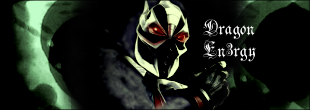
Avy: Looks okay - 7.5/10
Sig: Don't get what the writing means (I'm a little slow...) - 8/10
Sig: Don't get what the writing means (I'm a little slow...) - 8/10

About Me

0
Avy: 10/10 Sheeva > Most things
Siggy: 8/10 Not my type of music but it's very nicely done/
Fanbars: 8/10 Nicely done. Good work.
Siggy: 8/10 Not my type of music but it's very nicely done/
Fanbars: 8/10 Nicely done. Good work.

About Me
0
skinsley Wrote:
Avatar 7/10, it moves but its cheap
Signature 9/10 love the effect.
You make it yourself ?
Avatar 7/10, it moves but its cheap
Signature 9/10 love the effect.
You make it yourself ?
Yep. I just got photoshop back yesterday after 3 months of having to live without it. I'm so happy. This was my first sig to make since 31 August. I can't use it anymore, I havn't got a clue of my old methods, it's going to take me a while to get back into the swing of things.
Anyway as for above both avy and siggy get 9/10. I don't like SF but they are really nice.


0
Damn... Keith, thats sick.
10/10 for both.
I'm glad to hear that you got PS...be sure to challenge someone in my Sig Battles thread...
YOu can evern challenge me if you dare
10/10 for both.
I'm glad to hear that you got PS...be sure to challenge someone in my Sig Battles thread...
YOu can evern challenge me if you dare


0
For both 10/10
I love it! it's wonderfuly put together DE
Yay!! Keith got PS back!!
I love it! it's wonderfuly put together DE
Yay!! Keith got PS back!!

0
8.5/10 for both
I like the scrolling banner in the sig.
I like the scrolling banner in the sig.
0
AVY: 9/10
SIG: 10/10
SIG: 10/10

0
The avvys cool...I always liked it... 8/10
Sig...hmm, that person just messes it all up.
j/k 8/10...
Sig...hmm, that person just messes it all up.
j/k 8/10...
0
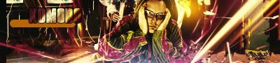
8.5/10 for both. They looks really nice, but I am not a big fan of Eminem


About Me

0
Avy: Nice =] 8/10
Sig: I have the brush you used on the background
looks really nice =] 8.5/10
Sig: I have the brush you used on the background
looks really nice =] 8.5/10
About Me
0
Nicely done. Stryker actually looks cooler with the red stripe imo. 9/10
Avy: 9/10
Avy: 9/10

About Me

0
Avatar: 6/10
Signature: 9/10
Signature: 9/10
About Me
0
Avy:10/10
Siggy: 9/10
Userbar: 9/10
Siggy: 9/10
Userbar: 9/10
About Me

0
avy: 10
Sig: 9.5 (Needs a border)
Can someone please rate this sig:

Sig: 9.5 (Needs a border)
Can someone please rate this sig:
0
My rating is ... 8/10, I like it.
If you want me to rate it like a jerk then....
The render is chopy, and it needs yellow to make it more blended.
The text needs alot of work, and the whole sig is just boring...
Thats me getting ratings from a Top Notche SOTW site....lol
But seriously, I like it. 8/10.
If you want me to rate it like a jerk then....
The render is chopy, and it needs yellow to make it more blended.
The text needs alot of work, and the whole sig is just boring...
Thats me getting ratings from a Top Notche SOTW site....lol
But seriously, I like it. 8/10.


© 1998-2025 Shadow Knight Media, LLC. All rights reserved. Mortal Kombat, the dragon logo and all character names are trademarks and copyright of Warner Bros. Entertainment Inc.