

About Me

0
10s all around. I love that Sheeva signature. 


About Me
BunnyHaetsU - Ramblings of a man who probably shouldn't be allowed into society.
0
The above person is obviously anti-Raiden.
I rate such activity 7.2 / 10
I rate such activity 7.2 / 10
About Me
0
8/10
0
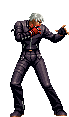
Avy: Easily my fave avy in all of MKO. Definitely a 10
Sig: Looks cool, really love that scratchy effect people use on their sigs. 10 as well.
Sig: Looks cool, really love that scratchy effect people use on their sigs. 10 as well.

About Me
Why don't you have a seat?
0
Avy: 8
Sig:8
Sig:8

About Me

how bout a cup of shut the hell up.
0
7 avy: Fair old man jinky avy
9 sig: Ive always liked your sigs. I like the one with the kid it gave me a seizure
9 sig: Ive always liked your sigs. I like the one with the kid it gave me a seizure
About Me

0
avy: 10
Sig: 6 too big
Sig: 6 too big

About Me

0
10/10-jax and shujinko are bad-asses.
About Me
0
khanswarrior15 Wrote:
10/10-jax and shujinko are bad-asses.
Shujinko?10/10-jax and shujinko are bad-asses.

0
9 for both thats a cool looking sig SM799.
About Me
0
SubMan799 Wrote:
khanswarrior15 Wrote:
10/10-jax and shujinko are bad-asses.
Shujinko?10/10-jax and shujinko are bad-asses.
OHH.....LOL,i was lookin at sick freaks avy and your sig sry,lol.

About Me

0
avatar= 8/10
signature=10/10
signature=10/10
About Me
Why don't you have a seat?
0
Avatar: 5
Sig: N/A
You don't have a sig!
Also, it's Briggs, not Bridges, SubMan.
Sig: N/A
You don't have a sig!
Also, it's Briggs, not Bridges, SubMan.
About Me
0
avy 8/10,bro you should get some one to make you a custom shinnok sig.It would be greatly improved EDIT:srry,lol i meant shinnok avy.
About Me
Why don't you have a seat?
0
WTF? A Shinnok sig?


0
5/10 I know you just got into Gimp, so here's my thoughts...
The render needs to "pop" more in color and in depth. It's really "flat" and I assume you ment to "blend" with the background when you "pallet swapped" Baraka. You can try tricks with "contrast" or "Lightness & Darkness" here too. Experiment more with "Color Replacement" or "Color Adjustment",and you'll get that good really fast.
The text is too bold and too big but could work. Just experiment there more, I still have trouble with text today. Also, try coloring the text or blending.
The background is cool, but it's "flat" and could blend better with the render. Tricks I use are "Button", "Shading", or "Lighting" effects. All of these will help your render and "focal point" "pop" like I mentioned. There's a million options here, experimenting with the "brushes" commonly helps enough though.
That's my thoughts SickFreak. Hope I wasn't too harsh or anything, cuz that's not what I ment to do at all.
-----------------------
Whoever rates mine, please emphasize on the avy. I have a couple of them and am trying to decide which one stays...
Avatar 10/10
Signature 9/10
Now pred, i dont know where the hell you get these backgrounds from, they look great, but this one doesnt seem to look like you spent as much time on it as you do your other stuff.
For anyone else id give them a 10, but your reputation for awsomeness makes you fall short of your mark on this new one.
Cleaver idea, wonderful outcome, but all your other stuff is so much more "awsome"
0
9/10 for avy.
10/10 sig
They are both wonderful to look at. Not much pass that to say really. The "9" for the avy comes from the "bold" around the text. Other than that they're pretty much flawless.
--------------------------------
Thanks man. For the background.....I cut the shit out of it. It took like an hour by itself because I'm not so good at cutting. There's two backrounds there actually. One has a "button" effect, the other some minor color adjustments and fading. The images themselves are from the MKFanatic website, where I got the two main renders as well.
The sprites in the background are from the MKWarehouse as well as Raiden's MK1 bio. The lightning was cutout too.
All and all, this sig took me.......Alll Fucking Day!! Hahaha!! No, but it did take like 7hrs between three days (waiting for renders to be cut).
EDIT:
Oh yea! Forgot to mention the blood code, blood and the dragons. See those? I like to put "secrets" in my sigs sometimes. The Dragons aren't so secret though, but they did come from the "warehouse" as well as the blood.
I think coming up with a concept takes the longest though....meh
0
10/10
10/10
10/10
9/10
2/10 2 is generouse because atleast it is a signature...
---------------------------
Button effect, cant say ive ever tried that pred, ill have a wee look at that sometime, 7 hours, why do you not just cut things out yourself, im sure you can do it.
Though my post in the request thread was secconded by you.
Cutting out is not one of my weakpoints though, its just boring.
0
9-10/10
My cut outs commonly look discraceful. I can do little cuts thoughlike the left Raiden in my sig now, I cut the lighting off his hand),just nothing as difficult as a ask you guy to do sometimes...heheh.
Like that Fujin cut, remember? I tried it first, got "strung out" over the ponytail, then asked you, the pro. Haha! I end up with all kinds of "blotches" and "holes" in the render.....It gets ugly. I think it's just my main program....PhotoImpact10
skinsley Wrote:
Button effect, cant say ive ever tried that pred, ill have a wee look at that sometime, 7 hours, why do you not just cut things out yourself, im sure you can do it.
Though my post in the request thread was secconded by you.
Cutting out is not one of my weakpoints though, its just boring.
Button effect, cant say ive ever tried that pred, ill have a wee look at that sometime, 7 hours, why do you not just cut things out yourself, im sure you can do it.
Though my post in the request thread was secconded by you.
Cutting out is not one of my weakpoints though, its just boring.
My cut outs commonly look discraceful. I can do little cuts thoughlike the left Raiden in my sig now, I cut the lighting off his hand),just nothing as difficult as a ask you guy to do sometimes...heheh.
Like that Fujin cut, remember? I tried it first, got "strung out" over the ponytail, then asked you, the pro. Haha! I end up with all kinds of "blotches" and "holes" in the render.....It gets ugly. I think it's just my main program....PhotoImpact10
0
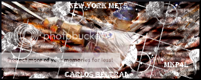
10/12
10/13
and I just made my sig. I put alot of hard work into it.
10/13
and I just made my sig. I put alot of hard work into it.
Avy 8.
Sig 3, perhaps you would like to ask someone to make you a better signature, that looks like it was made on paint, not easy to make good images with paint.
---------------------------------
Predator what the hell is buttoning lol, i looked all around my programme on photoshop and found nothing of the sort, lol


© 1998-2025 Shadow Knight Media, LLC. All rights reserved. Mortal Kombat, the dragon logo and all character names are trademarks and copyright of Warner Bros. Entertainment Inc.