

About Me

0
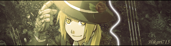
my newest sig................


About Me

0
-Jago- Wrote:


Nice job, the 2nd one is my favorite.
xtatics, not bad, I like how some parts of Bond were blended.
EDIT:
From a tut and I really like this one.


0
-Jago- Wrote:
Wow, These are outstanding!
I'm really drawn to the first one. Its original and a style I;ve not seen done before. It looks like something from a fantasy game. The effects and colors fit the rend perfectly. I don't see how you could have done better on that one.
The second on is awesome as well. The design gives it an artistic feel to it. I wanna say tribal, but I am unsure on what to call it. I like how the render is within the background, as if he was hiding in it. Like before, the effects are great on this one. The only thing that could have made it better is, perhaps some text on the left near the renders shoulder.
Keep up the good work, I hope to see some more. I like your work but you rarely ever post it on here.

About Me
0
i really like this one, and i know the font is the same as the last but for Iron Maiden sigs i want to use their official font and that one is it...............

Good but once again your text makes it look like a child did it....it makes soooooo much difference you would not belive.
Try not putting two different texts on each side, put them both on one side and close to each other, dont put red text on a red background YOU CANT FUCKING SEE IT, thers nothing wrong with the font you used...just where you put the text and what colour you used.
The background is pretty good and the render fits with it.....but the text makes what was good look realy bad.


0
skinsley Wrote:
..... dont put red text on a red background YOU CANT FUCKING SEE IT......
..... dont put red text on a red background YOU CANT FUCKING SEE IT......
LoLz

About Me
0
i agree Skins but i can see the font perfectly fine in this sig
About Me
0
it usually does.........................wow i really suck at text, i should have used a brown or blueish color; would've stood out better. might try to change the text. EDIT: i changed the text and added some; i think it looks better.
Yes thats much better....now all you need to do is place the text so it looks decent.
One bit of text to the left...and one bit of text to the right takes away the focus of the whole signature...put it all together....above or below each other but as long as there all close...change the size of the font if you must.
Its best to use two different fonts on Two seperate lines....one for Your title and one for your Name or whatever you may want to write.
Look at other peoples signature for example....the text on my current sig is not great...but its alright, look at that for a little example, ulcatron has also done a good job gettig his text a little better, starting off with ragular white or black text is good before you advance a little.
About Me
0
i would move it, but i already saved it on Photobucket and deleted it in my Pictures, so i can't change anything else. The only way i was able to change of the text was because i put it directly over the old text.
Oh well, this is good enough as it is i guess.
Oh well, this is good enough as it is i guess.
0

I made everything except the stuff that looks like broken glass.


0
UlcaTron Wrote:
Arctic Inspired.

Arctic Inspired.
*Sigh*
I dont want to sound like a jackass but its ugly. Alot of the sigs you make are kinda ugly. You wanna know why? there too plain. You also make them with very unattractive colours. Your style is also way to repetitve. Try some new styles bro. You have made better sigs in the past before. You have potential. Alot.
Anywho havent posted here in a bit so heres some stuff I made.

U2 FTW!!!^^^^ One of my favorite bands.


This dude is the ONLY rap ill listen to. Gym Class heroes are awsome.^This one took me a while^.

^on an other site, ppl have told me this is my best yet.

^dont ask wtf I was doing.
Comments and tips etc are more than welcome. Most of these are just from the top of my head and im just trying to be creative and do things that are different. Also my avy and sig are new.
0
thanks man, I appreciate it.
About Me
0
prodigy004 Wrote:
Anywho havent posted here in a bit so heres some stuff I made.
U2 FTW!!!^^^^ One of my favorite bands.
Anywho havent posted here in a bit so heres some stuff I made.
U2 FTW!!!^^^^ One of my favorite bands.
These, including your current one are your best imo.
Ulcatron, try something different and more interesting with techniques like clipping masks, smudging, filters, etc. Try taking a look at tuts for help.
0
Glad you like em Hik.
0
skinsley Wrote:
All those sigs are amazing Prodigy...gotta say I think you have surpassed me.
All those sigs are amazing Prodigy...gotta say I think you have surpassed me.
You're sick lol.
prodigy004 Wrote:
*Sigh*
I dont want to sound like a jackass but its ugly. Alot of the sigs you make are kinda ugly. You wanna know why? there too plain. You also make them with very unattractive colours. Your style is also way to repetitve. Try some new styles bro. You have made better sigs in the past before. You have potential. Alot.
Anywho havent posted here in a bit so heres some stuff I made.
U2 FTW!!!^^^^ One of my favorite bands.
This dude is the ONLY rap ill listen to. Gym Class heroes are awsome.^This one took me a while^.
^on an other site, ppl have told me this is my best yet.
^dont ask wtf I was doing.
Comments and tips etc are more than welcome. Most of these are just from the top of my head and im just trying to be creative and do things that are different. Also my avy and sig are new.
UlcaTron Wrote:
Arctic Inspired.
Arctic Inspired.
*Sigh*
I dont want to sound like a jackass but its ugly. Alot of the sigs you make are kinda ugly. You wanna know why? there too plain. You also make them with very unattractive colours. Your style is also way to repetitve. Try some new styles bro. You have made better sigs in the past before. You have potential. Alot.
Anywho havent posted here in a bit so heres some stuff I made.
U2 FTW!!!^^^^ One of my favorite bands.
This dude is the ONLY rap ill listen to. Gym Class heroes are awsome.^This one took me a while^.
^on an other site, ppl have told me this is my best yet.
^dont ask wtf I was doing.
Comments and tips etc are more than welcome. Most of these are just from the top of my head and im just trying to be creative and do things that are different. Also my avy and sig are new.
Those sigs look pretty sweet.


© 1998-2026 Shadow Knight Media, LLC. All rights reserved. Mortal Kombat, the dragon logo and all character names are trademarks and copyright of Warner Bros. Entertainment Inc.