


I like the ryu sig.....did you use the random bars like on my sprite sig below ?
Im not to into the Venom one though, well It looked pretty hot before I looked for venom and noticed that there was a Square of Venom and the rest was fucked up.....just didnt look good to me, other than that thing u did with venom it looked real cool as an abstract lol.
Im not to into the Venom one though, well It looked pretty hot before I looked for venom and noticed that there was a Square of Venom and the rest was fucked up.....just didnt look good to me, other than that thing u did with venom it looked real cool as an abstract lol.

Its pretty nice. But ive noticed that you use a C4D for all the sigs you make, which isnt much of a good thing. Its okay to use them to add effects but you use it just as a BG. But its cool, I use do do the same thing  .
.
Just try not to use them just as BG too much. Good work tho, you're sigs usually dont look bad.
Just try not to use them just as BG too much. Good work tho, you're sigs usually dont look bad.

About Me

0
s3Kt0r Wrote:
Recently made siggy:

What ya'll think about it?
Recently made siggy:
What ya'll think about it?
Eh, I personally don't like it. The render appears to be too blended into the background (Did you lower the opacity of the render?) I dislike the BG the most- it didn't come out very well. The C4D placement isn't that great; some parts covering Itachi should be erased to make it more appealing imo. Your current Deadpool one is alright though.
A sprite tag, which didn't come out very well compared to the outcome in this tutorial.


0
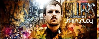
Heres my newest that i made for Matt as a gift:
Opinions? To bright or???
Opinions? To bright or???
Hikari, Fantastic.
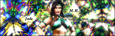
And Karate......that sig looks awsome.....It should not but it somehow does.
The colours clash and all that shizzle, but its cool to look at, I can see the text well and Jade seems to be enjoying her time.
I have not made a sig since the 19th of june :S.
And Karate......that sig looks awsome.....It should not but it somehow does.
The colours clash and all that shizzle, but its cool to look at, I can see the text well and Jade seems to be enjoying her time.
I have not made a sig since the 19th of june :S.
Hikari, very nice. I like your outcome better than the Tutorials outcome.
Sektor, sorry, I don't like it.
KARATE, it's good, but the BG is wayy to bright for me.
My sig :

No tuts. used. I used shit I already know for it. Opinions upon improvement?
Sektor, sorry, I don't like it.
KARATE, it's good, but the BG is wayy to bright for me.
My sig :
No tuts. used. I used shit I already know for it. Opinions upon improvement?

UlcaTron Wrote:
Hikari, very nice. I like your outcome better than the Tutorials outcome.
Sektor, sorry, I don't like it.
KARATE, it's good, but the BG is wayy to bright for me.
My sig :
No tuts. used. I used shit I already know for it. Opinions upon improvement?
Hikari, very nice. I like your outcome better than the Tutorials outcome.
Sektor, sorry, I don't like it.
KARATE, it's good, but the BG is wayy to bright for me.
My sig :
No tuts. used. I used shit I already know for it. Opinions upon improvement?
I like the text, thats pretty cool, other than that its a plain signature, and it definatly is not deserving of ALBA.
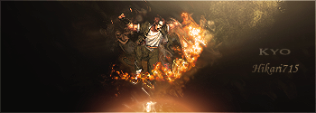
Its been a loong time, I think I still got it.
0
Ulcatron,Its just to plain and the text is not my favorite.
S3kt0r,I really dont like it to much. I seen you do wayyyy better.
Skinsley,Honestly when i first looked at it i didnt like it at all,But after looking at it a 2nd time theres something about it i do like but i cant figure it out. I think you could of done better on text. You said yourself its been awhile. Definitely nowhere near your best bro.
This one was a request.
This one i made for Toxik.
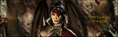
I love criticism.
S3kt0r,I really dont like it to much. I seen you do wayyyy better.
Skinsley,Honestly when i first looked at it i didnt like it at all,But after looking at it a 2nd time theres something about it i do like but i cant figure it out. I think you could of done better on text. You said yourself its been awhile. Definitely nowhere near your best bro.
This one was a request.
This one i made for Toxik.
I love criticism.
About Me
0
skinsley Wrote:
Its been a loong time, I think I still got it.
Its been a loong time, I think I still got it.
It's not bad, I like the shattering effect coming out from him, although I seen better from you before. Still, nice work.
Probably not my best =\


0
Seems like a little too much going on. I still love the depth you put into it though, it's something I've been working on for some time now.
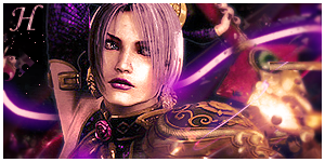
This is fantastic. The size choice complements the picture. Ivy's one of my favorite characters too.....that is Ivy right? heh

For this one, its hard to say for me. Cuz I haven't seen a DbZ sig I really really liked. I'm sure it's always render selection though...It's a nicely put together sig however.
0
Hikari,That sig is the best i have seen from you yet. I was always wondering if you would do a different idea rather than just the same. Dont get me wrong i love your sigs,But they always have that explosion look to them and this one is a way different approach and i love it! Nice job.
Pr0d1gY,I like it. Im not really a DBZ fan but it turned out very well. Nice job man.
Heres my newest one. It was a request.
What you think? To much effects?
Pr0d1gY,I like it. Im not really a DBZ fan but it turned out very well. Nice job man.
Heres my newest one. It was a request.
What you think? To much effects?
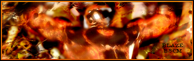
Blaze is way to bright. But it does look alright. You should make more sigs. It does help. Plus a lot of the BG is not my style. But if its yours then do whatever.
------------------------------------------------------------------
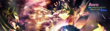
I was following a GIMP Tutorial and It eventually required stuff the old GIMP Doesn't have. After that I just fucked around on my own. I think it came out alright.
Thoughts opinions?

------------------------------------------------------------------
I was following a GIMP Tutorial and It eventually required stuff the old GIMP Doesn't have. After that I just fucked around on my own. I think it came out alright.
Thoughts opinions?
Well it looks kinda like a few of my sigs....do you use me for learning or something ?
If so i could send you psds to help you learn much better.
It aint great though ulca, you have lost your touch lately mate.
P.S. Prodigy004 (i prefer the name lol) you still wanna do that PSD trade, sory I completely forgot about it .
Next....Ive been a sack of shit at sigs lately, could someone pick me out a couple of my best (your own personal opinion), so I can go back to my old roots and learn back from myself ?
Photobucket located here.
http://s42.photobucket.com/albums/e316/skinsley/
Thanks.
About Me
0
Thanks Pred and KARATE! =)
Not bad prodigy, I like it. The render fits nicely in the BG.
Yup, in her SC4 attire. Kilik, Sophitia and Taki are better imo. :P
skinsley, I checked in your PB account and the latest aren't bad although I don't really like the Astoroth one.
EDIT:

I actually found 4 others I really liked, but since you asked for 2, here are the ones I thought that were really nicely done.
Not bad prodigy, I like it. The render fits nicely in the BG.
ThePredator151 Wrote:
This is fantastic. The size choice complements the picture. Ivy's one of my favorite characters too.....that is Ivy right? heh
This is fantastic. The size choice complements the picture. Ivy's one of my favorite characters too.....that is Ivy right? heh
Yup, in her SC4 attire. Kilik, Sophitia and Taki are better imo. :P
skinsley, I checked in your PB account and the latest aren't bad although I don't really like the Astoroth one.
EDIT:
I actually found 4 others I really liked, but since you asked for 2, here are the ones I thought that were really nicely done.


© 1998-2026 Shadow Knight Media, LLC. All rights reserved. Mortal Kombat, the dragon logo and all character names are trademarks and copyright of Warner Bros. Entertainment Inc.