


About Me

0
Ulca- that Ryu sig is the best sprite sig I seen from you.
Devil Jin, that Naruto sig is one of your best- but as Ulca said, it is plain on the right side. I also noticed his face is kind of blurry. Still I like it.
MINION, that Guilty Gear one is my definite favorite out of the sprite sigs. Thanks for the sprial renders btw!
Devil Jin, that Naruto sig is one of your best- but as Ulca said, it is plain on the right side. I also noticed his face is kind of blurry. Still I like it.
MINION, that Guilty Gear one is my definite favorite out of the sprite sigs. Thanks for the sprial renders btw!
About Me

0
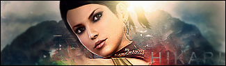
Hikari715 Wrote:
Ulca- that Ryu sig is the best sprite sig I seen from you.
Devil Jin, that Naruto sig is one of your best- but as Ulca said, it is plain on the right side. I also noticed his face is kind of blurry. Still I like it.
MINION, that Guilty Gear one is my definite favorite out of the sprite sigs. Thanks for the sprial renders btw!
Aww, No probs.


0
ECLASSIC Wrote:
My First One........(With Help From A HomeBoy)

you know, I've never got how to make a border. Can you help me with that?My First One........(With Help From A HomeBoy)


0
Heres my newest:
I think i need a new idea.....
Edit: I found my new idea!!
Opinions?
I think i need a new idea.....
Edit: I found my new idea!!
Opinions?


0
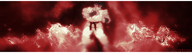
UlcaTron Wrote:
Nice Karate
Nice Karate
i like those effects on it a lot. on the link it says "Tutryu" you used a tutorial to make that? if so can you give me the link to the tut? i checked out your photobucket page and i saw that some of your other work had the same kind of effects on it and i was always tring to figure out how you were making such cool effects.
EDIT: how do i install GIMP 2.2? i ask because when i look at some tutorials i have to have GIMP 2.2 i have GIMP 2 is there a big difference between the two, and is it downloadable at the same site as GIMP 2?


0
UlcaTron Wrote:
Dope. I like how once you figure out what's in there, it's like "Ahhhh!, Sub Zero from the card game!! I get it now.."
lol


0
Urls for the tuts, por favor?
About Me
0
... @ MINION.
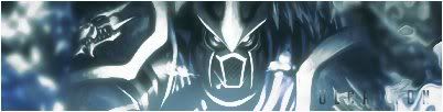
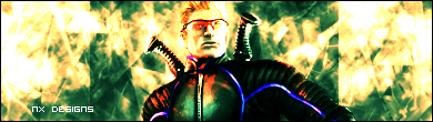
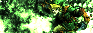
1- The pinkish BG is ok- but the orange/red colors over Shujinko is awful and makes the render look odd with the sig.
2- Your worst one imo. The random color blotches over Stryker kills it and there is a rectangle thing behind the render :S
3- The best out of the three- Link seems to surprisingly blend well but tI really don't like the white blob on the left towards Link. It's really plain on the left of it too.
There are tuts for GIMP but from what I seen- only a few are good.
redman Wrote:
Comments/Opinions?
Comments/Opinions?
1- The pinkish BG is ok- but the orange/red colors over Shujinko is awful and makes the render look odd with the sig.
2- Your worst one imo. The random color blotches over Stryker kills it and there is a rectangle thing behind the render :S
3- The best out of the three- Link seems to surprisingly blend well but tI really don't like the white blob on the left towards Link. It's really plain on the left of it too.
There are tuts for GIMP but from what I seen- only a few are good.


About Me
0
About Me
0
Made this a couple of weeks ago but here it is.
C+C.
C+C.


© 1998-2026 Shadow Knight Media, LLC. All rights reserved. Mortal Kombat, the dragon logo and all character names are trademarks and copyright of Warner Bros. Entertainment Inc.