


0
UlcaTron Wrote:
alright ulca you making a comeback from your other work that you say is "ugly" theres no way your not proud of yourself on this one


0
I like almost everything on this latest page. Wow.
Minion and Xtactics great new sigs.
And then again to Minion, those pieces are spectacular man! I like the second one better than the first.
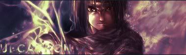
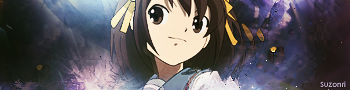
Hikari OmG that's a beautiful picture....is it a new style or technique you're trying?
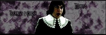
Then Ulca-d00dle, I really like that sig too.
Everything gets two thumbs up this go round. You guys are just lucky I didn't quote it all like I was going to...lol....would've been a humongous post from me. Lol
Minion and Xtactics great new sigs.
And then again to Minion, those pieces are spectacular man! I like the second one better than the first.
Hikari OmG that's a beautiful picture....is it a new style or technique you're trying?
Then Ulca-d00dle, I really like that sig too.
Everything gets two thumbs up this go round. You guys are just lucky I didn't quote it all like I was going to...lol....would've been a humongous post from me. Lol

About Me

0


About Me

0
ThePredator151 Wrote:
Hikari OmG that's a beautiful picture....is it a new style or technique you're trying?
Hikari OmG that's a beautiful picture....is it a new style or technique you're trying?
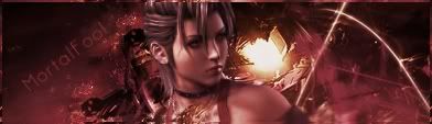
Thanks, it's from a tut. I have been using the healing brush for the effects around Zafina (One of the new Tekken characters) and a bit of smudging as well.
Nice stuff MK07 and Ulca.

0
my 1st sprite sig that i actually worked on. unlike that evilryu sprite sig that i was real tired doing
KOF KIM SPRITE:

oh btw i used one of minions spiral render....things lol
opinions?
KOF KIM SPRITE:
oh btw i used one of minions spiral render....things lol
opinions?
0
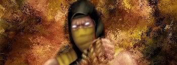
MortalKombat2007 Wrote:
fucking love the lighting in all ur sigs.. and ur avatar is HOT HOT HOT
MINION... we know u skills in high places... WE KNOW...
0
NEW KAZUYA: [http://img406.imageshack.us/img406/640/kazuyasigqz3.jpg
idk how to upload the images correctly with imageshack. if i use the HTML code it'll fuck up and the pic will be small as hell. but if i use the normal URL links (like how im gonna use now) it jus shows the code and you'll have to copy and paste (and who likes doing that?)
idk how to upload the images correctly with imageshack. if i use the HTML code it'll fuck up and the pic will be small as hell. but if i use the normal URL links (like how im gonna use now) it jus shows the code and you'll have to copy and paste (and who likes doing that?)
Haha.
That one is wayyyy old sk00l. I used a shit tutorial on it.
Here's an new one, (My best, even though i didn't use any tuts on it, which i'm proudof my self)
I really can't beleive i made this, mainly because i just experimented. Comments, opinions?
That one is wayyyy old sk00l. I used a shit tutorial on it.
Here's an new one, (My best, even though i didn't use any tuts on it, which i'm proudof my self)
I really can't beleive i made this, mainly because i just experimented. Comments, opinions?
0
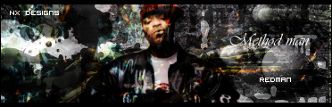
redman Wrote:
Haha.
That one is wayyyy old sk00l. I used a shit tutorial on it.
Here's an new one, (My best, even though i didn't use any tuts on it, which i'm proudof my self)
I really can't beleive i made this, mainly because i just experimented. Comments, opinions?
Haha.
That one is wayyyy old sk00l. I used a shit tutorial on it.
Here's an new one, (My best, even though i didn't use any tuts on it, which i'm proudof my self)
I really can't beleive i made this, mainly because i just experimented. Comments, opinions?
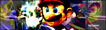
lol i almost had a seizure just lookin at it. idk what kind of theme its supposed have it just looks like random colors swarming around mario
About Me
0

Just duplicated the stock twice and erased parts (one on lighten, the other on multiply). Then I added layer adjustments and a few gradients in between. There were also some soft brushing set on linear dodge/soft light.

Hikari715 Wrote:
Just duplicated the stock twice and erased parts (one on lighten, the other on multiply). Then I added layer adjustments and a few gradients in between. There were also some soft brushing set on linear dodge/soft light.
Just duplicated the stock twice and erased parts (one on lighten, the other on multiply). Then I added layer adjustments and a few gradients in between. There were also some soft brushing set on linear dodge/soft light.
It's so simple the sig is great. It looks awesome. Good job. 5/5.
PS. Ive seen you use the same text for your name in your past sigs. Do you like that text?
About Me

0
Hikari715 Wrote:
Just duplicated the stock twice and erased parts (one on lighten, the other on multiply). Then I added layer adjustments and a few gradients in between. There were also some soft brushing set on linear dodge/soft light.
Just duplicated the stock twice and erased parts (one on lighten, the other on multiply). Then I added layer adjustments and a few gradients in between. There were also some soft brushing set on linear dodge/soft light.
Good job hun!

0
MINION Wrote:
New One:

I took the picture of the clown myself, from my T-Shirt.
New One:
I took the picture of the clown myself, from my T-Shirt.
You could make some good money off that picture right there....I am so sure of it. haha
Hit the South side around here and them Latino boys would eat that right up. That would be all over they lo-los' and everything. lol No joke though man..that's a dope picture...let alone being a sig.

0
I need to start making more sigs, I used to do like one a week bow it's like one a month -_-
lol and I know I still owe people some gifts >_>

About Me

0
Nothing special.......


© 1998-2026 Shadow Knight Media, LLC. All rights reserved. Mortal Kombat, the dragon logo and all character names are trademarks and copyright of Warner Bros. Entertainment Inc.