


About Me

0
 edit
edit 
0
flameshang Wrote:
Edit: best sig yet.

Edit: best sig yet.
very nice
just your text needs work
and also its better if text is in one place so it doesn't remove focus

About Me
0
gotcha, any tips on how to make the text better? i am not sure how to blend it very well.
0
flameshang Wrote:
gotcha, any tips on how to make the text better? i am not sure how to blend it very well.
gotcha, any tips on how to make the text better? i am not sure how to blend it very well.
First try just using one font, and a font that works with the sig, eeven if its just a simple font you can make it work
Try setting it to different modes such as overlay, soft light, lighten, using multiple layers and blurring or adding effects to some, using gradients that go with the color of your sig works good too
Another way I do sometimes is to use a clipping mask for the text, this is quite simple and works really well sometimes, you can also add more effects from there
Also try using some of the blending options under fx, Ive been trying to use this lately and it comes quite handy and produces a nice effect, you can add drop shadows, inner glows, inner shadows, outer glows, bevels, gradients, outlines, just play around with the different settings, try to get the text to stand out but still fit in with the color scheme of the sig
Use tutorials, Photoshop text tutorials, as I'm guessing that's what you use, I'm no expert on text at all, I'm learning myself, sometimes it really pisses me off.
If you want some expert help ask MINION, Murcie or some other experienced sigmaker for help, they will probably give you some great tips.
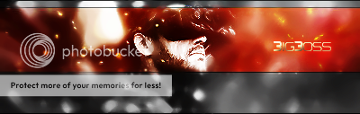
On another note, who is liking that new metal gear solid game
Yesterday when I saw that pic I just had to make a sig
Glad to see some gameplay today
Here is Big Boss

About Me

Get that ass BANNED
0
Not the greatest. It was going somewhere and then I gave up and threw shit on it. Some bright light shit mind you.

Its 6 in the morning. Gimme a break
AWWWW YEAH, Rep dat big boss.
Its 6 in the morning. Gimme a break
AWWWW YEAH, Rep dat big boss.
About Me
0
i really need help with text. any links to good tutorials. i found some but they dont really seem to help in the way i need help
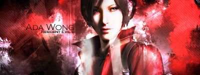
anyways heres a Nova sig

anyways heres a Nova sig


About Me
0
Quick one I whipped up tonight.
About Me
0
TheCypher Wrote:
Quick one I whipped up tonight.
Quick one I whipped up tonight.
Very good. i like
here's to my favorite,

0
flameshang Wrote:
Very good. i like
here's to my favorite,
TheCypher Wrote:
Quick one I whipped up tonight.
Quick one I whipped up tonight.
Very good. i like
here's to my favorite,
nice background and effects
but kabal is really hard to see, I don't know if that's what you were going for or not though
having some of the light shine on to him would have probably made it look better im thinking
About Me
0
well it def wasnt what i was going for at first... but thats how it turned out. im okay with it
About Me
0
On a different note, your getting better with the type. But I would generally advise to not use decorative fonts if they are gonna be at a tiny size. Readability key and at that size the little extra flair that font has is a little distracting.
Having most of Kabal's face and such in shadow gives a good mysterious tone to the sig. If that's what you were going for, great, good job. If not, don't sweat it. I can't tell you how many sigs I've started with one idea in mind only to have it turn out completely different in the end. Usually for the better.
Having most of Kabal's face and such in shadow gives a good mysterious tone to the sig. If that's what you were going for, great, good job. If not, don't sweat it. I can't tell you how many sigs I've started with one idea in mind only to have it turn out completely different in the end. Usually for the better.
About Me
Get that ass BANNED
0
TheCypher Wrote:
I can't tell you how many sigs I've started with one idea in mind only to have it turn out completely different in the end.
I can't tell you how many sigs I've started with one idea in mind only to have it turn out completely different in the end.
I feel ya.
About Me
0
TheCypher Wrote:
On a different note, your getting better with the type. But I would generally advise to not use decorative fonts if they are gonna be at a tiny size. Readability key and at that size the little extra flair that font has is a little distracting.
On a different note, your getting better with the type. But I would generally advise to not use decorative fonts if they are gonna be at a tiny size. Readability key and at that size the little extra flair that font has is a little distracting.
yeah on that one i just used a random default font and literally did nothing to it.
edit akuma sig


0
First one in a while.
About Me
0
AwesomeTaco Wrote:
First one in a while.
First one in a while.
excellent !
0
flameshang Wrote:
excellent !
AwesomeTaco Wrote:
First one in a while.
First one in a while.
excellent !
very nice
also Im "trying" photoshop cs6 now, I need to reinstall it though because I was suppose to install cs6 extended
Im gonna be "trying" that for a long time though
Right now im using an early version of cs5
About Me

0
I'm amazed at all the great work here. You people "some of whom I know and don't" are doing a helluva good job. As far as TEXT was concerned. Try either,
http://www.pixel2life.com/
or http://www.good-tutorials.com/
Both which can assist you in probably any field. Great work guys.
http://www.pixel2life.com/
or http://www.good-tutorials.com/
Both which can assist you in probably any field. Great work guys.

About Me

MK Online Featured User 31/3/2010 12/4/2011
-----------------------Gifts-----------------------
Shinnok-fan64 - s3Kt0r
0


0
Haven't made a sig in a very long time...still, I love this thread!


© 1998-2026 Shadow Knight Media, LLC. All rights reserved. Mortal Kombat, the dragon logo and all character names are trademarks and copyright of Warner Bros. Entertainment Inc.