
Scorpion Render Touch up *NEW VERSIONS (with alt)*
Scorpion Render Touch up *NEW VERSIONS (with alt)*
0
posted05/23/2008 10:08 PM (UTC)by
Thanks for the input and compliments everyone!
Minion: Nice edit!!
Mick-Lucifer: I miss the pants too! The thy skulls were silly, but overall that's probably my favorite Scorpion design to date.

Okay... here's another version. I switched up the mask a bit and re-shaped his head to make it more the way it was.
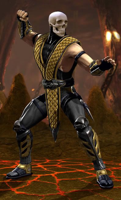
Here's a possible alt. I tried it with the flames, didn't look cool to me.


0
Wow...I don't know how you did it, but that actually looks pretty damn good. It looks better than the way they did the render. I also think that Predator was right about the tabi color. The black looks better.

About Me

0
yea me too i really wish MK had people like u working on the design for characters.
0
It looks awesome, except I actually think the shoulder pads looked better on him.
0
Nice work, but I prefer the original one. Scorpion looks way more evil in the original render, and thats the look he needs.

0
looks okay.
i also prefer the original.
is this a crab in his face? *lol* ;)
the head looks a little squished.
good job with the harpoon.
regards,
mkde
i also prefer the original.
is this a crab in his face? *lol* ;)
the head looks a little squished.
good job with the harpoon.
regards,
mkde


0
Yea there we go.
Here's a little crit:
1. I think the head looked better before. It's one of those things that takes to see it changed until it's realized the preference.
2. That belt needed what you did to it. I mean, it could still have the skull there, but it's much less offensive, and much more appreciated the way you have it.
3. I LOVE it without the shoulder pads. Love it. Much Much better. So much better..lol
4. The harpoon needed what you did to it too. That's the threat of Scorpion afterall.
5. The uum, knee pads, particularly his right leg could be toned down a little so it doesn't protrude so much...but it doesn't look bad like it is. Just a note.
5. HAHA! Those yellow toes are gone! Looks waay better this way.
And so in conclusion, the head thing is the "worst" part. The knee pads are the variable, and Everything else is lovely the way you have it.
Great job Aculeus. Ahaha, great entertainment! You have my approval.
Yes, Yes....this seems to be the case. Seeing the adjustments solidifies the claim.
Here's a little crit:
1. I think the head looked better before. It's one of those things that takes to see it changed until it's realized the preference.
2. That belt needed what you did to it. I mean, it could still have the skull there, but it's much less offensive, and much more appreciated the way you have it.
3. I LOVE it without the shoulder pads. Love it. Much Much better. So much better..lol
4. The harpoon needed what you did to it too. That's the threat of Scorpion afterall.
5. The uum, knee pads, particularly his right leg could be toned down a little so it doesn't protrude so much...but it doesn't look bad like it is. Just a note.
5. HAHA! Those yellow toes are gone! Looks waay better this way.
And so in conclusion, the head thing is the "worst" part. The knee pads are the variable, and Everything else is lovely the way you have it.
Great job Aculeus. Ahaha, great entertainment! You have my approval.
Bezou Wrote:
Basically, I think we MK fans prefer simplicity in our designs. And the MK team doesn't.
Basically, I think we MK fans prefer simplicity in our designs. And the MK team doesn't.
Yes, Yes....this seems to be the case. Seeing the adjustments solidifies the claim.

About Me
To get something you've never had you must do something you've never done.
0
and now.........*drum roll*............THE COMPARISON!
About Me
To get something you've never had you must do something you've never done.
0
ya know, i gotta be honest. i like the original better. if anything, Scorpion just needs to trade in that WCW belt for a standard-sized cloth one.

0
I would have left the mask and head alone, buty I like the rest of your changes a good deal. Nice work.
0
I just don't like the mask...Other than that, tight!
About Me
What do you like? Hit the Toasty thumbs up on articles and forum posts for a quick response!
0
I miss pants...

... but not those ridiculous skulls.
Good job on the edit! Definitely made some improvements!
... but not those ridiculous skulls.
Good job on the edit! Definitely made some improvements!
I'm a HUGE fan of your beautiful work Acuelus, you know that, and even though I think you have an amazing talent and did an excellent job by just re-doing the pic and making it look like a real render, I like the original a lot better.
The main problem I have with your new one is the biggest change: The head.
WHY? I absolutely adore the new one, I feel it was time to see something a bit more different, and somehow, the new “head/mask/etc” does look different, very good.
Its almost like its skinnier/longer, which rocks.
I have no problems with the original spear or golden toes. Your spar does look very cool though.
But the thing I must admit I like from yours a LOT more, is the belt. I really don’t think that huge WWF kind of belt was needed for Scorpion, its just too big! But aside from the belt, everything else is fine (though I would had rather something more original for him and Sub-Zero).
Still, despite me liking the original better, yours rocks!! Very good editing and talent (and yes, your belt is 100x’s better).
Nah, I prefer the new render type of pants.
The main problem I have with your new one is the biggest change: The head.
WHY? I absolutely adore the new one, I feel it was time to see something a bit more different, and somehow, the new “head/mask/etc” does look different, very good.
Its almost like its skinnier/longer, which rocks.
I have no problems with the original spear or golden toes. Your spar does look very cool though.
But the thing I must admit I like from yours a LOT more, is the belt. I really don’t think that huge WWF kind of belt was needed for Scorpion, its just too big! But aside from the belt, everything else is fine (though I would had rather something more original for him and Sub-Zero).
Still, despite me liking the original better, yours rocks!! Very good editing and talent (and yes, your belt is 100x’s better).
Mick-Lucifer Wrote:
I miss pants...
... but not those ridiculous skulls.
Good job on the edit! Definitely made some improvements!
I miss pants...
... but not those ridiculous skulls.
Good job on the edit! Definitely made some improvements!
Nah, I prefer the new render type of pants.
0
I like the canon render more, but this is cool dude


Mick-Lucifer Wrote:
I miss pants...
... but not those ridiculous skulls.
Good job on the edit! Definitely made some improvements!
I miss pants...
... but not those ridiculous skulls.
Good job on the edit! Definitely made some improvements!
I have to agree with you Mick-Lucifer. The skulls are annoying, and SCORPION NEEDS PANTS - he's too goddamn tough to wear tights.
But overall: TOTALLY AWESOME EDIT!

About Me
What do you like? Hit the Toasty thumbs up on articles and forum posts for a quick response!
0
queve Wrote:
Nah, I prefer the new render type of pants.
Nah, I prefer the new render type of pants.
Be honest. You're going to do roundhouse kicks and pause to get a look at his butt, aren't you?
Oh snap! If you made it more grey it would be Smoke!
Oh snap! If you made it red it would be Ermac!
Oh snap! If you made it purple it would be Rain!
Oh snap! If you made it a mustardy browny yellow it would be Tremor!
Oh snap! If you made it white it would be an all new bad ass chinese ninja warriooooooorrrrrrr!!!
IT HAS BEGUN!

0
MINION Wrote:
Nice bro, I did a lil touch up, of my own.

Nice bro, I did a lil touch up, of my own.

Bezou Wrote:

NOOOOOOB!!! :P
NOOOOOOB!!! :P
Well hell, I love both of those more than the original render. Primary and Alt costumes right there. As shallow as it may seem of me. *shrugs*
About Me

0
Love it!
Good job man!!1
Good job man!!1


© 1998-2025 Shadow Knight Media, LLC. All rights reserved. Mortal Kombat, the dragon logo and all character names are trademarks and copyright of Warner Bros. Entertainment Inc.