


0
I was just thingking about his thread....
Anyway,
Avy 10/10....just absolutly one of the nicest avatars I've seen...Keep it.
Sig....4/10 I really just don't like it...The one that matches you Avy was WAY better...

Anyway,
Avy 10/10....just absolutly one of the nicest avatars I've seen...Keep it.
Sig....4/10 I really just don't like it...The one that matches you Avy was WAY better...
0
Avy: 9.5/10 - Done perfectly, just don't like the text =/
Sig: 15/10 - Yup... best sig I have seen in a long time. I really like it.
Sig: 15/10 - Yup... best sig I have seen in a long time. I really like it.
0
Avy: 8/10 - its pretty good just plain and simple
Sig: 9/10 - that's really good. the background blends in with the pic
Sig: 9/10 - that's really good. the background blends in with the pic

About Me

MK Online Featured User 31/3/2010 12/4/2011
-----------------------Gifts-----------------------
Shinnok-fan64 - s3Kt0r
0
6/10 for both

About Me

0
7.0 for both

About Me
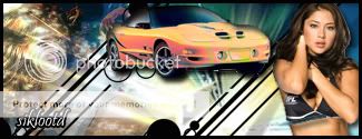
My tastes have changed since I created this account over 4 years ago. I prefer being called Siklootd and now love heavy metal music. 
Long live heavy metal music!
0
7/10 for both
could someone rate this also? I love the pontiac trans am so much that I had to make a sig for it!!! And once my car is paid off, I'll own one of these!

I blended the actual render into the background as much as I could without ruining the true beauty of the vehicle, and the text is always hard for me, but I think it's okay.
could someone rate this also? I love the pontiac trans am so much that I had to make a sig for it!!! And once my car is paid off, I'll own one of these!
I blended the actual render into the background as much as I could without ruining the true beauty of the vehicle, and the text is always hard for me, but I think it's okay.

Car sig, a 5 im not feeling it....take this advice, Text that big and obviouse just does not look good in almost all signatures.
And the render does not look blended......1 tip get the lassoo tool and set it to 15 pixels then draw round the car, then select inverse, then delete, then deselect.....that could help it blend.
Your current is a 7.5 I like what you did, its realy cool but its just not my tang.
And the render does not look blended......1 tip get the lassoo tool and set it to 15 pixels then draw round the car, then select inverse, then delete, then deselect.....that could help it blend.
Your current is a 7.5 I like what you did, its realy cool but its just not my tang.

About Me

0
Avatar: 6/10
Signature: 8/10
Signature: 8/10

0
This thing is still here? That's intense.

About Me

how bout a cup of shut the hell up.
0
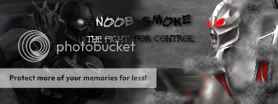
Avatar 1/10 : Very plain
Sig 0/10: Im sure you can guess why
Sig 0/10: Im sure you can guess why
0
avy: 5
sig:6
sig:6


0
avy: 1/10 Idk, I mean, I what it is.... just don't like it.
Sig: 2/10 ditto, I'm not huge on DBZ, but I do like the cartoon....I just don't like what that sig is doing. sry bro
Click the request link in my sig and get somethin' way better done.....
(not trying to be harsh, just my op--)

Sig: 2/10 ditto, I'm not huge on DBZ, but I do like the cartoon....I just don't like what that sig is doing. sry bro
Click the request link in my sig and get somethin' way better done.....
(not trying to be harsh, just my op--)
0
I have seen better from both you and Vorpax, though they are still done brilliantly.
The avy is nice, 10/10. No flaws there.
The sig is good, the background is really nice, but the sprite/render/whatever doesn't look good for some reason. I think it is too white, especially the legs. 9/10.
I personally preferred the one Skinsley made, though this is great too.
The avy is nice, 10/10. No flaws there.
The sig is good, the background is really nice, but the sprite/render/whatever doesn't look good for some reason. I think it is too white, especially the legs. 9/10.
I personally preferred the one Skinsley made, though this is great too.
About Me
how bout a cup of shut the hell up.
0
10 for both. Very nice Matt
0
8/10 for both
About Me
My tastes have changed since I created this account over 4 years ago. I prefer being called Siklootd and now love heavy metal music.
Long live heavy metal music!
0
Avy: 8/10 I love it man
Sig: 6/10 It's pretty good but I don't know if you purposely made all that white visible on the Scorpion side of the sig, I think you need to move the background around and cover that up a little bit because Scorpion even drips into the white space a little. If you wanted it that way that's cool, but you should still consider fixing that a little.
Sig: 6/10 It's pretty good but I don't know if you purposely made all that white visible on the Scorpion side of the sig, I think you need to move the background around and cover that up a little bit because Scorpion even drips into the white space a little. If you wanted it that way that's cool, but you should still consider fixing that a little.


About Me

0
Sig: 8
Avy: 7
Avy: 7
0
Ermacsmainman Wrote:
10 for both. Very nice Matt
10 for both. Very nice Matt
Thanks =)
SubMan gets 8's for both. It is a good sig with a good sprite, but the background is not so good with the sprite. Like the colours dont match up well. Still, its a good sig.


© 1998-2025 Shadow Knight Media, LLC. All rights reserved. Mortal Kombat, the dragon logo and all character names are trademarks and copyright of Warner Bros. Entertainment Inc.