
Artist Vincent Proce Posts Artwork from MK vs. DC, Plus A Scrapped MK Re-Imaging Project

0
Excellent designs,as i said before,those are the looks i want for the characters,simple outfits like in MK1,not that overloaded crap we've seen in the last games.

About Me

0
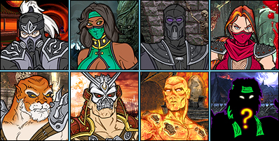
Raiden, Scorpion, Kano and Sonya look freakin amazing.
They all have a more serious looks and darker feel to them.
I really wish they would have used thoes.
They all have a more serious looks and darker feel to them.
I really wish they would have used thoes.
About Me
0
This is EXACTLY what I wanted for the mk series. A complete re-imagining. I hope mk9 is heading this direction, despite the fact this awesome artist isn't on the team anymore.
Very kick-ass.
Very kick-ass.
About Me
0
Aww man, I've always wanted an MK1 remake. These designs look pretty awesome too. Although, since I've always had my own costume design ideas, there's all these little things that I can't help but nitpick...
Like why is Sonya carrying a sword and medieval armor on one arm? Why is Kano going bare-foot and again there's a sword, held on with frayed rope like some sort of ancient peasant? Shouldn't they look more modern and urban than that? Shaolin Monks or his DA alt are definitely the best versions of Kano's MK1 outfit so far. I'm not sure the tattoos fit Sonya's character, either. Is having ink done common for someone who's that highly disciplined and career-minded? Seems to me like she wouldn't be the type to mark herself as an individual or have something to show off like that. (Also of note, the Kano image seems like it should be flipped, his eye and bandolier are on the wrong side. He made the same mistake with the eye in the MKvsDCU art too.)
I also just don't like the spiky, chitinous armor on Scorpion's arms and belt. It kind of makes sense because it's reminiscent of the plates on an insect or scorpion's body, but just like the excessive detail on the underside of his gloves/gauntlets in MKvsDCU, which I never liked, it's just a bunch of weird H.R. Giger-esque ridges that don't look like anything and don't seem to serve a purpose. I think maybe it's supposed to be some sort of coil and track that he launches his spear from? But that's stupid, the spear should be a ninja kunai and it should come out of his palm supernaturally like it always has. Any other version of the spear, I'm not interested in.
The "splattered with yellow demon blood" explanation for his colors is pretty cool though. And there's one little touch that is almost brilliant...he's wearing a ring on his left hand. Like a wedding ring. Only problem is, it's on the wrong finger, lol.
I definitely love that Raiden, too. I'm totally gonna borrow some of the ideas there for my own artwork. (Probably not the hat covering his whole head, that may be ripping off Big Trouble in Little China one step too much...)
I wonder if this project had gone through, just how much in these designs would've made it to the final drafts and what the CG models would look like. Painting doesn't seem like it lends itself well to the "concept" phase of character design. It certainly captures atmosphere well (though it also makes the characters look medieval rather than modern), but you'd think sketches with clear linework would be easier to work from.


0
His Scorpion is just wonderful. The paint splattered on him gleans something reminiscent of the Joker in the last Batman movie. So maybe I wouldn't splash him with yellow paint, but rather, burn the yellow vest. Similar look, but could definitely distinguish MK's poster-boy from anything else out here. heh..
The ring on his finger is a wonderful touch as well. That's right, let that story element show through in the design! Overall I just love how dead and dirty he looks. The way his clothing looks torn up and worn out, it strikes just the right tone for Scorpion. Makes him fearful, which is right on point. We're supposed to be impressed by his appearance. There's supposed to be an element of fear and pain about him even though his design remains simplistic..
Only thing I definitely don't like is the mechanisms like Razor mentioned. Change that element about him to something more supernatural and we should be golden. I'd try to go abstract, instead of the normal souls and such....Maybe death & maggot-infested, or like death + lava or some sort of singed aspect, instead of the mechanics of it. The spear should appear to seethe from the flesh through his palm, and if there has to be a mechanical attribute about him, it should probably seem as though after he died, it fused, or became apart of his natural structure or something. Which is why I like the way his forearms seem to be attached to his biceps by...something unnatural.
I like the way the spear looks in this image, but again, I agree with RazorsEdge701 on this one. Should be some sort of cool ninja Kunai. The way he throws the spear could have been mechanism-reliant before he died, but afterward, it's supposed to come out of his hand. The first movie kinda sealed this in place I think, because it upped the ante on what was possible for the spear itself, and how it could be thrown. The next real progression came from Scorpion in MKSM. So, although I don't necessarily think the spear should be a living aspect of Scorpions character, the way it looks should be so impressive.
This design is on par with the cleaner ninja Scorpion done by Aculeus a while back. I would be happy to see something like these two designs be the primary and alternate costumes for Scorpion in MK9.
98/100
--
I don't really like the Raiden. More clear, I like how God-like he looks (the use of accent colors and alot of flowing garments), but it's too much embellishment on the part of the details and patterns. In this respect, I'd encourage them to take more cues from the first game and more cues from the first movie, and simplify his design. I liked MKvsDC's design alot, only really taking issue with the sleeveless Raiden at the time...but that eventually worked out well, and I ended up liking how they simplified him that way anyway. Really good choices in that game for Raiden, and I appreciate them listening to us Raiden fans on MKvsDC's design. Turned out great despite the anxiety.
I like that he used a ronin gasa in this image (I've always liked those), but I can identify with why it might be a bad choice to go with that. BUT, if they found a good way to mix the traditional jingasa that Raiden usually wears, with the ronin, I would definitely take it. Which is what it looks like he tried to do with this image. I'd say use this sort of hat design, but design a different costume, and match up the look so that it works out better.
As stated, I like the flowing garments and all, but I think Raiden should probably be a bit more conservative here. He looks like Fujin dressed in Raidens clothes. He should look like someone who might be capable of commanding thunder and lightning...
I get the concept here, but I think this appeal is Fujin's instead. Raiden should be a stronger//more potent design, while still maintaining the god aura that this image has, and reflecting the leadership that Raiden is used to. I might summarize it as a strong design, but a passive color pallet. MKvsDC does this. MKDA primary does this. MK1, 2, and 4 does this. They're stable designs, with passive, almost relaxed color pallets. Blue, white, a touch of gold or metal here or there...ect.
Raiden also has passive elements of fear and mystery about him too. This is mostly in presence, but the main attributes that should be there, depend on how they play his eyes and the hat in the design, and whether or not he has the lightning circulating around him when we see him. Says, he doesn't really embellish in the power he has...it's just to some extent apparent. This is another reason I liked the MKvsDC design, because they managed an element of this in how old they made him look. Striking the right tone with how old he looks is something I'd want to stick around for another game or so before they change that about him again.
Mainly though, just go outside during a thunder storm and take in what that feels like, and try to put that into his design. You'll notice that there is nothin uncertain about it...it can kill you....but, it requires that you behave in a specific way in order to be struck by lightning. No matter who you are, where you're at, or what you're doing. Raidens design should reflect that force, plus an appeal of finesse about Carlos presented Raidens mastery of the martial arts during MK1-T.
-- Dark Raiden then, should probably look like whatever it might feel like to understand that the force of a thunder-storm is purposely trying to hurt you. Still finesse in the martial arts aspect of the character, but mostly strong design cues reflective of how damning it might be to get smited by a God who possess such a power. Raiden is not Zeus, he's more like Zeus + Kratos after Kratos' long training in the art of killing people....first.
Y'know, he'd make a game out of it, knowing full well that the scale is tipped unfairly his way. With big bosses, he'd use his knowledge of the system he knows is in place for the universe, to violate that system in ways he knows is safe for him , and not defined by his leadership (dark raiden would probably want to build a case for himself in the process of his ruthless behavior, afterall), and ingeniously bait, trap, or capture anyone who is not as old and wise as he.(he would think of everything.)
Think about it.... and remember his dark sense of humor. He's been watching mortals from all over the universe violate every which way they can for billions of years, presumably. Dark Raiden is a way to exploit the darker thought-processes that Light Raiden would probably dismiss. All of these sorts of qualities should dictate what his dark design looks like.
It's harder to be good than it is to be bad so, given this understanding, what would he look like that would personify//justify the choices Raiden makes to behave in a more ruthless way? He'd probably look sharper design-wise....but not a whole lot different. He'd probably wear things that insinuate what he is capable of more openly....and he'd probably be more willing to show his power more obviously, as a threat more often.
That's the sort of thing I want from a Dark Raiden design if they go this route.
40/100
--
I just don't like his Sonya. I still like Kerri, and the MK3 & MKSM designs better than any of the rest. I also like the MK4/G design but yea. If they do ever use the MK1 color pallet again. I'd encourage them to take some heavy cues from MK3, MK4/G, and MKSM more than anything else. Also, MKvsDC didn't do terrible, but they pretty much bothed Sonya in that game.
20/100
--
I like his Kano design alot, but I'm not a fan of this character much at all and think that he should probably not come back. That said, by only real quam with this design is that he should be more modern. He should have shoes on...he should reflect what it takes to oppose a military force like the USSF. In that respect, I guess he kind of does, considering Bin Laden vs the US (lol!). Yes he's supposed to be dirty and unruly, but Kano organizes himself to some extent.
I don't have much on him besides to say modernize him a bit. Don't "clean him up", but give him modern ex-military or rogue military personnel clothing.
Also, give me more Steam-Punk from his eye thing. More skin and robotic attribute meet eachother from him. It should look pretty freaky even if it is the plate and the lazer on the eyeball. Meaning they could travel a little bit away from the Terminator look, but only if it means we're going into a more futuristic steam-punk sort of thing. It's supposed to be advanced technology after all.
70/100
--
Altogether though, I like the direction of his style and hope the MK team has some justification for letting such talent go. If his design involvement is any indication for what may be in store...I'm game.
About Me
0
On the subject of MK1 Raiden costumes, I always thought the movie hit on a brilliant stroke by having his white robes and straw hat be a beggar disguise. It's kinda like the act Yoda pulls in Empire Strikes Back when Luke first meets him, except they didn't go as far with it as they could've.
I guess in a reboot, you'd be going all the way back to his MK1 bio and ending though, where Raiden isn't a mentor or "Protector of Earthrealm", he's a neutral asshole looking to slaughter everybody and prove gods are superior to mortals, so disguising his true nature and teaching the other heroes to save the world wouldn't fit.
But that just goes to show my biggest problem with these designs: A complete start-over is a bad idea. I absolutely want an MK1 remake, but I want it to be an update, NOT a reboot. It'd be a mistake to erase all the character details and evolution we've had over the past what, 17 years? In MK1, the characters were all just cliches and homages to other things. But now they stand out on their own as original creations with 3-dimensional personalities. Don't throw all that away and go back to the bare bones tropes.
If you retell MK1, do it according to the current canon with all the retcons that have been added, don't just start over. Use Christopher Lambert-based mentor Raiden and Australian Kano, have references to MK Mythologies and the fact that Liu trained with Bo' Rai Cho. Say that Scorpion was rezzed by Quan Chi/Shinnok, not by some random demon.
Going back and remaking older games should mean an opportunity to capitalize on all the richness that was added later. Do what Shaolin Monks was supposed to do if they hadn't botched it.

About Me
Save a life; Kill a necromorph
0
they did it with Star Trek and Batman. So why not

0
oh man, the picture of Scorpion, Sonya, Kano, and Raiden look so cool! I wonder what Sub-Zero, Liu Kang, Johnny Cage, Shang Tsung, and Goro looks like!
About Me
For the most in-depth, in-detail, Mortal Kombat lore analysis vids, there's only one source:
0
Update (Mar-21-2010): Vincent also updated his blog to say the following:Hello folks, I promised that I would try and complete the other five characters from the original Mortal Kombat when I found some time and yesterday I did. Here is Sub Zero how I envision him. I haven’t worked out much of his back story other than that he was a part of the Way of the Frost Dragon, an honorable secret society of warriors that were direct enemies with the ninja organization Scorpion was a part of before he was killed by Shang Tsung (disguised as Sub Zero).
Over time I will try and draw the rest of them.
Sub Zero was always my favorite character to play with.

Over time I will try and draw the rest of them.
Sub Zero was always my favorite character to play with.

What the hell has invaded Sonya's arm? Why does Scorpion have a wedding ring when Japanese do not use them to my knowledge? Why is Sub-Zero a vagrant rug and matress distributor?
Just nitpicking. Good art, decent designs, Sub-Zero story sucks though.
Just nitpicking. Good art, decent designs, Sub-Zero story sucks though.
]{0MBAT Wrote:
Update (Mar-21-2010): Vincent also updated his blog to say the following:Hello folks, I promised that I would try and complete the other five characters from the original Mortal Kombat when I found some time and yesterday I did. Here is Sub Zero how I envision him. I haven’t worked out much of his back story other than that he was a part of the Way of the Frost Dragon, an honorable secret society of warriors that were direct enemies with the ninja organization Scorpion was a part of before he was killed by Shang Tsung (disguised as Sub Zero).
Over time I will try and draw the rest of them.
Sub Zero was always my favorite character to play with.
Hmmmmm, I hope to see a bigger picture in high resolution like all the other ones we saw.
But I can already say I'm not a big fan of this design or story for Sub-Zero. I don't really like the look that much, seems a bit simple boring. BUT the art is amazing, of course.
I can't wait to see Johnny Cage and the others.
While I certainly love his style, I really dislike some of his new additions and recreations for the characters, mainly:
1) Sonya with no pants??? WTF?!?!?! And that big thing on her hand?
About Me
0
Definitely not a fan of the story. What is it with this guy and genericizing things? How is "Way of the Frost Dragon" better than "Lin Kuei"? Why have Shang Tsung be the one who killed Scorpion? Why, in both ninjas' stories, actively cut out Quan Chi's place?
As far as the art...there are elements of the design I like and elements I don't, about 50/50. Same as all the others he's done.
Also can't help but notice he said "other five characters". Which means we'll be getting Goro and Shang, but not Reptile. I'm not sure if I should be disappointed or relieved, considering my feelings so far.


© 1998-2026 Shadow Knight Media, LLC. All rights reserved. Mortal Kombat, the dragon logo and all character names are trademarks and copyright of Warner Bros. Entertainment Inc.