
About Me

0


0
SubMan799 Wrote:
actually, I just got Gimp yesterday.
ThePredator151 Wrote:
I must have forgotten you make sigs d00d. Nice job anyway.
SubMan799 Wrote:
I must have forgotten you make sigs d00d. Nice job anyway.
actually, I just got Gimp yesterday.
Oh, well then that explains it. You're off to a much better start than others in that case.

About Me

0

^ Made this avatar a while from a tut. These are the avatars some people use in MSN, LiveJournal, forums, etc. This involved various textures- vector, grunge, etc. These textures can be found in LiveJournal and DA.
0

Non-Animated:
Mmmm....Yeees......Learning indeed.
About Me
0
In need of constructive critisicm. Honestly, I don't know what I'm doing wrong or right. I'm justdoing this based off what Ithink is a good sig, but beauty is in the eye of the beholder, so yeah. Also, long post comming:

Yoshi

Batman

Jacksonville Jaguars

Wolverine

Sonic

Mario

Scorpion

Zelgius

Cloud

Sasuke Uchia

Naruto Uzumaki

Fox McCloud
Yoshi
Batman
Jacksonville Jaguars
Wolverine
Sonic
Mario
Scorpion
Zelgius
Cloud
Sasuke Uchia
Naruto Uzumaki
Fox McCloud
About Me
0
Three things:
- When making a sig, never cover the render/focal's face. Also, always leave the render's blending mode at Normal and don't change the opacity either.
- If you are adding text, make it viewable. (The Yoshi one is viewable could have been a lighter shade of green; The Cloud one is not completely viewable :\ *Perhaps white color instead?*)
- Blending is lacking in some (Take a look at the right side of the knight sig- see what I mean?) Simple blending tip- erase edges of the render with a soft round brush set on 50% opacity. Or maybe a lasso tool?
Some of the renders' edges look choppy. What happened there?
You can go to GIMP Talk for some simple sig tuts. You do have potential in making sigs even if you are in the beginner stage.

0
Don't remember the last time I made a sig, almost forgot how to set up the html thing for it ¬¬
It says Suz on there cause my other name is Suzonri.
About Me
0
Hikari715 Wrote:
Three things:
- When making a sig, never cover the render/focal's face. Also, always leave the render's blending mode at Normal and don't change the opacity either.
- If you are adding text, make it viewable. (The Yoshi one is viewable could have been a lighter shade of green; The Cloud one is not completely viewable :\ *Perhaps white color instead?*)
- Blending is lacking in some (Take a look at the right side of the knight sig- see what I mean?) Simple blending tip- erase edges of the render with a soft round brush set on 50% opacity. Or maybe a lasso tool?
Some of the renders' edges look choppy. What happened there?
You can go to GIMP Talk for some simple sig tuts. You do have potential in making sigs even if you are in the beginner stage.
Thanks for the advice. I didn't want to text to take much attention, so I put in in a shade that could blend in the background. The images are choppy because I had to erase the white box around the images because I still don't know how to get it off -_-
And thanks again
About Me
0
Hmm... for the render's case, never copy and paste them into GIMP and erase the white background. That trick will not make the render look good in the end.
You have to save the render into your computer and then open it up, resize, you know the drill. Makes it easier.
PS- did you get some of the renders from Planet Renders? If so, just register as a member in the Renders section, login, go search for whatever render you want, click on the thumbnail and then on the 'preview' pic. You will get the full size render in a new window and just save it.
About Me
0
Hikari715 Wrote:
Hmm... for the render's case, never copy and paste them into GIMP and erase the white background. That trick will not make the render look good in the end.
You have to save the render into your computer and then open it up, resize, you know the drill. Makes it easier.
PS- did you get some of the renders from Planet Renders? If so, just register as a member in the Renders section, login, go search for whatever render you want, click on the thumbnail and then on the 'preview' pic. You will get the full size render in a new window and just save it.
I just tried what you said in the second paragraph, and the white box is still around it. Dd I mess up, or is it supposed to be there?
Oh, and I'll try planet renders
EDIT: I got it. The white box is gone! Huzah!
About Me
0
Looks like the picture you copied was not rendered out. Yeah, go check out PR.
About Me
0
Okay, here's what I made using the advice you gave me:

New Sigs:


New Sigs:
0
SubMan799 Wrote:
The latest look alot better already.

About Me
0
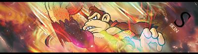
Skins, the sig looks good- DK seems to flow nicely and it's quite colorful too. The dots I don't like so much :\ Nice entry although too bad SOTW's theme is on Sega. Maybe next week? =P
Latest look good Subman, the Subzero one is the best imo.
Latest look good Subman, the Subzero one is the best imo.


About Me
0
Hey Pred, what program do you use?
0
SubMan799 Wrote:
Hey Pred, what program do you use?
Hey Pred, what program do you use?
I got a cluster
1. PhotoImpact10
2. PhotoShop Cs2
3. Ulead GIF Animator
Use these three almost everyday for something or another.
Another thing I noticed. Your avatar is too big(100x100). Biggest that will fit in that square is 75x75.
============
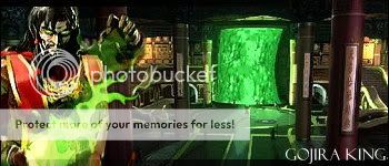
New Sig inspired by Xtactics
About Me
0
ThePredator151 Wrote:
I got a cluster
1. PhotoImpact10
2. PhotoShop Cs2
3. Ulead GIF Animator
Use these three almost everyday for something or another.
Another thing I noticed. Your avatar is too big(100x100). Biggest that will fit in that square is 75x75.
============
SubMan799 Wrote:
Hey Pred, what program do you use?
Hey Pred, what program do you use?
I got a cluster
1. PhotoImpact10
2. PhotoShop Cs2
3. Ulead GIF Animator
Use these three almost everyday for something or another.
Another thing I noticed. Your avatar is too big(100x100). Biggest that will fit in that square is 75x75.
============
I knew it was either 75x75 or 100x100. Thx Pred, I'll go resize it

skinsley Wrote:
I sort of fucked up on SOTW, and made a nintendo...lol I looked at Ulcatrons sig and my mind wanderd into Nintendo instead of Sega.
I sort of fucked up on SOTW, and made a nintendo...lol I looked at Ulcatrons sig and my mind wanderd into Nintendo instead of Sega.
My bad.. lol.
I decided to wait for next week's SOTW. I don't fucking want to really make more sigs.

About Me

MK Online Featured User 31/3/2010 12/4/2011
-----------------------Gifts-----------------------
Shinnok-fan64 - s3Kt0r
0


About Me
0


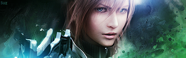
I tried a different style on this last one.
EDIT:


© 1998-2026 Shadow Knight Media, LLC. All rights reserved. Mortal Kombat, the dragon logo and all character names are trademarks and copyright of Warner Bros. Entertainment Inc.