


About Me

0
I need to make sigs more lolz............


About Me

0
I made a background, but did it without thinking of a character to put on it. My brother suggested this guy from Bleach. I don't like the show ,but he does, and I needed a render, so here it is:

Zach & SubMan.
You both are creating reptitive signatures. While I understand you are both beginners, it seems as though you're not putting more than 10 minutes into each signature you make. The point of practicing is to take time to develop your familiarity with photoshop so that you are able to create better, more unique sigs.
Right now I can see a pattern of dots in all your sigs + and that ocean ripple/ripple distortion.
Stop, relax, take some time (and I'm talking a good hour or two) to make your next sigs, and *then* post.
Anywhoo... back to signatures.
I just made this one... the colors + sig overall were bad, so I masked the entire thing with a b&w gradient... hah.


I've gotten really lazy after that little sig splurge (and I've noticed some people haven't seen their sigs! *cough* skinsley *cough* )
)
Or maybe they were just bad.... either way. lol
You both are creating reptitive signatures. While I understand you are both beginners, it seems as though you're not putting more than 10 minutes into each signature you make. The point of practicing is to take time to develop your familiarity with photoshop so that you are able to create better, more unique sigs.
Right now I can see a pattern of dots in all your sigs + and that ocean ripple/ripple distortion.
Stop, relax, take some time (and I'm talking a good hour or two) to make your next sigs, and *then* post.
Anywhoo... back to signatures.
I just made this one... the colors + sig overall were bad, so I masked the entire thing with a b&w gradient... hah.
I've gotten really lazy after that little sig splurge (and I've noticed some people haven't seen their sigs! *cough* skinsley *cough*
Or maybe they were just bad.... either way. lol
About Me
0
lol,xtactics, I was just thinking the same thing. No joke. I realized my sigs were repetitive, so I decided to experiment with GIMP.


0
xtactics Wrote:
Yep, I like it alot better in black & white.

About Me
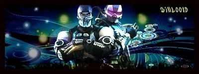
My tastes have changed since I created this account over 4 years ago. I prefer being called Siklootd and now love heavy metal music. 

Long live heavy metal music!
0
SubMan799 Wrote:
lol,xtactics, I was just thinking the same thing. No joke. I realized my sigs were repetitive, so I decided to experiment with GIMP.
lol,xtactics, I was just thinking the same thing. No joke. I realized my sigs were repetitive, so I decided to experiment with GIMP.
Those are very good bro, I especially like the way you did the Charizard one. Those are definetely stand out sigs that are really good.
About Me
0

0
xtactics Wrote:
Zach & SubMan.
You both are creating reptitive signatures. While I understand you are both beginners, it seems as though you're not putting more than 10 minutes into each signature you make. The point of practicing is to take time to develop your familiarity with photoshop so that you are able to create better, more unique sigs.
Right now I can see a pattern of dots in all your sigs + and that ocean ripple/ripple distortion.
Stop, relax, take some time (and I'm talking a good hour or two) to make your next sigs, and *then* post.
Anywhoo... back to signatures.
I just made this one... the colors + sig overall were bad, so I masked the entire thing with a b&w gradient... hah.
I've gotten really lazy after that little sig splurge (and I've noticed some people haven't seen their sigs! *cough* skinsley *cough*)
Or maybe they were just bad.... either way. lol
Zach & SubMan.
You both are creating reptitive signatures. While I understand you are both beginners, it seems as though you're not putting more than 10 minutes into each signature you make. The point of practicing is to take time to develop your familiarity with photoshop so that you are able to create better, more unique sigs.
Right now I can see a pattern of dots in all your sigs + and that ocean ripple/ripple distortion.
Stop, relax, take some time (and I'm talking a good hour or two) to make your next sigs, and *then* post.
Anywhoo... back to signatures.
I just made this one... the colors + sig overall were bad, so I masked the entire thing with a b&w gradient... hah.
I've gotten really lazy after that little sig splurge (and I've noticed some people haven't seen their sigs! *cough* skinsley *cough*
Or maybe they were just bad.... either way. lol
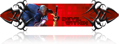
Ooh I like Casino Royale. Nice one!


About Me

0
the Black and White does look better. Casino royale is my favorite Bond film in my book, closely followed by Goldeneye.
Better than Die Another Day imho. The only thing I liked in that film was the Vanquish car and the car chase later on.
*Ahem*


The second and third one were just radial gradients set on hard light.
Roxas Avatar:


Better than Die Another Day imho. The only thing I liked in that film was the Vanquish car and the car chase later on.
*Ahem*
The second and third one were just radial gradients set on hard light.
Roxas Avatar:


==========================================================
Just really a "warm-up" sig from staying dormant for like... ever. (Thanks a bunches Hik-hik, nice sigs too! And yes CR is the best Bond in my opinion too lol)
What you all think? I see some newcomers with some sigs, looking good guys. @ Bushin, that's a really REALLY good sig for someone who's never opened up a PhotoManip'n program. Even for a tut! I really like that shit, keep it up. It's a unique style. I'll come back and opinionate everyone else later :P
(And where's MINION?


0
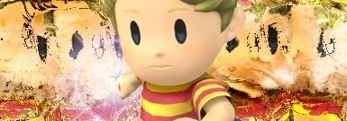
New sig i made. No tuts this time.

Praise/criticism wanted.
I think it's sweet but i think it needs a border, even a 1px black border would do. I dunno i just think sigs without borders look odd (unless it's a part transparent sig)
Praise/criticism wanted.
xtactics Wrote:
What you all think?
What you all think?
I think it's sweet but i think it needs a border, even a 1px black border would do. I dunno i just think sigs without borders look odd (unless it's a part transparent sig)
About Me
0
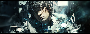
My latest sigs.....they suck lolz.....

0
Not bad SF, but for the first one you should have distorted it a bit more because we can see the renders you used lol.
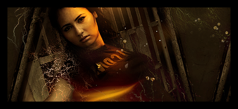
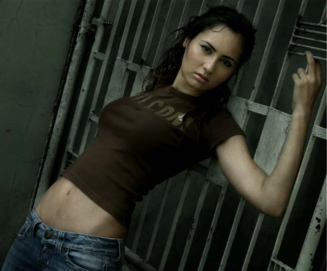
Stock Used
Stock Used
About Me
My tastes have changed since I created this account over 4 years ago. I prefer being called Siklootd and now love heavy metal music.
Long live heavy metal music!
0
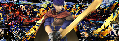
Here's a new one I just did:
It's only the second sig I've ever made that uses a frame around the actual sig.
It's only the second sig I've ever made that uses a frame around the actual sig.

About Me

MK Online Featured User 31/3/2010 12/4/2011
-----------------------Gifts-----------------------
Shinnok-fan64 - s3Kt0r
0
Bushin Wrote:


Just got done with these.
EDIT: Retouched, which ones look better?


Just got done with these.
EDIT: Retouched, which ones look better?
Fucking sweet, u should entre one of them into SOTW.
___________________________________________________________
Here my sig


© 1998-2026 Shadow Knight Media, LLC. All rights reserved. Mortal Kombat, the dragon logo and all character names are trademarks and copyright of Warner Bros. Entertainment Inc.