

Hikari715 Wrote:
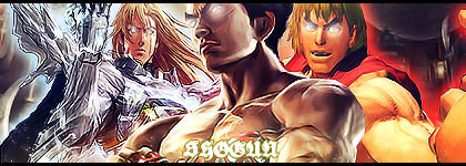
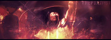
I really like the concept. The clipped text is barely viewable.
The rectangle clipping masks have potential but doesn't seem to work too well. Maybe try making the effect appear subtle for having a more easy-for-the-eye look. (Just shift the clipped image in any directions).
The render is pretty choppy (There's a render someone in the cut out thread cut by MINION).
Scrap the white stock "scribbles" on the upper right corner. It's pretty distracting. Try darkening some areas and blurring some areas for depth. Try adding some glowing lights using a soft brush on the building signs set on lighten/screen/linear dodge and try playing with the opacity. Colors are alright.
I saw that the render still has white in it. It looks really weird. I like the sig though lol. Can't read the text
The sig im wearing. CATS FTW


0
DevilJin Wrote:
I don't know when I'm gonna post my "real" stuff but here is all of the gifts I made for people.


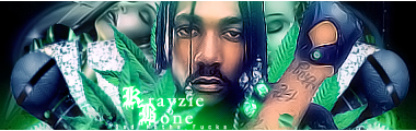
Comment if you want...
I don't know when I'm gonna post my "real" stuff but here is all of the gifts I made for people.
Comment if you want...
I like these. I'mma Bone Thugz Fan too, so I really like what you did with that Krayzie Bone sig. Rarely Happens.
UlcaTron Wrote:

Thank you Ulcapants, they look great too.
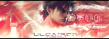
Can I get one in some kind of b/w/red theme?...So I can wear it with this avatar?
So that when I switch again in lil' a while, I'll can use yours.


0
@Pred:
Yeah I know, I've never seen anyone post a Bone thugs sig either.
@Hikari:
That's for the comment. Those are just sigs people requested so sometimes they don't end up as good as I'd like them to. When I'm just free styling I'm a lot better.
@Ulcatron:
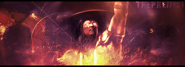
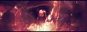
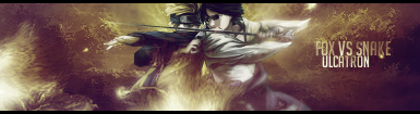
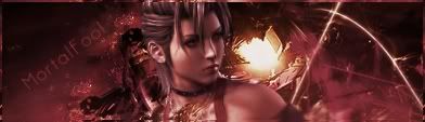
Man, that Nina sig has so much potential it's not even funny. if you messed around with the render, color, and text some more it'd be perfect.
Yeah I know, I've never seen anyone post a Bone thugs sig either.
@Hikari:
That's for the comment. Those are just sigs people requested so sometimes they don't end up as good as I'd like them to. When I'm just free styling I'm a lot better.
@Ulcatron:
Man, that Nina sig has so much potential it's not even funny. if you messed around with the render, color, and text some more it'd be perfect.


About Me

0
Well I'm still a low-novice on Photoshop. But I have decided to make a signature out of The Joker's MK vs. DCU render, like it hasn't been used enough already. =P
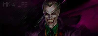
Is it any good?

Is it any good?
About Me
0
redman Wrote:
It needs to be lightend up a bit. Then its pretty good.
It needs to be lightend up a bit. Then its pretty good.
Hahaha. Well I went with the darker style to suit The Joker. I didn't feel his personality would suit a bright and colorful signature at all.
Thanks for the comment though.
0
I think he meant lighten up the joker since he's as dark as the BG. Did you lower the opacity of the render? If so, putting it back on 100% will work a lot.


0
I really liked that one Raiden sig someone above quoted.

I haven't made any in about a month, but I like the way it came out. =o (for a friend)
I haven't made any in about a month, but I like the way it came out. =o (for a friend)


© 1998-2026 Shadow Knight Media, LLC. All rights reserved. Mortal Kombat, the dragon logo and all character names are trademarks and copyright of Warner Bros. Entertainment Inc.