

About Me

0
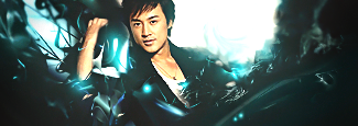
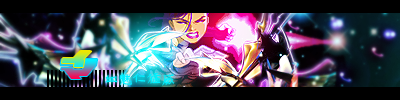
My latest sig:
And some avatars:


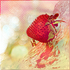


And some avatars:


About Me
0
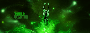
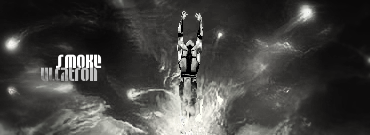
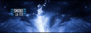
I like the Smoke one, the effects look good around him.
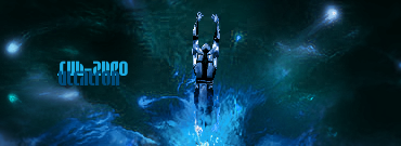
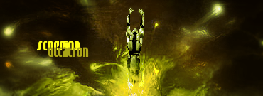
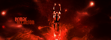
I don't like how the ninja's name in some of the tags is overlapped by the Ulcatron text though. The Ermac sprite actually works well with the colors. Not too bad overall.
I don't like how the ninja's name in some of the tags is overlapped by the Ulcatron text though. The Ermac sprite actually works well with the colors. Not too bad overall.
0


Some of these are old, some new. I think Im pretty much done with making sigs. I don't really like making them anymore. I guess I got bored of em.
About Me

0
TheCleansing Wrote:
Some of these are old, some new. I think Im pretty much done with making sigs. I don't really like making them anymore. I guess I got bored of em.!Quote
The 3rd one is total sex ; )
Some of these are old, some new. I think Im pretty much done with making sigs. I don't really like making them anymore. I guess I got bored of em.!Quote
The 3rd one is total sex ; )

About Me

MK Online Featured User 31/3/2010 12/4/2011
-----------------------Gifts-----------------------
Shinnok-fan64 - s3Kt0r
0
TheCleansing Wrote:
I love this one

0
TheCleansing Wrote:
Some of these are old, some new. I think Im pretty much done with making sigs. I don't really like making them anymore. I guess I got bored of em.
Some of these are old, some new. I think Im pretty much done with making sigs. I don't really like making them anymore. I guess I got bored of em.
I like a lot of them, Good stuff.
You're really good at making sigs, it's sad to see that your done with them. I hope you change your mind one day and continue,
About Me
0
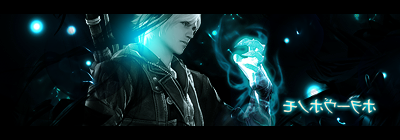
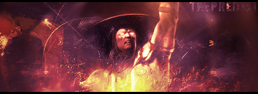
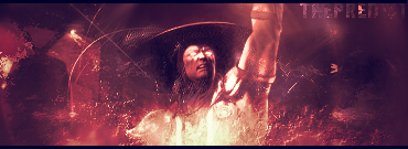
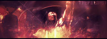
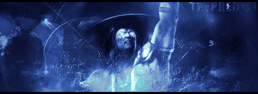
The third, fourth, fifth and seventh sigs are the best out of the bunch. I really like the concept in the third and fifth sigs alot. Lighting as usual is great. I really like the advertising feel on the Devil May Cry one (A personal favorite). The simplicity on the last tag is great as well.
0
Thanks for the comments guys =).
DJ, Im sure I'll get back into sigs again. Just right now I have no interest in them whatsoever. But I do have an "LP" on the way so you can expect that. I started it a couple days ago, so I mind as well finish it.
DJ, Im sure I'll get back into sigs again. Just right now I have no interest in them whatsoever. But I do have an "LP" on the way so you can expect that. I started it a couple days ago, so I mind as well finish it.
0
TheCleansing Wrote:
Thanks for the comments guys =).
DJ, Im sure I'll get back into sigs again. Just right now I have no interest in them whatsoever. But I do have an "LP" on the way so you can expect that. I started it a couple days ago, so I mind as well finish it.
Thanks for the comments guys =).
DJ, Im sure I'll get back into sigs again. Just right now I have no interest in them whatsoever. But I do have an "LP" on the way so you can expect that. I started it a couple days ago, so I mind as well finish it.
Cool. I've been making a lot of sigs but I just haven't posted any yet. I don't even know when I'm going to either, but you can see them in the link in my sig if you want. I usually be messing around, working on pen tooling, and smudging techniques.
0
Ah, lovely thread. Good to see it's still alive.
Good times.
Good times.


0
That looks ill man. The way you colored it makes it look even more real than the original stock.
Lemme see if I can make an avatar to match it and I'll switch everything at once.
Lemme see if I can make an avatar to match it and I'll switch everything at once.

0
edit: Didn't see the top line sry.


About Me
0
DevilJin Wrote:
I don't know when I'm gonna post my "real" stuff but here is all of the gifts I made for people.
![]()
Comment if you want...
I don't know when I'm gonna post my "real" stuff but here is all of the gifts I made for people.
Comment if you want...
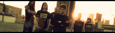
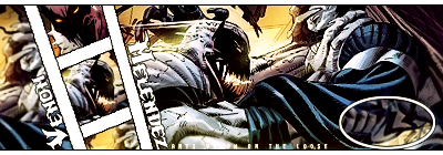
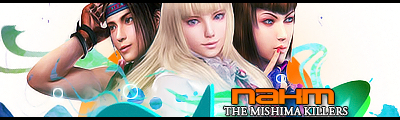
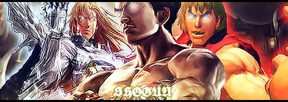
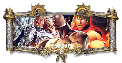
Pretty nice improvement here. =] These sigs are the best out of the bunch imo. The NAKM's concept is interesting and is my favorite out of the bunch. The fancy border on the other version of Shogun's sig is alright though it's a bit blurry/LQ on parts. Siegfried looks a kind of oversharpened.
The Venom one is so-so, the white lines and text are pixelated, but not bad. The white oval shape should be removed, it looks a bit random to me. =P
The concept on the last sig is nice, but looks a bit over-topazed/reduced noise.
Keep it up!
More avatars:


About Me
0
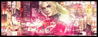
I really like the concept. The clipped text is barely viewable.
The rectangle clipping masks have potential but doesn't seem to work too well. Maybe try making the effect appear subtle for having a more easy-for-the-eye look. (Just shift the clipped image in any directions).
The render is pretty choppy (There's a render someone in the cut out thread cut by MINION).
Scrap the white stock "scribbles" on the upper right corner. It's pretty distracting. Try darkening some areas and blurring some areas for depth. Try adding some glowing lights using a soft brush on the building signs set on lighten/screen/linear dodge and try playing with the opacity. Colors are alright.


© 1998-2026 Shadow Knight Media, LLC. All rights reserved. Mortal Kombat, the dragon logo and all character names are trademarks and copyright of Warner Bros. Entertainment Inc.