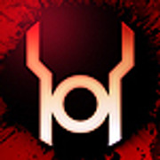
It started with a simple white circle, but in a matter of a day - it transformed into an all-new Dragon Logo!
The klassic symbol for Mortal Kombat has become the avatar for everything from Ed Boon's twitter (@noobde) to the official MK Facebook! As we count down to a June 2nd reveal -- it's a done deal! This is the new symbol: Kombat will kontinue!
Click to Enlarge: Comparison of Klassic & Updated Dragon Logos.
Fans have been pretty quick to embrace the new design, which differs only slightly from the classic serpentine silhouette. The new logo could be best described as tightened up. The eye is more narrow and focused forward. The nostril smaller and similarly oriented. The mouth is a fraction less, with a more steady, graphically appealing curve to its overall shape. The dragon clearly bears his fangs along with a flickering tongue.
A sharper, more vertical axis generally compliments what looks to be a far more aggressive symbol than the classically indifferent dragon of the original version. Who could complain about that? Not series co-creator Ed Boon! According to him, the NetherRealm team like their new logo, too!
RT @MKF30 @noobde Love the updated MK Logo and classic!! Will be my next tattoo!! EB: We love the new updated logo too.
— Ed Boon (@noobde) May 29, 2014What are the implications of the new logo? Well, that's certainly something to ponder. The last game introduced a busier, bevelled Dragon Logo - updated with three-dimensional detailing. This simplistic, black & white symbol takes us back to simpler times of the iconic original. Could this reflect the philosophy of the new game?...
At present, most theories for the Mortal Kombat (2011) sequel centre on a continuation of the rewritten timeline. That has us expecting a starting point based on version of a Mortal Kombat 4 plot. That story saw the fallen elder god Shinnok wage war on the Heavens from whence he fell. Does this more aggressive dragon represent the predicament or attitude of the Elder Gods in this new game? Don't forget -- it was they who empowered Raiden to claim victory at the end of the last game's story mode!
There is, of course, the massive success of the previous game to consider [read more]. At the height of its pop culture powers; Mortal Kombat made brilliant use of brand awareness by sometimes running only the iconic dragon trademark in its promotions. That seems to be the philosophy of the apparently leaked poster. Perhaps now was simply a good time to give the old bird a bit of a revamp.
What ever the case, we like it! We want to know if you like it, too! Register to share your thoughts and theories about the logo on the forums! We're asking the MKOmmunity the question of the moment: Who's Next? Vote in the User Poll and check out some of our thoughts about who might be next: Top 10 Armageddon Comebacks & Top 10 MK2011 Kontinues.