
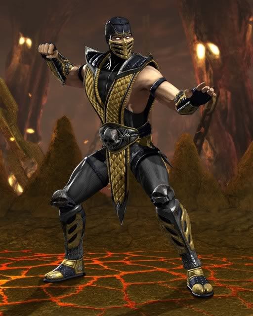
New Scorpion Wallpaper on Worlds Collide
New Scorpion Wallpaper on Worlds Collide
0
posted05/18/2008 11:02 AM (UTC)by
Member Since
09/20/2005 05:06 PM (UTC)
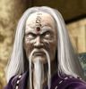
go to website -> download art or follow link below
http://www.worldscollide.com/images/Scorpion_Render.jpg
http://www.worldscollide.com/images/Scorpion_Render.jpg


About Me

0
hmm, I feel the need to yell dee duh dee!


About Me

0
Bezou Wrote:
Well, the render in this pic is slightly higher quality than the one released to sites.

Though it's still much less quality than almost any other fighting game.
Well, the render in this pic is slightly higher quality than the one released to sites.
Though it's still much less quality than almost any other fighting game.
All they did was mess with the hue and saturation, turned down the hue, to maybe -10%, to give it that washed out look on the face. Then turned up the brightness to say ooo, +15%, easy photoshop job.
The mask does look alot better though, I will say that.


0
Why is this "official image"...Cut out and pasted on this background?
I just noticed that there are "cutout mistakes" around Scorpion's edges. There all over him actually, damn. His shadow is also in the wrong place according to how light is hitting him.
?!?
They pulling a fast one on fans or what?
I just noticed that there are "cutout mistakes" around Scorpion's edges. There all over him actually, damn. His shadow is also in the wrong place according to how light is hitting him.
?!?
They pulling a fast one on fans or what?
About Me
What do you like? Hit the Toasty thumbs up on articles and forum posts for a quick response!
0
Vomit Wrote:
This is amazing! A New Wallpaper featuring a never before seen render of Scorpion! Why isn't this on the front page of MKO yet?
This is amazing! A New Wallpaper featuring a never before seen render of Scorpion! Why isn't this on the front page of MKO yet?
You're probably thinking of TotalMortalKombat.com.
Not too long ago they had exclusive screenshots of MKII!
MINION Wrote:
All they did was mess with the hue and saturation, turned down the hue, to maybe -10%, to give it that washed out look on the face. Then turned up the brightness to say ooo, +15%, easy photoshop job.
The mask does look alot better though, I will say that.
Bezou Wrote:
Well, the render in this pic is slightly higher quality than the one released to sites.
Though it's still much less quality than almost any other fighting game.
Well, the render in this pic is slightly higher quality than the one released to sites.
Though it's still much less quality than almost any other fighting game.
All they did was mess with the hue and saturation, turned down the hue, to maybe -10%, to give it that washed out look on the face. Then turned up the brightness to say ooo, +15%, easy photoshop job.
The mask does look alot better though, I will say that.
For someone who's decent at editing, you're not very observant dude. Take a closer look at the texturing.

Though, in your defense, I did say it was of "slightly higher quality". I have extremely developed eyes for these things.

About Me

0
Mick-Lucifer Wrote:
You're probably thinking of TotalMortalKombat.com.
Not too long ago they had exclusive screenshots of MKII!
Vomit Wrote:
This is amazing! A New Wallpaper featuring a never before seen render of Scorpion! Why isn't this on the front page of MKO yet?
This is amazing! A New Wallpaper featuring a never before seen render of Scorpion! Why isn't this on the front page of MKO yet?
You're probably thinking of TotalMortalKombat.com.
Not too long ago they had exclusive screenshots of MKII!
Hahaha.
About Me
0
Bezou Wrote:
Though, in your defense, I did say it was of "slightly higher quality". I have extremely developed eyes for these things.
Though, in your defense, I did say it was of "slightly higher quality". I have extremely developed eyes for these things.
I see it perfectly man, lol. The black part does look more HQ, if that's what you're looking for. But as far as face, and mask, not very much.
0
Why are you guys over-analyzing the render?
Just wait until we have some videos before you become too critical of minor details.
Just wait until we have some videos before you become too critical of minor details.


About Me
Mortal Kombat Nexus Online By Pakistani
0
wow nice wallpaper

About Me
Herro.
0
For someone who's decent at editing, you're not very observant dude. Take a closer look at the texturing.
Though, in your defense, I did say it was of "slightly higher quality". I have extremely developed eyes for these things.
Though, in your defense, I did say it was of "slightly higher quality". I have extremely developed eyes for these things.
Well, it looks like that they are slowly developing the graphics. Hopefully they continue untill it gets just as good as virtua fighter 5.
PapaRoachFan Wrote:
Well, it looks like that they are slowly developing the graphics.
Well, it looks like that they are slowly developing the graphics.
Not really. We simply got a far more compressed JPG initially. That's it. Just look at the file size.
PapaRoachFan Wrote:
Hopefully they continue untill it gets just as good as virtua fighter 5.
Hopefully they continue untill it gets just as good as virtua fighter 5.
I wish...
About Me

0

So how the fuck doesnt mk vs dc look as good as other fighters. I know mk hasnt been that good in recent times, but that doesnt have to make you biased.
0
kingjolly Wrote:
So how the fuck doesnt mk vs dc look as good as other fighters. I know mk hasnt been that good in recent times, but that doesnt have to make you biased.
So how the fuck doesnt mk vs dc look as good as other fighters. I know mk hasnt been that good in recent times, but that doesnt have to make you biased.
I think its because everyone is so obsessed with the "glowing light" effects (bloom, i think its called) and whatever game doesn't have it automatically has bad graphics. Some people are IGNORANT like that. All those bright flashy colors must make these kids nut themselves or something.
About Me
0
XTREEMIST Wrote:
I think its because everyone is so obsessed with the "glowing light" effects (bloom, i think its called) and whatever game doesn't have it automatically has bad graphics. Some people are IGNORANT like that. All those bright flashy colors must make these kids nut themselves or something.
kingjolly Wrote:
So how the fuck doesnt mk vs dc look as good as other fighters. I know mk hasnt been that good in recent times, but that doesnt have to make you biased.
So how the fuck doesnt mk vs dc look as good as other fighters. I know mk hasnt been that good in recent times, but that doesnt have to make you biased.
I think its because everyone is so obsessed with the "glowing light" effects (bloom, i think its called) and whatever game doesn't have it automatically has bad graphics. Some people are IGNORANT like that. All those bright flashy colors must make these kids nut themselves or something.
I see some glowing on sub-zero's arms in this pic

0
is it anything like the other games? absolutely NOT
0
kingjolly Wrote:
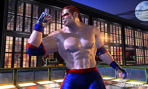
We all hope that's the comparison to make with this latest image(in-game MK to other in-game images). However, this Scorpion is a cutout.
Which means, much like my Raiden signature, that's not an in-game image.
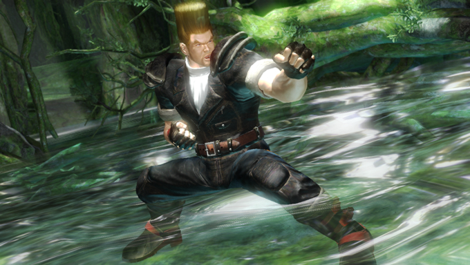
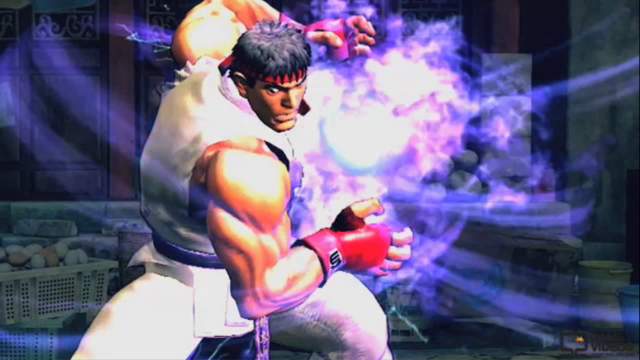
So the comparison would be more fair to this, or this, or this ooorr even this.
The comparison you made, needs to look like this to be "more accurate". If you see what I'm saying.
Also, the MKvsDC image you posted is edited (I suspect brightness & contrast mostly)by someone to look better. It's not what the trailer looks like. Also, the in-game screenshots are gonna look similar put on a pallet like I have them. VF5's graphics are astounding in real life. Tekken looks to be similar, while MKvsDC and SC4 look to be similar. However, from the looks of both MKvsDC and SC4; SC4's in-game stuff is far more detailed than the MkvsDC stuff.....so far. From partical effects, "nature" stuff, and the characters definition. Especially in hi-def.
Point here is, in the lower three of that "in-game" comparison image, things are better defined, at a lower definition than this MKvsDC, in high definition. Which is the shame//frustration.
This latest hi-res Scorpion render doesn't reflect realistic skin, or cloth, or metal textures anywhere near as well as the Tekken 6 Jin, Soul Calibur 4 Mitsurugi, or the one that's more than a year old; the Virtua Fighter 5 Akira Yuki. It's a disappointment considering they usually beat out the competition on at least "show" stuff // "fluff". They didn't do it this time...or haven't shown it to us yet. Couple that with an extremely goofy first entry to these current consoles, and there you have it.
Street Fighter 4 didn't go for photo-realism like the rest did, so it's not really a good comparison to make. Even though it's still really good graphics for a "cartoon".
0
MINION Wrote:
All they did was mess with the hue and saturation, turned down the hue, to maybe -10%, to give it that washed out look on the face. Then turned up the brightness to say ooo, +15%, easy photoshop job.
The mask does look alot better though, I will say that.
Bezou Wrote:
Well, the render in this pic is slightly higher quality than the one released to sites.
Though it's still much less quality than almost any other fighting game.
Well, the render in this pic is slightly higher quality than the one released to sites.
Though it's still much less quality than almost any other fighting game.
All they did was mess with the hue and saturation, turned down the hue, to maybe -10%, to give it that washed out look on the face. Then turned up the brightness to say ooo, +15%, easy photoshop job.
The mask does look alot better though, I will say that.
Yeah, still looks good though and doesn't look look less in quality then any other fighting game. If anything it looks better with the blood, damaged cues and details on his costume are insane....
I'd like to see the background as a wall paper
kingjolly Wrote:
I see some glowing on sub-zero's arms in this pic
XTREEMIST Wrote:
I think its because everyone is so obsessed with the "glowing light" effects (bloom, i think its called) and whatever game doesn't have it automatically has bad graphics. Some people are IGNORANT like that. All those bright flashy colors must make these kids nut themselves or something.
kingjolly Wrote:
So how the fuck doesnt mk vs dc look as good as other fighters. I know mk hasnt been that good in recent times, but that doesnt have to make you biased.
So how the fuck doesnt mk vs dc look as good as other fighters. I know mk hasnt been that good in recent times, but that doesnt have to make you biased.
I think its because everyone is so obsessed with the "glowing light" effects (bloom, i think its called) and whatever game doesn't have it automatically has bad graphics. Some people are IGNORANT like that. All those bright flashy colors must make these kids nut themselves or something.
I see some glowing on sub-zero's arms in this pic
Looks compitently next gen to me, plenty of brown and bloom


© 1998-2025 Shadow Knight Media, LLC. All rights reserved. Mortal Kombat, the dragon logo and all character names are trademarks and copyright of Warner Bros. Entertainment Inc.