

About Me

0
MINION Wrote:
There's a PLUGIN that lets you do cool wire type stuff, here:
http://www.philipp-spoeth.de/photoshop/sinedots2.php
Hikari715 Wrote:
^ Effects on the feet of the girl looks nice.
PS: Where did you get the line renders? Unless it's custom pen tool lines then never mind what I said.
^ Effects on the feet of the girl looks nice.
PS: Where did you get the line renders? Unless it's custom pen tool lines then never mind what I said.
There's a PLUGIN that lets you do cool wire type stuff, here:
http://www.philipp-spoeth.de/photoshop/sinedots2.php
Thanks, will download now. ^^
About Me

0
k....Here's my 2nd attempt on making a sig.
I'd like feedback on how i can make this better:

I'd like feedback on how i can make this better:
About Me
0
Both sigs look alright although the edges of the renders are quite choppy. The text in the Rocky sig is sort of pixelated when it is on the transparent area :S I like the Obama sig more- the use of the maple leaf brush looks neat.
As a gif file the quality is ok though it you want better quality in sigs try saving them in JPEG or PNG format.
As a gif file the quality is ok though it you want better quality in sigs try saving them in JPEG or PNG format.

About Me
My tastes have changed since I created this account over 4 years ago. I prefer being called Siklootd and now love heavy metal music. 
Long live heavy metal music!
0
I just got Photoshop CS3 Extended, and damn it's way different than GIMP. I'm trying to learn as much as I can with it and I'll start posting sigs up here for you guys to comment on:
Here's my first photoshop sig:
Here's my first photoshop sig:
About Me
0
Hikari715 Wrote:
Both sigs look alright although the edges of the renders are quite choppy. The text in the Rocky sig is sort of pixelated when it is on the transparent area :S I like the Obama sig more- the use of the maple leaf brush looks neat.
As a gif file the quality is ok though it you want better quality in sigs try saving them in JPEG or PNG format.
thanks Hikari. I'll look into that.
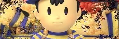
I just finished this one
I think I've found my new drug.
0
wow kingjolly... thats really good for ur 3rd time!
About Me
0
thanks!
Toturials are really useful.
Toturials are really useful.


0
That is quite good KJ. I'm really impressed.


About Me

0
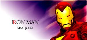
Here's my latest sigs....how dare you all get light years ahead of me!!!!


0
I like my Iron Man one better.... but its to big to use so i made this one
About Me
0
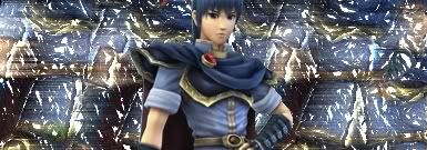
Killer fractual sigs MINION.
SF64- Sorry to say this but the Sheik one is the only one that seems ok. Sorry. You see you can still see parts of the renders and the main renders are still unblended, they just stand there.
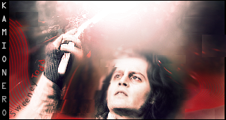
Well Kam, the use of the rectangles and lighting looks good, so does the effects on whatever Sweeney is holding. :P
SF64- Sorry to say this but the Sheik one is the only one that seems ok. Sorry.
Well Kam, the use of the rectangles and lighting looks good, so does the effects on whatever Sweeney is holding. :P
0
Shinfan, I love the 3rd and 5th sig dude. Sweet job.
Awesome as usual MINION and Kami.
New-
Awesome as usual MINION and Kami.
New-
0
prod I really really like how u did the text


0

Doesn't really follow Versatiles instructions but i mostly did this for me as i'm still learning, i didn't what i could do so i just used his idea >_>
Basic pattern making, and very basic line tool useage (apart from rendering).
Praise/criticism?
0
Yes it was intentional. Now that i look back on it the lines do look a bit too hard.
Here's how it looks without them

And this is the lines with lowered opacity so it looks softer and they are behind the renders.

Do these look better?
Here's how it looks without them
And this is the lines with lowered opacity so it looks softer and they are behind the renders.
Do these look better?
0
the one w the lines in the BG looks best... u should try also putin the line layr in Overlay... and line are alwways more fun when they are diagonal! lol
About Me
0
Well, here's my 4th sig.
I tried doing this one without looking at toturials. I'm not entirely sure how successful it is.
I tried doing this one without looking at toturials. I'm not entirely sure how successful it is.

About Me

0

About Me
0

0
prodigy004 Wrote:
Oooo
MortalKombat2007 Wrote:
Ahhhh

About Me

MK Online Featured User 31/3/2010 12/4/2011
-----------------------Gifts-----------------------
Shinnok-fan64 - s3Kt0r
0

This piece of crap didn't work the way I wanted it to.
Just wanted to show it to people that I been experiment new ways of making sigs rather doing same old 2d rectangle sigs
Update edit: for weird reason photoshop was fucked up shadow by puting background behind it. I will not be fixings this and it would be wasted of time fixing sig that is not working


© 1998-2026 Shadow Knight Media, LLC. All rights reserved. Mortal Kombat, the dragon logo and all character names are trademarks and copyright of Warner Bros. Entertainment Inc.