

About Me
Herro.
0
Made mine when i found out that everyone else was making funny allusions to mk vs dc.


0
Kamionero Wrote:
well.. here's how I used to do them
Fisrst, posterize the pic. to a level that looks like it would look good vectored.
Then, select by color, and transform selection into path, then select path and fill w the color. What this does is make the edges nice and smooth like a vector should. Do this for all the colors and u should get something like THIS!
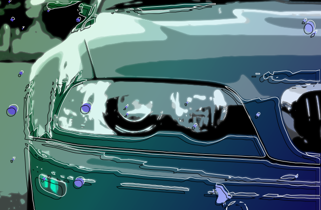
I also traced the paths and moved them arround for the lines and the blue spots for fun
DevilJin Wrote:
hey how do you make a vectored render in GIMP?
hey how do you make a vectored render in GIMP?
well.. here's how I used to do them
Fisrst, posterize the pic. to a level that looks like it would look good vectored.
Then, select by color, and transform selection into path, then select path and fill w the color. What this does is make the edges nice and smooth like a vector should. Do this for all the colors and u should get something like THIS!
I also traced the paths and moved them arround for the lines and the blue spots for fun
Thanks for the info. I'm gonna try this out


0
I guess you can say my sig is new even though I been using the same idea for years but I decided not to make it animated.


0
skinsley Wrote:
It is nice, I like it.
Not much to it by the looks of it, but nice all the same.
It is nice, I like it.
Not much to it by the looks of it, but nice all the same.
I know, but I haven't done this in awhile so what can you do?
thanks for the comment though


About Me

MK Online Featured User 31/3/2010 12/4/2011
-----------------------Gifts-----------------------
Shinnok-fan64 - s3Kt0r
0
DevilJin Wrote:

more confident about it, but still need practice (especially on those damn curving lines)
Opinions?
more confident about it, but still need practice (especially on those damn curving lines)
Opinions?
I agree with the lines, try transparent line and make edges shaper rather curved or try to find good abstract 3D render
DevilJin Wrote:
more confident about it, but still need practice (especially on those damn curving lines)
Opinions?
more confident about it, but still need practice (especially on those damn curving lines)
Opinions?
I love it, their are a few problems though, the double text thing, theres too much of other peoples ideas there, almost TUTORIAL based signature.
The background I love, the sprite and the lines around him are....I would expect over the top but NO they realy work.
I dont like the text, its a bit fuzzed and blurry, maybee it looked good before you saved it, and the border and text within it seems to not belong.
I know ive pointed out quite a few problems, but the sig is quite good, but it can be improved.
0
devilwithin Wrote:
I agree with the lines, try transparent line and make edges shaper rather curved or try to find good abstract 3D render
DevilJin Wrote:
more confident about it, but still need practice (especially on those damn curving lines)
Opinions?
more confident about it, but still need practice (especially on those damn curving lines)
Opinions?
I agree with the lines, try transparent line and make edges shaper rather curved or try to find good abstract 3D render
The only reason why I made the lines stick out and curve at the end is because I thought that if I had done that it would've made the sig look just a little boring, so in the end I curved them. Its the 1st time tried doing this to so I believe it was pretty good for a 1st try. You shoulda saw the lines at 1st, you'd think a 5 year old did it.
@Skins- I really never knew that a lot of other people did the text thing. I thought it was kinda original.
0

I was trying to get a "vintage" photo look on this by messing around with the colors and stuff.
I'd appreciate it if you guys could tell me if it looks good and if I got the vintage photo feeling, if you guys know what im talking about. Heres the original stock.
Stock
0
it looks great prod!!! also, a good thing to do to that sort of effect is add a flare on the corner and set to like soft light

100 percent better in so many ways.
Colour, lighting, everything.....where did you learn this ?
Colour, lighting, everything.....where did you learn this ?
prodigy004 Wrote:
I was trying to get a "vintage" photo look on this by messing around with the colors and stuff.
I'd appreciate it if you guys could tell me if it looks good and if I got the vintage photo feeling, if you guys know what im talking about. Heres the original stock.
Stock
I was trying to get a "vintage" photo look on this by messing around with the colors and stuff.
I'd appreciate it if you guys could tell me if it looks good and if I got the vintage photo feeling, if you guys know what im talking about. Heres the original stock.
Stock
0
Devil jin, thats a great sig, but the render is too clashy w the rest of the sig, u want to keep it clean cut, but sort of make the difference a tad more subtle, u should add a grandient map of 2 opposite colors and set it to a low opacity, it would soften the color difference, and add a more clean-cut feel
0
Kamionero Wrote:
Devil jin, thats a great sig, but the render is too clashy w the rest of the sig, u want to keep it clean cut, but sort of make the difference a tad more subtle, u should add a grandient map of 2 opposite colors and set it to a low opacity, it would soften the color difference, and add a more clean-cut feel
Devil jin, thats a great sig, but the render is too clashy w the rest of the sig, u want to keep it clean cut, but sort of make the difference a tad more subtle, u should add a grandient map of 2 opposite colors and set it to a low opacity, it would soften the color difference, and add a more clean-cut feel
Thank you for the info and your opinion. Hey by the way do you still use GIMP or do you use something else?


About Me
MK Online Featured User 31/3/2010 12/4/2011
-----------------------Gifts-----------------------
Shinnok-fan64 - s3Kt0r
0


About Me

0
Very nice effect on the stock, Prodigy and it looks much better than the original too ^^


0
Hikari715 Wrote:
Very nice effect on the stock, Prodigy and it looks much better than the original too ^^
Very nice effect on the stock, Prodigy and it looks much better than the original too ^^
That has to be the first sig ever that I don't like from you. He just doesn't seem...in there.
0
ThePredator151 Wrote:
That has to be the first sig ever that I don't like from you. He just doesn't seem...in there.
Hikari715 Wrote:
Very nice effect on the stock, Prodigy and it looks much better than the original too ^^
Very nice effect on the stock, Prodigy and it looks much better than the original too ^^
That has to be the first sig ever that I don't like from you. He just doesn't seem...in there.
yeah... at first i overlooked this sig, and then i noticed u made it.... i gotta say i was confused by it
0
Kamionero Wrote:
yeah... at first i overlooked this sig, and then i noticed u made it.... i gotta say i was confused by it
ThePredator151 Wrote:
That has to be the first sig ever that I don't like from you. He just doesn't seem...in there.
Hikari715 Wrote:
Very nice effect on the stock, Prodigy and it looks much better than the original too ^^
Very nice effect on the stock, Prodigy and it looks much better than the original too ^^
That has to be the first sig ever that I don't like from you. He just doesn't seem...in there.
yeah... at first i overlooked this sig, and then i noticed u made it.... i gotta say i was confused by it
Yeah... It looks kinda weird, and doesn't look like you "style"
Well some more new stuff:

About Me


0
I now have Photoshop back so hopefully, I can start posting again. Here is my newest one:


About Me
0
Well I was trying something new for the Nero one. Any suggestions for better blending/improvement on anything else?


© 1998-2026 Shadow Knight Media, LLC. All rights reserved. Mortal Kombat, the dragon logo and all character names are trademarks and copyright of Warner Bros. Entertainment Inc.