
0
ugh.

About Me

0
Iori9 Wrote:
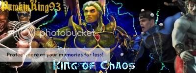
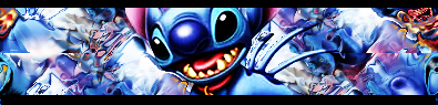
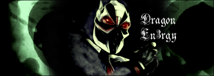
check out my sig, its made by MortalKombat2007, though he messed up, its supose to be i not an L
check out my sig, its made by MortalKombat2007, though he messed up, its supose to be i not an L
.................................


0
skinsley Wrote:
And Iori it looks like your name is an L to me.
And Iori it looks like your name is an L to me.
Same here.
Anyway, here is a sig I made. Nothing too impressive, but it is only my first sig. I just made it by following the tutorial Cosmos made step by step.
Advice is more than welcome.

0
here's my sig that was made by sbdjuggalos

About Me
0
check it out thanks juggalo
im still hoping someone could take a figure liek the others and pallete swap it into smoke to fill smokes place
im still hoping someone could take a figure liek the others and pallete swap it into smoke to fill smokes place
MortalKombat2007 Wrote:
.................................
Iori9 Wrote:
check out my sig, its made by MortalKombat2007, though he messed up, its supose to be i not an L
check out my sig, its made by MortalKombat2007, though he messed up, its supose to be i not an L
.................................
Don't feel bad, its a common mistake people make about my name, you did a gread job on it anyway.
If only there was a way to change my username around a little making it a lower case I (i)
About Me
0


0
matthewhaddad Wrote:
Same here.
Anyway, here is a sig I made. Nothing too impressive, but it is only my first sig. I just made it by following the tutorial Cosmos made step by step.
Advice is more than welcome.
skinsley Wrote:
And Iori it looks like your name is an L to me.
And Iori it looks like your name is an L to me.
Same here.
Anyway, here is a sig I made. Nothing too impressive, but it is only my first sig. I just made it by following the tutorial Cosmos made step by step.
Advice is more than welcome.
Future competiton...no reallly. Keep going the way you're going and you'll be fine man. I actually do like it. More the potential that's there. No specific advice yet, You have Gimp right?
=====================
Better post up the controversal Kratos Sig. Bigg ups to Skinsley for such an epic battle. Lol!

0
ThePredator151 Wrote:
Future competiton...no reallly. Keep going the way you're going and you'll be fine man. I actually do like it. More the potential that's there. No specific advice yet, You have Gimp right?
Future competiton...no reallly. Keep going the way you're going and you'll be fine man. I actually do like it. More the potential that's there. No specific advice yet, You have Gimp right?
Umm... wow. Dont know what to say.
Future competition? Really? I'm honoured you'd say that - really - I didnt think it was that good, but I have been reading a few tutorials and trying to make half way decent looking sigs, and this is the result. Glad you liked it.
And yeah, I use GIMP.
Thx for the comment, Grandmaster!

About Me
My tastes have changed since I created this account over 4 years ago. I prefer being called Siklootd and now love heavy metal music. 
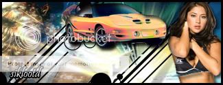
Long live heavy metal music!
0
Could someone tell me what they think of my current signature that I'm using? I spent a long time trying to locate some great Trunks pictures that represent him at his coolest moments and then put them on a background that looked like it worked pretty well. I used Tagg to write my name on it because me and my friend used to tagg walls and stuff, so I thought that would look cool. So let me know your opinions on how it looks. I think that I'm getting better at making sigs though.
I downloaded every single DBZ episode ever made
once watched i picked through lots of episodes on my computer and took a screen of the characters...i wish i had it now, coz i had some insane screen of Trunks in the middle of his Transformation.
Nobody ever Comments on anything i do.
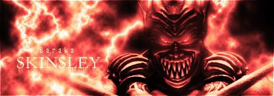

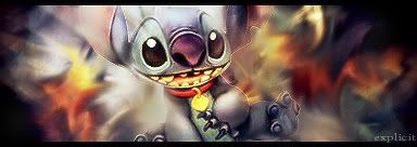
I think i cracked it with the Baraka sig.
once watched i picked through lots of episodes on my computer and took a screen of the characters...i wish i had it now, coz i had some insane screen of Trunks in the middle of his Transformation.
Nobody ever Comments on anything i do.
I think i cracked it with the Baraka sig.
About Me
0
I like that Baraka sig Skinsley.........................

About Me

0


0
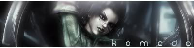
skinsley Wrote:
Ay perfecto on the text killkano, which two fonts did you use ?
K1LLKANO Wrote:

Ay perfecto on the text killkano, which two fonts did you use ?
Lucida Bright was the font for both text blocks.
I've found text to be the biggest PITA for sigs, and using a custom font actually makes it look worse usually. So I generally stick with more traditional styles and try to keep it minimal to prevent it from detracting from the image.
And that Baraka sig is really sharp looking (in a good way). The flow and blending work really well together.
About Me
0

Not too impessed with that one.
The background is a little too simple. and it sort of clashes, Spiderman's left leg looks like its part of the background, and the box behind the text doesnt look to appealing.
Try coppying the image of spiderman, stretching it to be bigger than the scren, and blur it and ripple it and stuff, i think that would make a better background, and would keep the colours.


0
I'm starting a line of sigs called Beginning Basic.
Heres the first two...


Comments would be appreciated...
Heres the first two...
Comments would be appreciated...
0
skinsley Wrote:
i like them, but what do you mean by.
A line of sigs ?
i like them, but what do you mean by.
A line of sigs ?
lol, thanx
I explained it in the Drive By Thread...


© 1998-2026 Shadow Knight Media, LLC. All rights reserved. Mortal Kombat, the dragon logo and all character names are trademarks and copyright of Warner Bros. Entertainment Inc.