
0
skinsley Wrote:
Not too impessed with that one.
The background is a little too simple. and it sort of clashes, Spiderman's left leg looks like its part of the background, and the box behind the text doesnt look to appealing.
Try coppying the image of spiderman, stretching it to be bigger than the scren, and blur it and ripple it and stuff, i think that would make a better background, and would keep the colours.
ahahhaa... for some reason I LOVED that sig!!! The clash and the brighnetss and saturation made it a very fun sig! Really like it... the leg thing is true tho... it'd be nice if it faded away... and the text is not very pretty... what killkano said is VERY true... a traditional font in little size is ussually a good choice

About Me

0
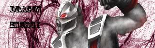
- DragoNEn3rgY -
Very good concept. The sigs looks nice too.
- Skinsley -
Think of celeberties that have thier own clothes line (ex. 50 Cent: G Unit) . It's the same thing, except he's doing it with his sigs rather than clothes. Come to think of it, those designs on his sigs would look great on clothes.
Very good concept. The sigs looks nice too.
- Skinsley -
Think of celeberties that have thier own clothes line (ex. 50 Cent: G Unit) . It's the same thing, except he's doing it with his sigs rather than clothes. Come to think of it, those designs on his sigs would look great on clothes.

About Me
My tastes have changed since I created this account over 4 years ago. I prefer being called Siklootd and now love heavy metal music. 
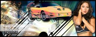
Long live heavy metal music!
0
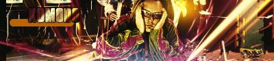
Here's my newest sig that I made, let me know what you think of it.


About Me
0
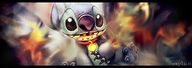
here is a sig i made today :).... i hope you guys thinks it looks cool :P
Btw: sbdjuggalos your sig looks really cool :)
Btw: sbdjuggalos your sig looks really cool :)


0
MortalKombat2007 Wrote:
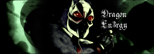
- DragoNEn3rgY -
Very good concept. The sigs looks nice too.
- Skinsley -
Think of celeberties that have thier own clothes line (ex. 50 Cent: G Unit) . It's the same thing, except he's doing it with his sigs rather than clothes. Come to think of it, those designs on his sigs would look great on clothes.
Exactly, Thanx

About Me
0
here is a sig that i made today... i hope you guys think it looks ok =)

About Me
Why don't you have a seat?
0

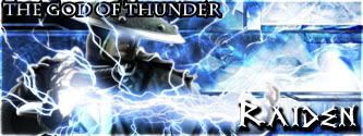
My first animated sig.
That would be awsome.....if the background wasnt so ....not good.
You need to work on the background big time.....your still better than darrius464 though .
.
God ive not made a sig in ages....ive been ill all week, im just not in the mood for creativity.
You need to work on the background big time.....your still better than darrius464 though
God ive not made a sig in ages....ive been ill all week, im just not in the mood for creativity.
About Me
0
Skinsley wrote:
That is nothing less than awsome.
thanks... im glad you liked it :D
That is nothing less than awsome.
thanks... im glad you liked it :D
0
same sig i just changed the color


About Me
 We've got chicken tonight. Strangest damn things. They're man made.
 0
mine is just text
0
My latest sig... havent made one in awhile... and Im really happy of my new baaaaby
About Me


0
Man I miss photoshop! I have been more concentrating on doing tattoo flash nowadays. I do have access to Paintshop Pro though. Anyone know any good tutorial sites for PSP?
0
Kamionero Wrote:
My latest sig... havent made one in awhile... and Im really happy of my new baaaaby
My latest sig... havent made one in awhile... and Im really happy of my new baaaaby
YAY! New sig by KAM! w00t w00t!
That is a nice sig brah... I like the effects it has and the simple-ness of it...
more....MORE....MOOOORREE
About Me
0
wow really nice sig Kamionero....
here is one that i just created... =)
here is one that i just created... =)
About Me
0
thanks guys =)...
and for skinsley: i know that the text kills it big time hehe (i dont have that many fonts at the moment....but i tried a few fonts and all of them sucked).
Thanks for the idea to blend the render =)
this is how it looks like when i took away the text and added some lights to the render... is it better or worse? XD


0
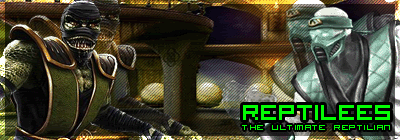
Bravo reptilees...Bravo
And to make it even better you seem to be "Cinemist" like me.
(Cinematic pictures. Tell a story or usually have few things going on in them. Like a moive ad or DvD cover.)
You don't blend so much like I do, but they still look wonderful. Great Job man.
Fresh ones:

 Rough Renders...


Proto-Type for "Deadly Dominion" by: LeoBrZ81....(including a FanArt render for the story that was my first "coloring job")/// Update coming soon...
And to make it even better you seem to be "Cinemist" like me.
(Cinematic pictures. Tell a story or usually have few things going on in them. Like a moive ad or DvD cover.)
You don't blend so much like I do, but they still look wonderful. Great Job man.
Fresh ones:
Proto-Type for "Deadly Dominion" by: LeoBrZ81....(including a FanArt render for the story that was my first "coloring job")/// Update coming soon...
Better Reptilees.!!!much better i love that signature.
Though it does need text..use something simple like arial or anything else that is solid and easy to see, make it white and lower the opacity a bit.
and dont make it too big, i think that would be a good way of adding text to that particular signature.
Though it does need text..use something simple like arial or anything else that is solid and easy to see, make it white and lower the opacity a bit.
and dont make it too big, i think that would be a good way of adding text to that particular signature.
0
About Me
0
wow predator your sigs looks awesome.... i expected as much from a pro artist as yourself =P
Im glad you like my sig =)
and for skinsley: thanks for the advice.... ill try it out =)
Im glad you like my sig =)
and for skinsley: thanks for the advice.... ill try it out =)
About Me
Sig made by Prodigy004
0
Here's my latest:


© 1998-2026 Shadow Knight Media, LLC. All rights reserved. Mortal Kombat, the dragon logo and all character names are trademarks and copyright of Warner Bros. Entertainment Inc.