
0
I made this Li Mei sig, its my fav sig so far...I love it!

0
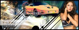
Some sexy (not really) new sigs from me:


I like my Jade one, but I blurred the Raiden one too much, dont like it =/
I like my Jade one, but I blurred the Raiden one too much, dont like it =/
0
matthewhaddad Wrote:
Some sexy (not really) new sigs from me:
I like my Jade one, but I blurred the Raiden one too much, dont like it =/
Some sexy (not really) new sigs from me:
I like my Jade one, but I blurred the Raiden one too much, dont like it =/
Wow, good job Matt. The one im using now is my FIRST sig ive ever made too.
0
prodigy004 Wrote:
Wow, good job Matt. The one im using now is my FIRST sig ive ever made too.
Wow, good job Matt. The one im using now is my FIRST sig ive ever made too.
Wasn't expecting anyone to say that, thanks!
Your first sig kicks my 4th and 5th sigs asses though, hehe.


0
matthewhaddad Wrote:
Some sexy (not really) new sigs from me:
I like my Jade one, but I blurred the Raiden one too much, dont like it =/
Some sexy (not really) new sigs from me:
I like my Jade one, but I blurred the Raiden one too much, dont like it =/
I KNEW IT!! Haha!!
That shit looks good Matt! That Jade one is real nice...
Again! Again!!
0
skinsley Wrote:
Un like some people that are new to making signatures, you know what colour/type of background to use with your render.
Un like some people that are new to making signatures, you know what colour/type of background to use with your render.
Im assuming your talking about mine?

About Me
My tastes have changed since I created this account over 4 years ago. I prefer being called Siklootd and now love heavy metal music. 
Long live heavy metal music!
0
Man Prodigy, your sig is awesome!!! Broly is my second favorite DBZ character (Trunks is first), and that sig looks so good!!! You really blow my sig to pieces!
0
sbdjuggalos Wrote:
Man Prodigy, your sig is awesome!!! Broly is my second favorite DBZ character (Trunks is first), and that sig looks so good!!! You really blow my sig to pieces!
Man Prodigy, your sig is awesome!!! Broly is my second favorite DBZ character (Trunks is first), and that sig looks so good!!! You really blow my sig to pieces!
Thanks man I appreciate it alot!. But I would have to say your is better seeing as how it probably took more work to do.
Oh and btw, Broly owns Trunks!
0
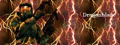
MY FIRST SIG!! what do you think?
0
DragoNEn3rgY Wrote:
Yea...
Also... Why does your sigs make me thirsty?
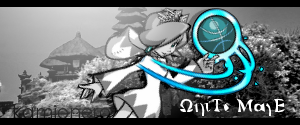
Kamionero Wrote:
u mean tuts?
DragoNEn3rgY Wrote:
Kam, would you mind sending my some of your favorites?
Kam, would you mind sending my some of your favorites?
u mean tuts?
Yea...
Also... Why does your sigs make me thirsty?
hehehhe... im so glad u said that!!! HAHAHAHA... the pic waws supposed to look watery and fluent...
btw... i PMed u those tuts... cant have everyone runnin arround knoin my secrets...
About Me
My tastes have changed since I created this account over 4 years ago. I prefer being called Siklootd and now love heavy metal music.
Long live heavy metal music!
0
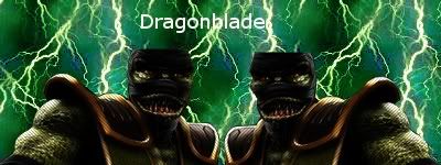
Dragonblade Wrote:
MY FIRST SIG!! what do you think?
MY FIRST SIG!!
Nothing personal man, but it needs major improvement. I know that it's your first sig, but I saw the render that Skinsley gave you to work with, and I still can't figure out how you managed to pixelate the image so much. Maybe you didn't stretch the image properly and it became "squashed" and pixelated as a result, make sure that when you change either the width or the height that the other stays in proportion to it. Plus I just noticed that Master Chief is floating in the middle of the sig, not touching the bottom of the sig or anything. That makes it look bad. Make sure that your images aren't floating unless they're a full image, you know legs and everything. But he's just kind of chopped off at the waist. The background is just the same image copy and pasted over and over, you could have simply scaled it 400 X 150 instead of doing that because you can see the lines in between were it was pasted each time. But still, I understand that it's your first sig, some of my first sigs weren't very good. But you could use improvement. And I don't want you to think I'm being harsh or anything, just trying to help you out bro.


About Me

0
Vorpax Wrote:
Supremely proud.
Supremely proud.
Wow, that's really good! Mine: just a simple smudge sig using the butterfly brush for the smudging.

Some similar ones but using a dune grass brush:


^^^ Never that good at sprite sigs.

Yeah, the Kung Lao one is too bright and the render didn't come out that great. -_-
0
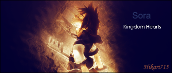
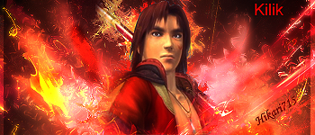
Hikari715 Wrote:
Wow, that's really good! Mine: just a simple smudge sig using the butterfly brush for the smudging.
Some similar ones but using a dune grass brush:
^^^ Never that good at sprite sigs.
Yeah, the Kung Lao one is too bright and the render didn't come out that great. -_-
Vorpax Wrote:
Supremely proud.
Supremely proud.
Wow, that's really good! Mine: just a simple smudge sig using the butterfly brush for the smudging.
Some similar ones but using a dune grass brush:
^^^ Never that good at sprite sigs.
Yeah, the Kung Lao one is too bright and the render didn't come out that great. -_-
Really good! hopefully one day ill be able to be that good.
0
skinsley Wrote:
Un like some people that are new to making signatures, you know what colour/type of background to use with your render.
Un like some people that are new to making signatures, you know what colour/type of background to use with your render.
ThePredator151 Wrote:
I KNEW IT!! Haha!!
That shit looks good Matt! That Jade one is real nice...
Again! Again!!
I KNEW IT!! Haha!!
That shit looks good Matt! That Jade one is real nice...
Again! Again!!
Thanks for the good feedback, much appreciated
Still have a long way to go before I can do something as good as either of you two.

About Me

0
Damn! Those look great, anyways, here's another Link sig, didn''t like how the my last one came out.

0
metaknight
White mage... stole idea from someone named fullmetalenvy

0
skinsley Wrote:
HIKARI.... AGAIN just wow
HIKARI.... AGAIN just wow
Agreed. Same with Kamionero, too. MK2007, not bad either.
All are pretty damn awesome
0
yeah i didn't think it was good either. my brother said it sucked too. its my first though so i didn't expect good comments. any way for the picture being pixeled i cut it out myself cuz i didn't like how skinsley did a full cut out of the pic. i just wanted it how it was. anyway for the lightning thing i didn't copy and paste it. it was a pattern. and the sig is 400x150.
well here's my 2nd sig and i know it still has the lightning background. i just like it ok, i won't have that background on my next sig.
well here's my 2nd sig and i know it still has the lightning background. i just like it ok, i won't have that background on my next sig.
About Me
My tastes have changed since I created this account over 4 years ago. I prefer being called Siklootd and now love heavy metal music.
Long live heavy metal music!
0
MortalKombat2007 Wrote:
Damn! Those look great, anyways, here's another Link sig, didn''t like how the my last one came out.
Damn! Those look great, anyways, here's another Link sig, didn''t like how the my last one came out.
I love it MK2007! I think your last one was good too (it was better than anything I could ever make!!) but this one is very good too!
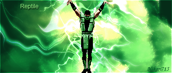
Dragonblade Wrote:
Well firstly REPTILE has had his brain removed....and they didnt put his scalp back....how nice is that of them.
The background is the same as you had before....just green, and that shade of green clashes with the Reptile images, and makes them look bad quality.
if your going to make a green background for a character with green in him....make sure the green is similar....otherwise its just a clash....like you see before you.
The text, i know simple is good, but you have to do soemthing with that simple text, smaller and a little bit opaque is the best way depending on the signature.
A render with half a Head is like breaking Rule 1 man.
About Me
0


© 1998-2026 Shadow Knight Media, LLC. All rights reserved. Mortal Kombat, the dragon logo and all character names are trademarks and copyright of Warner Bros. Entertainment Inc.