


0
@Benzou- What is that in the sig? Looks kinda empty as well.
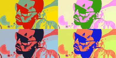
@AKELDAMA- I see that you're pulling the "simple" look nicely. It looks so simple but at the same time unique and good.
NEW:
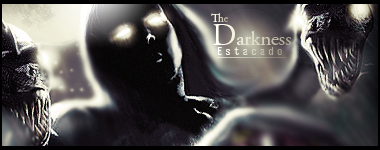
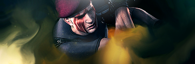
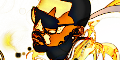
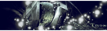
^What happened???
Dont ask what happened with the mask. Its just how it was made. I had no control over how it looks.
Opinions
@AKELDAMA- I see that you're pulling the "simple" look nicely. It looks so simple but at the same time unique and good.
NEW:
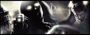
^What happened???
Dont ask what happened with the mask. Its just how it was made. I had no control over how it looks.
Opinions

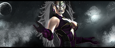
Akel, I love the clouds...did you make them or are they a stock.
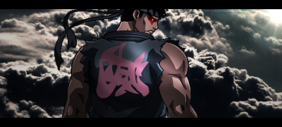
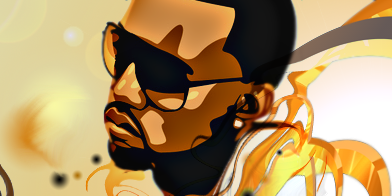
DJ the bottom half is brilliant, I love the way you did the lighting...but I do not like the top half it doesnt seem like it blends in with the bottom half and that mask as you have already pointed out looks pretty silly.
DJ the bottom half is brilliant, I love the way you did the lighting...but I do not like the top half it doesnt seem like it blends in with the bottom half and that mask as you have already pointed out looks pretty silly.

About Me

0
Great jobs on the sig, Prod- err Akeldama. The girl with the texture, Shao Kahn, Noob, Sareena and the Evil Ryu sigs are great! Lighting is always nice.
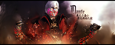
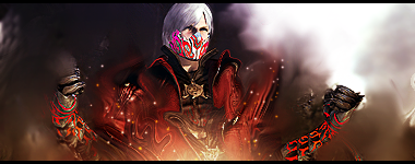
Devil Jin, nice job on the Super Star sigs but I somewhat prefer version 1. The Dante one is also quite interesting but the mask looks pretty awful with the oversaturated colors.
Wow @ MINION's gift for Predator151.
As for Pred, nice avatar as always. I thought the evil ryu sig came out well too, so nice and simple.
As for a new sig, I might make a new one but it will probably come sometime after my exams are finished (The last exam will be on June 18). I don't really have some ideas for the moment lol.
But I have made some avatars... but they are the fancy types...


I will admit the cupcake one is a bit weird.
Devil Jin, nice job on the Super Star sigs but I somewhat prefer version 1. The Dante one is also quite interesting but the mask looks pretty awful with the oversaturated colors.
Wow @ MINION's gift for Predator151.
As for Pred, nice avatar as always. I thought the evil ryu sig came out well too, so nice and simple.
As for a new sig, I might make a new one but it will probably come sometime after my exams are finished (The last exam will be on June 18). I don't really have some ideas for the moment lol.
But I have made some avatars... but they are the fancy types...
I will admit the cupcake one is a bit weird.
0
Thanks for the comment Hikari.
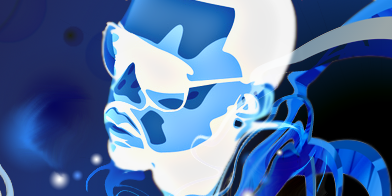
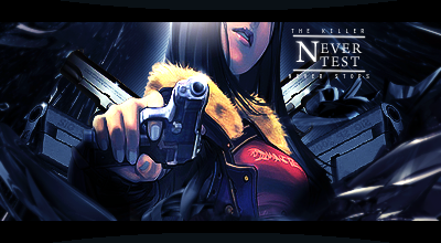
Hmm, I feel like going back to one of my favorite styles for a change. Nice, Dark feel.
^The second one with the gun was a random thought I had while I was making finishing touches. I went with that thought and came up with that. I think I came out pretty o.k.
Opinions?
Hmm, I feel like going back to one of my favorite styles for a change. Nice, Dark feel.
^The second one with the gun was a random thought I had while I was making finishing touches. I went with that thought and came up with that. I think I came out pretty o.k.
Opinions?


0
AKELDAMA Wrote:
Im not even going to act casual about this one, I really like it lol.
Im not even going to act casual about this one, I really like it lol.
You know what? I swear up and down that I was gonna use that picture of Evil Ryu instead, I just didn't, because of his red head band. I figured that there was something particular about why you wanted that specific render in your sig.
Looks good though. You do really good with natural things btw. I like it, but I think that if there was a more realistic render of Evil Ryu out there, it would fair better in that signature. Bg supersedes the render iMo... Great sig overall.
Hikari715 Wrote:
But I have made some avatars... but they are the fancy types...
I will admit the cupcake one is a bit weird.
But I have made some avatars... but they are the fancy types...
I will admit the cupcake one is a bit weird.
I don't think the cupcake one is weird, I think they all great. What else are you supposed to do with a cupcake? lol
DevilJin Wrote:
Thanks for the comment Hikari.
Hmm, I feel like going back to one of my favorite styles for a change. Nice, Dark feel.
Thanks for the comment Hikari.
Hmm, I feel like going back to one of my favorite styles for a change. Nice, Dark feel.
Now, that just looks gooood. idk what else to say right now..Don't dig the Dante sigs, looks like you did too much with it. Needs to look more realistic. Use greys and browns around edits like that....I think...
About Me

0
Hikari715 Wrote:src=http://i86.photobucket.com/albums/k98/Hikari715/avatars/babytiger.png>
I will admit the cupcake one is a bit weird.
I will admit the cupcake one is a bit weird.
Looks great!
0
Thought I'd try Jago's style one more time because I didn't really like the Bruce one, plus I'm really bored so don't really take these seriously.
EDIT:
LMAO look at this shit. Some asshole stole my old Kanye west sig and made it look like a real piece of shit. His Photobucket account is "NickPower72"
EDIT:
LMAO look at this shit. Some asshole stole my old Kanye west sig and made it look like a real piece of shit. His Photobucket account is "NickPower72"
0
skinsley Wrote:
Thats your sig alright.
lol, or maybee he just used the same tutorial ?
Im fucking with you !
No report that shit.
Thats your sig alright.
lol, or maybee he just used the same tutorial ?
Im fucking with you !
No report that shit.
Lol! Yeah he must've gotten that tutorial down to the very last detail lol.
EDIT:
Damn, I hope I win the SOTW over at GSA. Right now I'm tied for 1st place with 4 votes and 2 other people. I think the voting ends on Friday. I almost won last week. Placed 4th. Wish me luck y'all!


About Me
0
-Jago- Wrote:
i was on shrooms and made a sig of some indian guy

i was on shrooms and made a sig of some indian guy

That is F'n awesome.
About Me
0
Wow I love the dark background. And I love the new Sindel you have done...The colors on her run perfectly with the background.
About Me

0
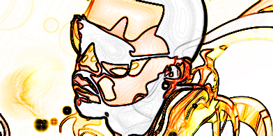
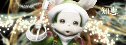
These are gifts for Deviljin,I think they turned out rather well,but not really sure.It was a very simple concept,nothing out of the ordinary.Criticism is definitely welcome.
Without Kanji:
With Kanji:
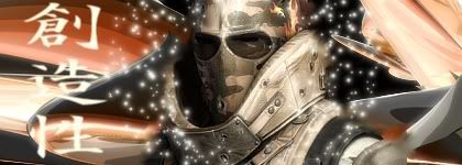
Without Kanji:

With Kanji:

0
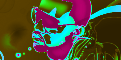
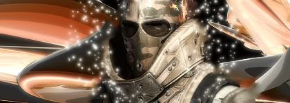
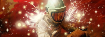
Wow, thanks dude I really appreciate it. I'm going to wear it right now.
I see that you've been practicing on your technique. I like the sparkles around him. get a little bit of depth in there and it'll look a little better.
depth:
http://en.wikipedia.org/wiki/Depth_of_field
I see that you've been practicing on your technique. I like the sparkles around him. get a little bit of depth in there and it'll look a little better.
depth:
http://en.wikipedia.org/wiki/Depth_of_field
About Me
0
DevilJin Wrote:
Wow, thanks dude I really appreciate it. I'm going to wear it right now.
I see that you've been practicing on your technique. I like the sparkles around him. get a little bit of depth in there and it'll look a little better.
depth:
http://en.wikipedia.org/wiki/Depth_of_field
Wow, thanks dude I really appreciate it. I'm going to wear it right now.
I see that you've been practicing on your technique. I like the sparkles around him. get a little bit of depth in there and it'll look a little better.
depth:
http://en.wikipedia.org/wiki/Depth_of_field
Here's my try at "Depth" = ]

About Me
0
Thanks everyone for the thoughts on the avatars. ^^
Nice job with the fractuals Jago.
Nice job with the fractuals Jago.
0
You are getting better but two things...
1. You don't need to blur the render much, if at all
2. the white spots distract me from the focal.
Speaking of focal, I never said anything about that...
The focal is the one spot you want people to look at right as they set their eyes on it.
Example:

As you can see the area where Dante is, is the one spot I want you to look at and by making him stick out more than anything else you have no choice but to look at him. Without a focal (and depth) your sig will seem...Flat, and boring...Another example is your ironman sig. There was one place that people noticed as soon as they laid eyes on it, and that was well on Ironman himself, which is good.
Oh and depth doesn't always mean the BG has to be blurry, its just there to help you find the main focal.
What else is there to talk about?....hmmm...Oh yeah, lighting.
Like the focal, lighting is pretty self-explanatory. Find a good spot to put a gradient or something like that over the focal.
Example:

See how it looks as though light is shining over him, or some sorta spotlight is on him? Thats lighting.
And one more thing...
Don't ever do something that'll make your sig messy. Again like those little white marks everywhere on the killzone one. They don't make sense, and they are just making the sig look bad because they are so random.
^Hope this big ass post helped you

About Me
0
Is this any better Jin?Your advice really helped,as did the tutorial I got some ideas from.I didn't follow,I just learned.


0
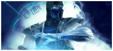
@Ulca- I like the master chief helmet one the most. Decent colors, and effects to it. The only thing I don't like about it is the text. Looks all dull and just sticks out. Put it closer to the render and make it blend a little bit more.
The only thing thats really distracting about the subzero one is how choppy the render is. It kinda just kills it. It has a nice concept though.
@Blud- Oh my god dude I didn't even know you made it until I read the name. Much MUCH better. The second one is my favorite out of the two. Love the effects, colors, and BG. They all flow nicely. If you want to manually do the little swirl things that are on his arm, just use the pen tool. You will be able to get as many as you want, and it kinda makes it look better. (If you were already doing that just ignore what I just said than.)
The first one is o.k, but I'm not a big fan of the dots right behind the render, and that Japanese text. love how it comes from the wand or whatever that is though.
Keep it up man, you're getting better fast...
EDIT: Finished this one yesterday...
Definitely not my best but not too bad I guess...
Opinions?
0
Actually... its one of the ones i like the most DevilJin


© 1998-2026 Shadow Knight Media, LLC. All rights reserved. Mortal Kombat, the dragon logo and all character names are trademarks and copyright of Warner Bros. Entertainment Inc.