

About Me

0
My newest piece of art...
"Emotional Respiration":
Version #1
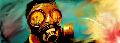
Version # 2
Tried to learn from Jin's advice one more...
"Emotional Respiration":
Version #1

Version # 2

Tried to learn from Jin's advice one more...


0
@Kam- Thanks dude, and I'm still lovin that one sig you made for me. Once I'm done with the one by Blud (Khanswarrior) Imma put that one back on.
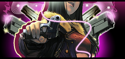
@Zach- When I downloaded the render, it was called "Gunz the dual". So I'm guessing it is.
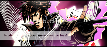
Do you recognize this girl?
http://img186.imageshack.us/img186/606/gunztheduelpic2axi3.png
@Blud- Is that your first smudge sig? If so pretty nice. Not really feeling the colors, and the stuff on the right (distracts from the focal) but other than that pretty good. I personally like the second version most.
@Zach- When I downloaded the render, it was called "Gunz the dual". So I'm guessing it is.
Do you recognize this girl?
http://img186.imageshack.us/img186/606/gunztheduelpic2axi3.png
@Blud- Is that your first smudge sig? If so pretty nice. Not really feeling the colors, and the stuff on the right (distracts from the focal) but other than that pretty good. I personally like the second version most.
About Me
0
DevilJin Wrote:
@Kam- Thanks dude, and I'm still lovin that one sig you made for me. Once I'm done with the one by Blud (Khanswarrior) Imma put that one back on.
@Zach- When I downloaded the render, it was called "Gunz the dual". So I'm guessing it is.
Do you recognize this girl?
http://img186.imageshack.us/img186/606/gunztheduelpic2axi3.png
@Blud- Is that your first smudge sig? If so pretty nice. Not really feeling the colors, and the stuff on the right (distracts from the focal) but other than that pretty good. I personally like the second version most.
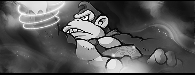
Actually,the astronaut was...But I like my newest sig better.


Am I allowed to ask anyone in here to make me a decent signature featuring Snake, Raiden and Ocelot from MGS4 that's really catchy? I cannot make signaures really well and I would like to have one like you guys do. Please? And if whoever is interested, can you IM me please saying that you are interested? Thank you.
0
Zach5524 Wrote:
Yes, that game is actually pretty addictive.
It's called GunZ: the duel. Fun game, and it's free! The best kind.
DevilJin Wrote:
@Zach- When I downloaded the render, it was called "Gunz the dual". So I'm guessing it is.
@Zach- When I downloaded the render, it was called "Gunz the dual". So I'm guessing it is.
Yes, that game is actually pretty addictive.
It's called GunZ: the duel. Fun game, and it's free! The best kind.
I just looked it up on youtube, and it looks o.k. Nothing really impressive.

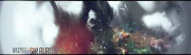
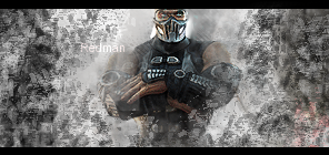
Ulcatron that Helmet sig is fantastic.
It is so origonal I love it.
Kahnswarrior, that Spaceman sig is one of your best night, you have improved greatly, but it needs a little more detail...the other sig is way too blurred.
And your latest, I love the render used, and the smudging is to die for, youve done very well with this one and it is definatly your best...needs a little more but only a little.
Your latest DJ is not as good as your others, I dont suppose renders like that can have much else done to them, but it seems a little flat compared to most of the things youve done recently.
Text I believe is your forté youre realy good at text.
And well done on all your advice, I was gonna give you a dragonpoint for your lighting and text explanation but my computers going a little slow due to downloading and such, so I will get to that later.
Wish I wasnt tired all the time, I wanna make a sig now but i just cant begin.
0
@Skins-
Thanks for the comment. I know its not one of my best but after looking at the render I was inspired to make that. Took 30 layers to do. Took a very long time but it could be better. I wanted the colors to stick out more and enhance the quality of the lady but I just couldn't get it the way I wanted.
My other stuff like my "Superstar" sig is much better. I've actually been working that style a lot lately. I'm in the middle of a project dedicated to that style, using it in different ways besides just using speakers. Its actually coming along really well right now and I'm happy with my results so far. I'll post all of them once I'm done with all of my ideas.
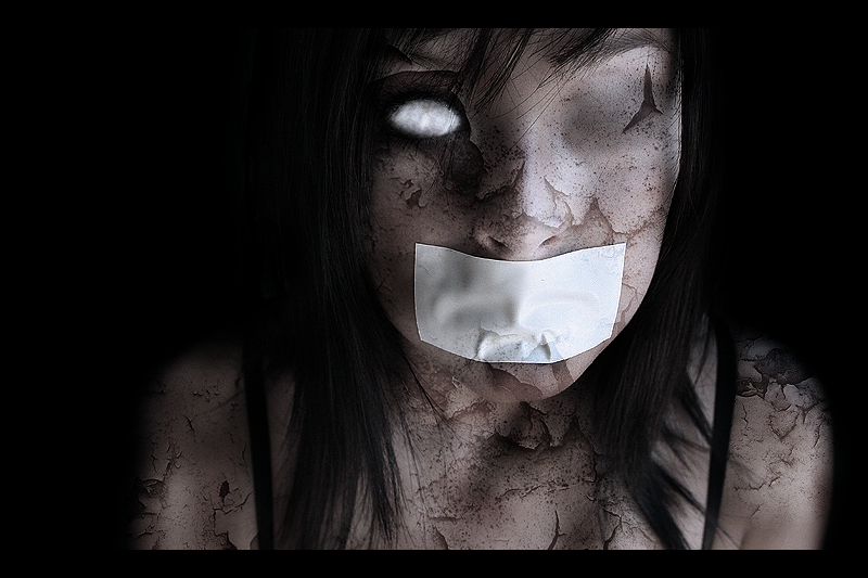
@AKEL-
That is a really nice piece of art right there and I don't even know where to start. Cracks look great, and looks very creepy. I can't really find anything wrong with it at all. Its as if there's nothing you can do to make it any better and I know it must have taken forever to finish it. Keep up the good work buddy.
Thanks for the comment. I know its not one of my best but after looking at the render I was inspired to make that. Took 30 layers to do. Took a very long time but it could be better. I wanted the colors to stick out more and enhance the quality of the lady but I just couldn't get it the way I wanted.
My other stuff like my "Superstar" sig is much better. I've actually been working that style a lot lately. I'm in the middle of a project dedicated to that style, using it in different ways besides just using speakers. Its actually coming along really well right now and I'm happy with my results so far. I'll post all of them once I'm done with all of my ideas.
@AKEL-
That is a really nice piece of art right there and I don't even know where to start. Cracks look great, and looks very creepy. I can't really find anything wrong with it at all. Its as if there's nothing you can do to make it any better and I know it must have taken forever to finish it. Keep up the good work buddy.
Thanks dude. You have a really good eye for things and I really like that and respect it. You can see that I tried to make it creepy/dark(shouldn't be hard to tell lol) and before you mentioned that you noticed that I have been making some of my sigs simple yet nice. Thank you.
I look forward to seeing more of you sigs and your improvement in the future. Which wont be too long, seeing as how you improve at a fast pace.
I look forward to seeing more of you sigs and your improvement in the future.
About Me
0
skinsley Wrote:
Ulcatron that Helmet sig is fantastic.
It is so origonal I love it.
Kahnswarrior, that Spaceman sig is one of your best night, you have improved greatly, but it needs a little more detail...the other sig is way too blurred.
And your latest, I love the render used, and the smudging is to die for, youve done very well with this one and it is definatly your best...needs a little more but only a little.
Your latest DJ is not as good as your others, I dont suppose renders like that can have much else done to them, but it seems a little flat compared to most of the things youve done recently.
Text I believe is your forté youre realy good at text.
And well done on all your advice, I was gonna give you a dragonpoint for your lighting and text explanation but my computers going a little slow due to downloading and such, so I will get to that later.
Wish I wasnt tired all the time, I wanna make a sig now but i just cant begin.
Why,thank-you for such kind words.I completely agree with you about my latest sig.I really liked the stock,so I decided to make a sig using it..I think it turned out rather well.It took awhile to decide what colors to use,but I think I selected the right ones..
As for the Astronaut,I was trying to give the focal kind of a "Pop" feel.I don't really think that I achieved it though.I though it turned out decent.I think I could have done much better.


0
That shit makes me want to give you an actual picture of me and just let you go to town.
Awesome work.
0
AKELDAMA Wrote:
Thanks dude. You have a really good eye for things and I really like that and respect it. You can see that I tried to make it creepy/dark(shouldn't be hard to tell lol) and before you mentioned that you noticed that I have been making some of my sigs simple yet nice. Thank you.
I look forward to seeing more of you sigs and your improvement in the future. Which wont be too long, seeing as how you improve at a fast pace.
Thanks dude. You have a really good eye for things and I really like that and respect it. You can see that I tried to make it creepy/dark(shouldn't be hard to tell lol) and before you mentioned that you noticed that I have been making some of my sigs simple yet nice. Thank you.
I look forward to seeing more of you sigs and your improvement in the future.
Thanks man I will try to finish this little "project" as soon as possible. Can't wait to see some more of your stuff either because you can make a sig look "simple" but at the same time you know it must've taken a long time to do. Shit, if I did that you'd think I just started making sigs.


About Me

0
UlcaTron Wrote:
All opinions will be accepted.
All opinions will be accepted.
Sorry but this is one of your worst. :\
The ugly green blob with the multi-colored squarish bits on the right pretty much ruins it. The dull red lighting on the left doesn't seem to work either, sorry. Keep working on colors, effects and lighting though.
----------------
New avatars:


The first one may look odd since it looks like the eyes are popping up more. Why? The stock was sooo grainy and I tried to use the blur tool to cover it up but I think I over did it a bit >_>
For the Anakin one, the right side is pretty dark, will fix it sometime tomorrow.

About Me

MK Online Featured User 31/3/2010 12/4/2011
-----------------------Gifts-----------------------
Shinnok-fan64 - s3Kt0r
0
UlcaTron Wrote:
All opinions will be accepted.
All opinions will be accepted.
get rid of the green and it might work but I like the idea
0
I finally finished my little "project" for the supstar style.


---------------------------------------------------------------------------------------------
With BGs...


Someone on GSA said that it was "too simple" but others said "it was cool".
What do y'all think?
---------------------------------------------------------------------------------------------
With BGs...
Someone on GSA said that it was "too simple" but others said "it was cool".
What do y'all think?
About Me
0
DevilJin, my favorites are these...
I really think you did a great job with the transparent pieces. One complaint, on the transparent Casino Life piece, the render's a bit choppy. The last piece looks pretty good as well.
Heh a sig from a while...


The last one is a flipped variation.
I really think you did a great job with the transparent pieces.
Heh a sig from a while...
The last one is a flipped variation.
0
Thanks. Yeah, I noticed that the render was a little choppy as well.
That xiaoyu sig looks very nice. Nice flow, and sharp like all of your work.
New
Less lighting at the bottom
That xiaoyu sig looks very nice. Nice flow, and sharp like all of your work.
New
Less lighting at the bottom
0
This whole page is impressive. I love it when that happens.


About Me
MK Online Featured User 31/3/2010 12/4/2011
-----------------------Gifts-----------------------
Shinnok-fan64 - s3Kt0r
0


© 1998-2026 Shadow Knight Media, LLC. All rights reserved. Mortal Kombat, the dragon logo and all character names are trademarks and copyright of Warner Bros. Entertainment Inc.